我有以下数据框(dput(df2)的输出结果):
structure(list(angles = c(-0.701916320805404, 2.33367948606366,
0.364313791379516, -0.228918909875176, -2.77064550417737, 2.97776037032614,
-3.03604124258522, 2.10507549390108, 2.07708771915781, -0.0646656487453258,
-0.701916320805404, 2.33367948606366, 0.364313791379516, -0.228918909875176,
-2.77064550417737, 2.97776037032614, -3.03604124258522, 2.10507549390108,
2.07708771915781, -0.0646656487453258, -0.701916320805404, 2.33367948606366,
0.364313791379516, -0.228918909875176, -2.77064550417737, 2.97776037032614,
-3.03604124258522, 2.10507549390108, 2.07708771915781, -0.0646656487453258
), id = c(9L, 4L, 5L, 6L, 3L, 10L, 3L, 4L, 4L, 6L, 1L, 4L, 5L,
6L, 2L, 1L, 3L, 4L, 4L, 6L, 1L, 7L, 5L, 6L, 2L, 1L, 3L, 4L, 4L,
6L), method = structure(c(2L, 2L, 2L, 2L, 2L, 2L, 2L, 2L, 2L,
2L, 3L, 3L, 3L, 3L, 3L, 3L, 3L, 3L, 3L, 3L, 1L, 1L, 1L, 1L, 1L,
1L, 1L, 1L, 1L, 1L), .Label = c("kd-clips", "QT-Clust", "True"
), class = "factor"), truid = structure(c(1L, 4L, 5L, 6L, 2L,
1L, 3L, 4L, 4L, 6L, 1L, 4L, 5L, 6L, 2L, 1L, 3L, 4L, 4L, 6L, 1L,
4L, 5L, 6L, 2L, 1L, 3L, 4L, 4L, 6L), .Label = c("1", "2", "3",
"4", "5", "6"), class = "factor")), .Names = c("angles", "id",
"method", "truid"), row.names = c(940L, 474L, 889L, 298L, 222L,
932L, 87L, 695L, 261L, 832L, 1940L, 1474L, 1889L, 1298L, 1222L,
1932L, 1087L, 1695L, 1261L, 1832L, 2940L, 2474L, 2889L, 2298L,
2222L, 2932L, 2087L, 2695L, 2261L, 2832L), class = "data.frame")
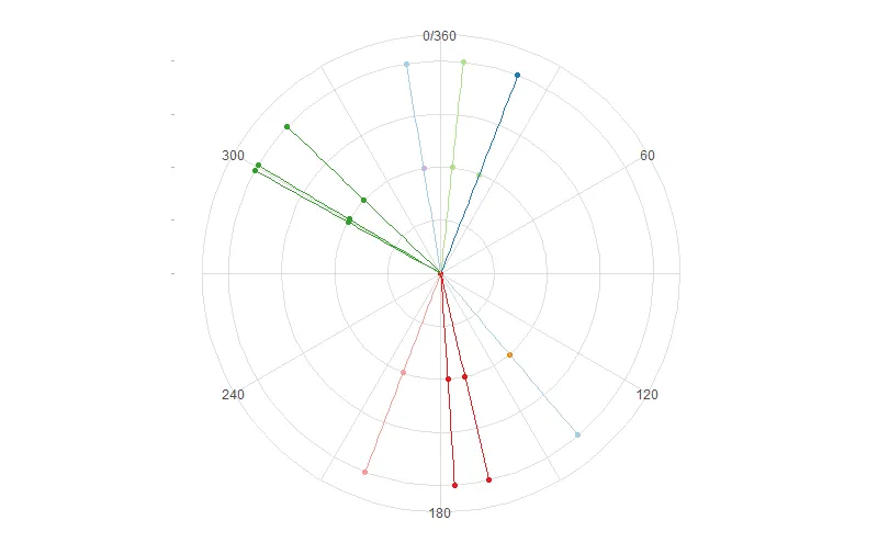
我运行下面的代码生成以下图表:
df2$y <- as.numeric(as.factor(df2$method))  + 3
df2$yend <- df2$y + 1

library(ggplot2)
library(RColorBrewer)
cx <- ggplot(df2, aes(y = y, x = angles))
cx + geom_point(aes(color = as.factor(id))) + ylim(0,6)  + theme_light() + scale_colour_brewer(palette = "Paired") +
  scale_x_continuous(labels = NULL, breaks = df2$angles)+coord_polar() +
  theme(legend.position="none",  panel.border=element_blank(), axis.title =
        element_blank(), axis.text = element_blank())
我得到了以下图像:
- 根据df2的最后一列(true.id),将放射线染色(与第三个同心圆中的点相同的颜色--与id ==“True”相同的颜色)。
- 我还想要一个径向刻度标尺,间隔为30(如在0、30、60、90等角度处)。但是,我不希望在y轴的左侧有刻度标尺。
- 上面有30个点,每个角度的每种方法都有三个重复。然而,图只显示了9个重复,即总共27个点。 (可能有两个角度--一个为2.077,另一个为2.105--非常接近,因此它们可能真的都在那里,但我无法确定,因为那么接近的两个点是什么?)
提前感谢!