在UIKit中,绘制描边和填充的路径/形状非常容易。
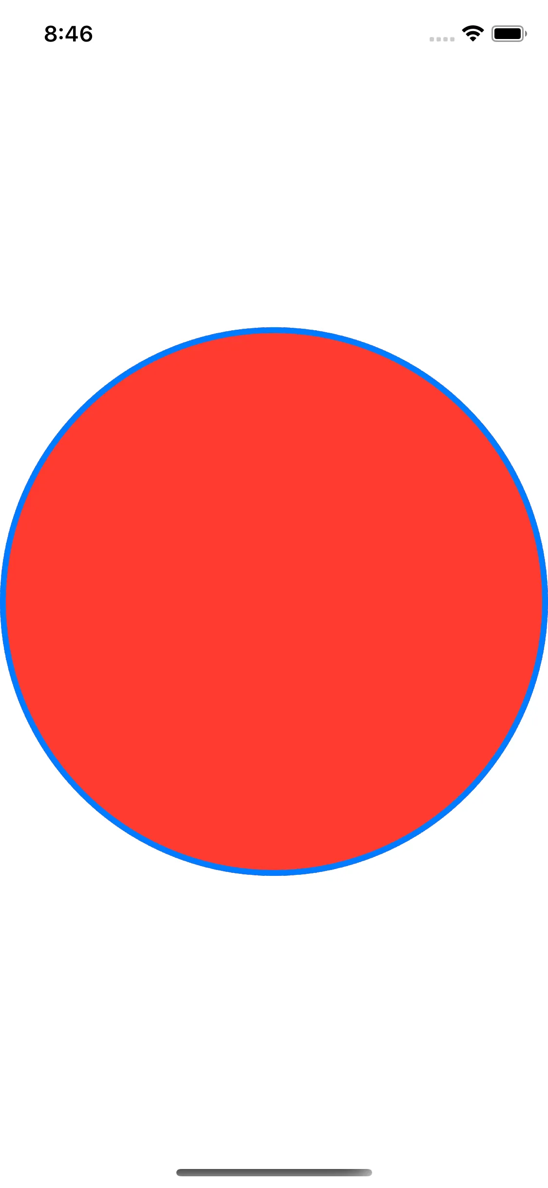
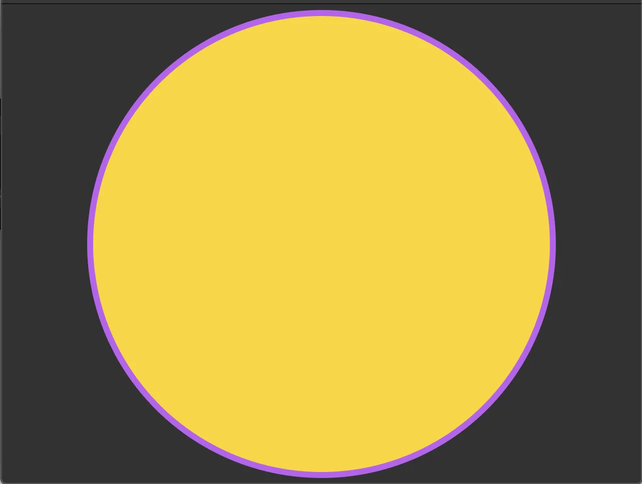
例如,下面的代码会绘制一个红色圆,描边为蓝色。
例如,下面的代码会绘制一个红色圆,描边为蓝色。
override func draw(_ rect: CGRect) {
    guard let ctx = UIGraphicsGetCurrentContext() else { return }

    let center = CGPoint(x: rect.midX, y: rect.midY)

    ctx.setFillColor(UIColor.red.cgColor)
    ctx.setStrokeColor(UIColor.blue.cgColor)

    let arc = UIBezierPath(arcCenter: center, radius: rect.width/2, startAngle: 0, endAngle: CGFloat.pi * 2, clockwise: true)

    arc.stroke()
    arc.fill()
}
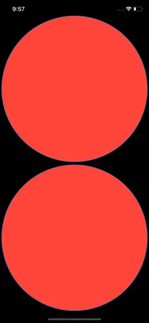
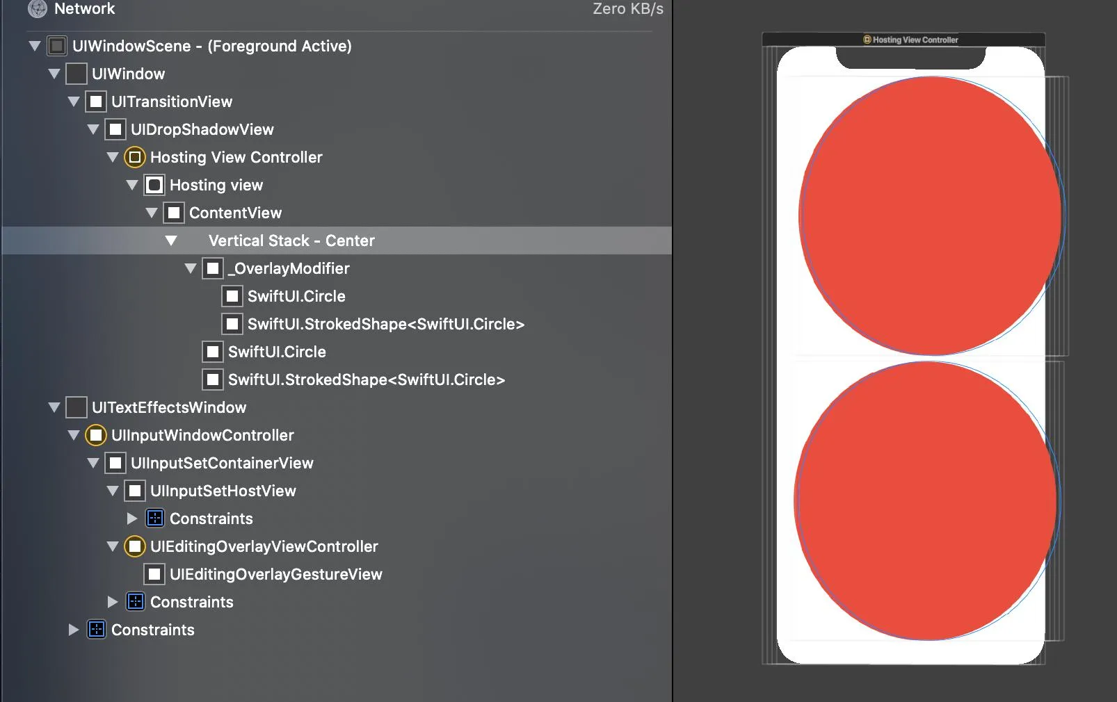
如何使用SwiftUI完成这个任务?
看起来SwiftUI支持以下功能:
Circle().stroke(Color.blue)
// and/or
Circle().fill(Color.red)
Circle().fill(Color.red).stroke(Color.blue) // Value of type 'ShapeView<StrokedShape<Circle>, Color>' has no member 'fill'
// or
Circle().stroke(Color.blue).fill(Color.red) // Value of type 'ShapeView<Circle, Color>' has no member 'stroke'
我只需要在ZStack中堆叠两个圆形吗?这看起来有点傻。