给曲线分布图下阴影区域涂上不同颜色

5
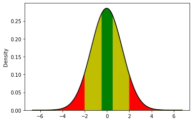
我正在使用seaborn的kdeplot绘制数据分布。
sns.kdeplot(data['numbers'], shade=True)

我希望将线下阴影区域分成三个部分,显示“高”百分位和“低”百分位。如果我能用三种不同的颜色来填充阴影区域,那就太理想了。
你有什么好的想法吗?
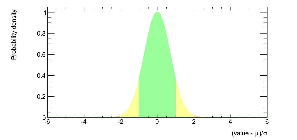
我希望它看起来像下面这样,我可以决定颜色之间的截止值。

enter image description here


我不确定seaborn是否有直接填充曲线的命令。但是你可以使用matplotlib(如果你有seaborn,因为它是一个依赖项,你也有matplotlib)来完成这个任务。请查看fill_between示例 - armatita
@armatita 我已经看过fill_between了。问题是这是一个分布,就像一个直方图。y值是自动生成的。我只需要给它x值。它不一定要用seaborn,用matplotlib生成类似的东西也可以。 - BKS
这是一个非常高级的图表,但完全可以在matplolib中复现。我猜测seaborn的kdeplot正在使用scipy.stats.gaussian_kde。它确实有点更加复杂,但并不多。 - armatita
2个回答

10

所以我想出了如何做到这一点。我将从seaborn图中检索x和y数组,然后使用fill_between来着色曲线下方。

points = sns.kdeplot(data['numbers'], shade=True).get_lines()[0].get_data()

x = points[0]
y = points[1]

plt.fill_between(x,y, where = x >=0.75, color='r')
plt.fill_between(x,y, where = x <=0.1, color='g')
plt.fill_between(x,y, where = (x<=0.75) & (x>=0.1), color='y')

1
如果您的问题得到解决,请不要忘记接受您的答案。 - joelostblom

0

自原回答发布以来唯一的区别是需要将shade=True更改为shaded=False

我还想分享一个稍微更完整的答案,供那些想要复制粘贴的人参考。

import numpy as np
import matplotlib.pyplot as plt
import seaborn as sns

mean = 0
std = 1

np.random.seed(0)
x = np.random.normal(loc=mean, scale=std, size=10000)

points = sns.kdeplot(x, shade=False, bw_method=1.0, color='black').get_lines()[0].get_data()

x = points[0]
y = points[1]

plt.fill_between(x, y, color='y')
plt.fill_between(x, y, where = (x<=0.5*std) & (x >= -0.5 * std), color='g') # 
plt.fill_between(x, y, where = (x>=2*std) | (x<=-2*std), color='r')

enter image description here


网页内容由stack overflow 提供, 点击上面的
可以查看英文原文,
原文链接