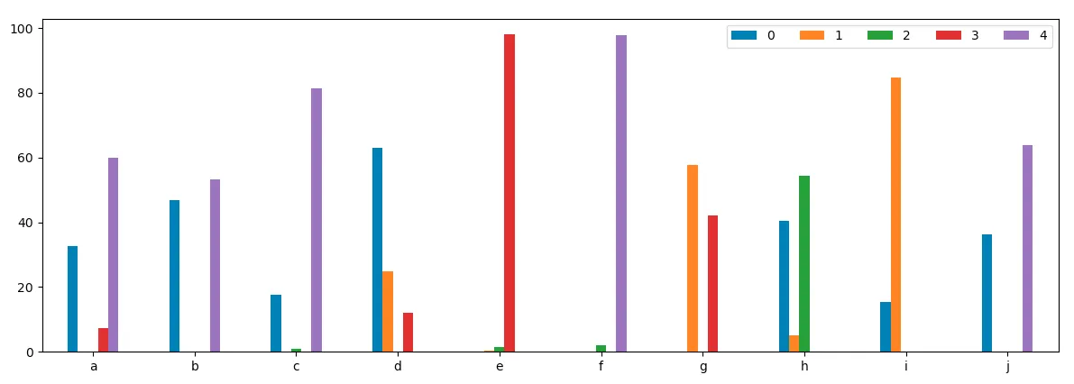
有时候数据集中有多个变量,还有一些与它们相关的其他“事物”对其产生贡献。显示这些不同“事物”对一个变量的贡献(例如%,金额等)可能是有用的。但是,有时并非所有“事物”都对所有变量产生贡献。当以条形图的形式绘制时,会出现特定变量没有从“事物”中获得贡献导致空白的情况。那么,如果“事物”的贡献为零,是否有办法在条形图中只不显示某个变量的特定条形?下面的示例显示了一组具有各种可能对其产生贡献的事物(1-5)的选择性变量(a-j)。请注意:当“事物”(1-5)对变量(a-j)的贡献为零时存在间隙。
from random import randrange
# Make the dataset of data for variables (a-j)
columns = ['a', 'b', 'c', 'd', 'e', 'f', 'g', 'h', 'i', 'j']
data = np.array([np.random.randn(5)**2 for i in range(10)])
df = pd.DataFrame(data.T, columns=columns)
for col in df.columns:
    # Set 3 of the 5 'things' to be np.NaN per column
    for n in np.arange(3):
        idx = randrange(5)
        df.loc[list(df.index)[idx], col] = np.NaN
    # Normalise the data to 100% of values
    df.loc[:,col] = df[col].values / df[col].sum()*100

# Setup plot
figsize = matplotlib.figure.figaspect(.33)
fig = plt.figure(figsize=figsize)
ax = plt.gca()
df.T.plot.bar(rot=0, ax=ax)
# Add a legend and show
plt.legend(ncol=len(columns))
plt.show()