我想实现类似这样的效果:
 当我悬停在图像上时,我想在该图像上放置这种带有文本和图标的黑色颜色。
我卡在这里了。我找到了一些教程,但它们对这种情况没有用。另外一个问题是 - 每个图像的高度都不同。宽度始终相同。
如何实现这种效果?
当我悬停在图像上时,我想在该图像上放置这种带有文本和图标的黑色颜色。我卡在这里了。我找到了一些教程,但它们对这种情况没有用。另外一个问题是 - 每个图像的高度都不同。宽度始终相同。
如何实现这种效果?
你可以使用这个简单的CSS/HTML来实现这个功能:
.image-container {
    position: relative;
    width: 200px;
    height: 300px;
}
.image-container .after {
    position: absolute;
    top: 0;
    left: 0;
    width: 100%;
    height: 100%;
    display: none;
    color: #FFF;
}
.image-container:hover .after {
    display: block;
    background: rgba(0, 0, 0, .6);
}
<div class="image-container">
    <img src="http://lorempixel.com/300/200" />
    <div class="after">This is some content</div>
</div>
更新:这里有一个带有一些额外样式的不错的最终演示。
.image-container {
    position: relative;
    display: inline-block;
}
.image-container img {display: block;}
.image-container .after {
    position: absolute;
    top: 0;
    left: 0;
    width: 100%;
    height: 100%;
    display: none;
    color: #FFF;
}
.image-container:hover .after {
    display: block;
    background: rgba(0, 0, 0, .6);
}
.image-container .after .content {
    position: absolute;
    bottom: 0;
    font-family: Arial;
    text-align: center;
    width: 100%;
    box-sizing: border-box;
    padding: 5px;
}
.image-container .after .zoom {
    color: #DDD;
    font-size: 48px;
    position: absolute;
    top: 50%;
    left: 50%;
    margin: -30px 0 0 -19px;
    height: 50px;
    width: 45px;
    cursor: pointer;
}
.image-container .after .zoom:hover {
    color: #FFF;
}<link href="//netdna.bootstrapcdn.com/font-awesome/4.0.3/css/font-awesome.min.css" rel="stylesheet"/>
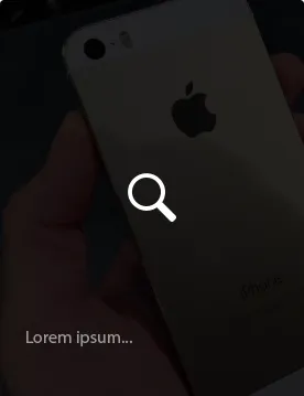
<div class="image-container">
<img src="http://lorempixel.com/300/180" />
<div class="after">
<span class="content">This is some content. It can be long and span several lines.</span>
<span class="zoom">
<i class="fa fa-search"></i>
</span>
</div>
</div>您可以使用伪元素来实现这一点,并在鼠标悬停时显示图像:
.image {
  position: relative;
  height: 300px;
  width: 300px;
  background: url(http://lorempixel.com/300/300);
}
.image:before {
  content: "";
  position: absolute;
  top: 0;
  left: 0;
  height: 100%;
  width: 100%;
  transition: all 0.8s;
  opacity: 0;
  background: url(http://lorempixel.com/300/200);
  background-size: 100% 100%;
}
.image:hover:before {
  opacity: 0.8;
}<div class="image"></div>将这个答案放在这里,因为它是谷歌中排名最高的结果。
如果您想要快速简单的方法:
filter: brightness(0.2);
*不兼容IE浏览器
虽然有些晚,但是当我们在搜索叠加方法的时候,在谷歌中这个帖子却排名靠前。
你可以简单地使用background-blend-mode。
.foo {
    background-image: url(images/image1.png), url(images/image2.png);
    background-color: violet;
    background-blend-mode: screen multiply;
}
这个操作会采用“multiply”混合模式将第二张图片与背景颜色混合,然后采用“screen”混合模式将第一张图片与第二张图片以及背景色混合。你可以使用16种不同的混合模式来实现任何叠加效果。
这16种混合模式分别为:multiply、 screen、 overlay、 darken、 lighten、 color-dodge、 color-burn、 hard-light、 soft-light、 difference、 exclusion、 hue、 saturation、 color和 luminosity。
<img />标签,它将无法工作。此外,目前background-blend-mode的支持还不是很好:只有最新版本的Chrome和火狐浏览器以及Safari部分支持(http://caniuse.com/#search=background-blend-mode)。 - bassplayer7.bg-img{
text-align: center;
padding: 130px 0px;
width: 100% !important;
background-size: cover !important;
background-repeat: no-repeat !important;
background: linear-gradient(0deg, rgba(0, 0, 0, 0.86), rgba(0, 0, 0, 0.86)), url(your-img-path);
}