如何使用CSS创建像下面这样的饼图?
I saw some people opting for Google Developers Tool, its very tough and it also uses JS and you only want CSS. So here is the most easy way, Pure CSS, made by using background gradient.
.pie {
  width: 400px;
  height: 400px;
  background-image: conic-gradient(orange 64%, blue 64%, blue 81%, black 81%);
  border-radius: 50%
}<div class="pie"></div>background-image 无效,不显示任何内容。 - Martin Tournoij(橙色:0%,橙色:64%,蓝色64%,蓝色:81%,黑色:81%,黑色:100%)(第一个和最后一个(0%/100%)是推断出来的,所以可以省略)。 - Plagiatus我发现这个是最简单的仅使用CSS的解决方案。以下是略微简化后的内容。
    .pieContainer {
      height: 150px;
      position: relative;
    }

    .pieBackground {
      position: absolute;
      width: 150px;
      height: 150px;
      border-radius: 100%;
      box-shadow: 0px 0px 8px rgba(0,0,0,0.5);
    }

    .pie {
      transition: all 1s;
      position: absolute;
      width: 150px;
      height: 150px;
      border-radius: 100%;
      clip: rect(0px, 75px, 150px, 0px);
    }

    .hold {
      position: absolute;
      width: 150px;
      height: 150px;
      border-radius: 100%;
      clip: rect(0px, 150px, 150px, 75px);
    }

    #pieSlice1 .pie {
      background-color: #1b458b;
      transform:rotate(30deg);
    }

    #pieSlice2 {
      transform: rotate(30deg);
    }

    #pieSlice2 .pie {
      background-color: #0a0;
      transform: rotate(60deg);
    }

    #pieSlice3 {
      transform: rotate(90deg);
    }

    #pieSlice3 .pie {
      background-color: #f80;
      transform: rotate(120deg);
    }

    #pieSlice4 {
      transform: rotate(210deg);
    }

    #pieSlice4 .pie {
      background-color: #08f;
      transform: rotate(10deg);
    }

    #pieSlice5 {
      transform: rotate(220deg);
    }

    #pieSlice5 .pie {
      background-color: #a04;
      transform: rotate(70deg);
    }

    #pieSlice6 {
      transform: rotate(290deg);
    }

    #pieSlice6 .pie {
      background-color: #ffd700;
      transform: rotate(70deg);
    }

    .innerCircle {
      position: absolute;
      width: 120px;
      height: 120px;
      background-color: #444;
      border-radius: 100%;
      top: 15px;
      left: 15px;
      box-shadow: 0px 0px 8px rgba(0,0,0,0.5) inset;
      color: white;
    }
    .innerCircle .content {
      position: absolute;
      display: block;
      width: 120px;
      top: 30px;
      left: 0;
      text-align: center;
      font-size: 14px;
} <div class="pieContainer">
<div class="pieBackground"></div>
<div id="pieSlice1" class="hold"><div class="pie"></div></div>
<div id="pieSlice2" class="hold"><div class="pie"></div></div>
<div id="pieSlice3" class="hold"><div class="pie"></div></div>
<div id="pieSlice4" class="hold"><div class="pie"></div></div>
<div id="pieSlice5" class="hold"><div class="pie"></div></div>
<div id="pieSlice6" class="hold"><div class="pie"></div></div>
<div class="innerCircle"><div class="content"><b>Data</b><br>from 16<sup>th</sup> April, 2014</div></div>
</div>哦,我的天!你看过Google图表工具吗?
https://google-developers.appspot.com/chart/interactive/docs/gallery/piechart
这很容易实现,但我对“外部API”部分有疑虑。如果谷歌决定取消此服务或者谷歌服务器崩溃了,图表就无法显示了。但就美观度和其他图表的选择而言,Google Charts还是一个不错的选择。我尝试了一些答案,但对于动态数据集来说,它们似乎过于复杂和难以采用。
我不需要在图表中打印数据,所以最终我选择了最简单的解决方案:
<div style="
        border-radius: 100%;
        width: 150px;
        aspect-ratio: 1;
        background: conic-gradient(blue 0deg 172deg, red 172deg 249deg, yellow 249deg 313deg, green 313deg 333deg, lightgreen 333deg 347deg, gold 347deg 360deg, pink 360deg 360deg
            );
    "></div>
它不需要CSS类,可以嵌入任何HTML中,并且conic-gradient内的字符串可以轻松地从值列表构造。
希望它作为构建饼图的简单方法会很有用。
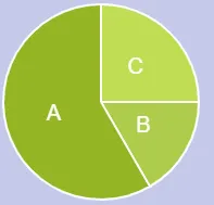
var canvas = document.getElementById("can");
var ctx = canvas.getContext("2d");
var lastend = 0;
var data = [60,210,90];
var myTotal = 0;
var myColor = ['#afcc4c', '#95b524','#c1dd54'];
var labels = ['B', 'A', 'C'];

for(var e = 0; e < data.length; e++)
{
  myTotal += data[e];
}

// make the chart 10 px smaller to fit on canvas
var off = 10
var w = (canvas.width - off) / 2
var h = (canvas.height - off) / 2
for (var i = 0; i < data.length; i++) {
  ctx.fillStyle = myColor[i];
  ctx.strokeStyle ='white';
  ctx.lineWidth = 2;
  ctx.beginPath();
  ctx.moveTo(w,h);
  var len =  (data[i]/myTotal) * 2 * Math.PI
  var r = h - off / 2
  ctx.arc(w , h, r, lastend,lastend + len,false);
  ctx.lineTo(w,h);
  ctx.fill();
  ctx.stroke();
  ctx.fillStyle ='white';
  ctx.font = "20px Arial";
  ctx.textAlign = "center";
  ctx.textBaseline = "middle";
  var mid = lastend + len / 2
  ctx.fillText(labels[i],w + Math.cos(mid) * (r/2) , h + Math.sin(mid) * (r/2));
  lastend += Math.PI*2*(data[i]/myTotal);
}html, body{
background: #c4c9e9
} <canvas id="can" width="200" height="200" />但最好使用绘制图表的库。 在apex-charts中有一个称为sparkline的选项,它可以帮助您删除多余的内容并绘制出简洁明了的图表。
这是一个使用apex-charts库创建的干净的环形图。 (使用sparkline选项删除了额外的内容):
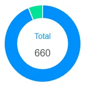
var options = {
  series: [620, 40],
  labels: ['Finished', 'Unfinished'],
  chart: {
    type: 'donut',
    sparkline: {
      enabled: true,
    }
  },
  plotOptions: {
    pie: {
      donut: {
        labels: {
          show: true,
          total: {
            showAlways: false,
            show: true,
            label: 'Total'
          }
        }
      }
    }
  },
};
var chart = new ApexCharts(document.querySelector("#chart"), options);
chart.render();
canvas元素可以提供您需要的一切。它可以轻松地通过JavaScript进行访问和使用。有一个基本用法的小教程可以在这里找到。.graph {
display: flex;
position: relative;
justify-content: center;
align-items: center;
margin: 50px 0;
width: 150px;
text-align: center;
}
.pie {
width: 150px;
aspect-ratio:1;
position:absolute;
}
.pie:before,
.pie:after {
content:"";
position:absolute;
border-radius:50%;
}
.pie:before {
inset:0;
background: radial-gradient(farthest-side,var(--c) 98%,#0000) top/var(--b) var(--b) no-repeat,
conic-gradient(var(--c) calc(var(--p)*1%),#0000 0);
}
.no-round:before {
background-size:0 0,auto;
}
.no-round:after {
content:none;
}<div style="display: flex; justify-content: center">
<div style="display: flex; flex-flow: wrap; justify-content: space-around; max-width: 400px; width: 100%">
<div class="graph" title="some title to display on hover">
<div class="pie no-round" style="--p:83;--c:#FC4819;--b:15px"></div>
<div class="pie no-round" style="--p:11;--c:#0089B0;--b:15px; rotate: 0.83turn"></div>
<div class="pie no-round" style="--p:6;--c:#23B032;--b:15px;rotate: 0.94turn"></div>
</div>
</div>
</div>div class='graph' 中添加一个新的 div class='pie no-round' 即可。--p:60,第二个将具有 --p:40;rotate:0.60turn。--p:50
第二个饼图:--p:40;rotate:0.50turn
第三个饼图:--p:10;rotate:0.90turn # 0.90 being 50 + 40
您可以从那里进行自定义,可以在每个扇形内部添加标签,如下所示:
.graph {
  display: flex;
  position: relative;
  justify-content: center;
  align-items: center;
  margin: 50px 0;
  width: 150px;
  text-align: center;
}

.label {
  position: absolute;
  color: white;
  padding-top: 5%;
  padding-left: 5%;
  font-size: 0.8rem;
}

.pie {
  width: 150px;
  aspect-ratio:1;
  position:absolute;
}
.pie:before,
.pie:after {
  content:"";
  position:absolute;
  border-radius:50%;
}
.pie:before {
  inset:0;
  background: radial-gradient(farthest-side,var(--c) 98%,#0000) top/var(--b) var(--b) no-repeat,
          conic-gradient(var(--c) calc(var(--p)*1%),#0000 0);
}
.no-round:before {
  background-size:0 0,auto;
}
.no-round:after {
  content:none;
}<div style="display: flex; justify-content: center">
<div style="display: flex; flex-flow: wrap; justify-content: space-around; max-width: 400px; width: 100%">
<div class="graph" title="some title to display on hover">
<div class="pie no-round" style="--p:83;--c:#FC4819;--b:15px"><strong class="label">83%</strong></div>
<div class="pie no-round" style="--p:11;--c:#0089B0;--b:15px; rotate: 0.83turn"><strong class="label" style="rotate: -0.83turn">11%</strong></div>
<div class="pie no-round" style="--p:6;--c:#23B032;--b:15px;rotate: 0.94turn"><strong class="label" style="rotate: -0.94turn">6%</strong></div>
</div>
<div class="graph" title="some title to display on hover">
<div class="pie no-round" style="--p:100;--c:#FC4819;--b:15px"></div>
<div class="pie no-round" style="--p:0;--c:#23B032;--b:15px; rotate: 0.100turn"></div>
<h4 style="max-width: 100px">0% Releases Distributed</h4>
</div>
</div>
</div>如果您想要添加中心标签,可以这样做:
.graph {
  display: flex;
  position: relative;
  justify-content: center;
  align-items: center;
  margin: 50px 0;
  width: 150px;
  text-align: center;
}

.pie {
  width: 150px;
  aspect-ratio:1;
  position:absolute;
}
.pie:before,
.pie:after {
  content:"";
  position:absolute;
  border-radius:50%;
}
.pie:before {
  inset:0;
  background: radial-gradient(farthest-side,var(--c) 98%,#0000) top/var(--b) var(--b) no-repeat,
          conic-gradient(var(--c) calc(var(--p)*1%),#0000 0);
  -webkit-mask:radial-gradient(farthest-side,#0000 calc(99% - var(--b)),#000 calc(100% - var(--b)));
  mask:radial-gradient(farthest-side,#0000 calc(99% - var(--b)),#000 calc(100% - var(--b)));
}
.no-round:before {
  background-size:0 0,auto;
}
.no-round:after {
  content:none;
}<div style="display: flex; flex-flow: wrap; justify-content: space-around; max-width: 400px; width: 100%">
<div class="graph" title="some title to display on hover">
<div class="pie no-round" style="--p:83;--c:#FC4819;--b:15px"></div>
<div class="pie no-round" style="--p:11;--c:#0089B0;--b:15px; rotate: 0.83turn"></div>
<div class="pie no-round" style="--p:6;--c:#23B032;--b:15px;rotate: 0.94turn"></div>
<h4 style="max-width: 100px">6% something</h4>
</div>
<div class="graph" title="some title to display on hover">
<div class="pie no-round" style="--p:100;--c:#FC4819;--b:15px"></div>
<div class="pie no-round" style="--p:0;--c:#23B032;--b:15px; rotate: 0.100turn"></div>
<h4 style="max-width: 100px">0% something else</h4>
</div>
</div>我在 CodePen 上找到了这个解决方案。你可以更改数据属性中的值,这正是我所需要的:
/*
  make each pie piece a rectangle twice as high as it is wide.
  move the transform origin to the middle of the left side.
  Also ensure that overflow is set to hidden.
*/
  .pie {
        position:absolute;
        width:100px;
        height:200px;
        overflow:hidden;
        left:150px;
        -moz-transform-origin:left center;
        -ms-transform-origin:left center;
        -o-transform-origin:left center;
        -webkit-transform-origin:left center;
        transform-origin:left center;
    }
/*
  unless the piece represents more than 50% of the whole chart.
  then make it a square, and ensure the transform origin is
  back in the center.

  NOTE: since this is only ever a single piece, you could
  move this to a piece specific rule and remove the extra class
*/
    .pie.big {
        width:200px;
        height:200px;
        left:50px;
        -moz-transform-origin:center center;
        -ms-transform-origin:center center;
        -o-transform-origin:center center;
        -webkit-transform-origin:center center;
        transform-origin:center center;
    }
/*
  this is the actual visible part of the pie.
  Give it the same dimensions as the regular piece.
  Use border radius make it a half circle.
  move transform origin to the middle of the right side.
  Push it out to the left of the containing box.
*/
    .pie:BEFORE {
        content:"";
        position:absolute;
        width:100px;
        height:200px;
        left:-100px;
        border-radius:100px 0 0 100px;
        -moz-transform-origin:right center;
        -ms-transform-origin:right center;
        -o-transform-origin:right center;
        -webkit-transform-origin:right center;
        transform-origin:right center;

    }
 /* if it's part of a big piece, bring it back into the square */
    .pie.big:BEFORE {
        left:0px;
    }
/*
  big pieces will also need a second semicircle, pointed in the
  opposite direction to hide the first part behind.
*/
    .pie.big:AFTER {
        content:"";
        position:absolute;
        width:100px;
        height:200px;
        left:100px;
        border-radius:0 100px 100px 0;
    }
/*
  add colour to each piece.
*/
    .pie:nth-of-type(1):BEFORE,
    .pie:nth-of-type(1):AFTER {
        background-color:blue;
    }
    .pie:nth-of-type(2):AFTER,
    .pie:nth-of-type(2):BEFORE {
        background-color:green;
    }
    .pie:nth-of-type(3):AFTER,
    .pie:nth-of-type(3):BEFORE {
        background-color:red;
    }
    .pie:nth-of-type(4):AFTER,
    .pie:nth-of-type(4):BEFORE {
        background-color:orange;
    }
/*
  now rotate each piece based on their cumulative starting
  position
*/
    .pie[data-start="30"] {
        -moz-transform: rotate(30deg); /* Firefox */
        -ms-transform: rotate(30deg); /* IE */
        -webkit-transform: rotate(30deg); /* Safari and Chrome */
        -o-transform: rotate(30deg); /* Opera */
        transform:rotate(30deg);
    }
    .pie[data-start="60"] {
        -moz-transform: rotate(60deg); /* Firefox */
        -ms-transform: rotate(60deg); /* IE */
        -webkit-transform: rotate(60deg); /* Safari and Chrome */
        -o-transform: rotate(60deg); /* Opera */
        transform:rotate(60deg);
    }
    .pie[data-start="100"] {
        -moz-transform: rotate(100deg); /* Firefox */
        -ms-transform: rotate(100deg); /* IE */
        -webkit-transform: rotate(100deg); /* Safari and Chrome */
        -o-transform: rotate(100deg); /* Opera */
        transform:rotate(100deg);
    }
/*
  and rotate the amount of the pie that's showing.

  NOTE: add an extra degree to all but the final piece,
  to fill in unsightly gaps.
*/
    .pie[data-value="30"]:BEFORE {
        -moz-transform: rotate(31deg); /* Firefox */
        -ms-transform: rotate(31deg); /* IE */
        -webkit-transform: rotate(31deg); /* Safari and Chrome */
        -o-transform: rotate(31deg); /* Opera */
        transform:rotate(31deg);
    }
    .pie[data-value="40"]:BEFORE {
        -moz-transform: rotate(41deg); /* Firefox */
        -ms-transform: rotate(41deg); /* IE */
        -webkit-transform: rotate(41deg); /* Safari and Chrome */
        -o-transform: rotate(41deg); /* Opera */
        transform:rotate(41deg);
    }
    .pie[data-value="260"]:BEFORE {
        -moz-transform: rotate(260deg); /* Firefox */
        -ms-transform: rotate(260deg); /* IE */
        -webkit-transform: rotate(260deg); /* Safari and Chrome */
        -o-transform: rotate(260deg); /* Opera */
        transform:rotate(260deg);
    }
/*
NOTE: you could also apply custom classes (i.e. .s0 .v30)
but if the CSS3 attr() function proposal ever gets implemented,
then all the above custom piece rules could be replaced with
the following:

.pie[data-start] {
   transform:rotate(attr(data-start,deg,0);
}
.pie[data-value]:BEFORE {
   transform:rotate(attr(data-value,deg,0);
}
*/
<!-- for each piece of the pie chart create one div and give it a data-value attribute that represents the amount (in degrees) that represents its total visible portion, and a data-start attribute that matches the amount rotation for the starting (the cumulative value amount of all the previous pieces). --> <div class="pie" data-start="0" data-value="30"></div> <div class="pie highlight" data-start="30" data-value="30"></div> <div class="pie" data-start="60" data-value="40"></div> <div class="pie big" data-start="100" data-value="260"></div>
在 Aaditya Pandey 的例子基础上,这是一个非常小的解决方案,只需要使用 CSS 就可以轻松使用:
.pie {
  width: 200px;
  height: 200px;
  background-image: conic-gradient(orange 50%, blue 50% 75%, red 75% 90%, green 90%);
  border-radius: 50%
}<div class="pie"></div>你可以使用conic-gradient,当你需要简单的东西时它很好用。但是它看起来不太好。
使用clip-path和transform可以得到更平滑的饼图。只需要一点逻辑,在值超过50%时翻转颜色和变换即可。
.smooth-pie-2 {
  clip-path: circle(50%);
  position: relative;
  display: block;
  width: 100px;
  height: 100px;
  background-color: #005744;
  box-sizing: border-box;
}

.smooth-pie-2 .after,
.smooth-pie-2 .before {
  position: absolute;
  display: none;
  width: 100px;
  height: 100px;
  background-color: #00AF89;
  box-sizing: border-box;
}

@supports(clip-path: circle(50%)) {
  .smooth-pie-2 .after,
  .smooth-pie-2 .before {
    display: block;
  }
}


/* just for demo */

main {
  display: flex;
  gap: 2em;
  font-family: sans-serif;
  margin: 0 2em;
}

section {
  display: flex;
  gap: 1em;
  flex-flow: column;
  font-family: sans-serif;
}<main>
<section>
<h2>Smooth</h2>
<!-- x <= 50% -->
<div class="smooth-pie-2" style="width: 100px; height: 100px; background-color: #005744;" title="33%">
<div class="before" style="transform: rotate(0.33turn) translatex(50px); background-color: #00AF89;"></div>
<div class="after" style="transform: translatex(-50px); background-color: #00AF89;"></div>
</div>
<!-- x > 50% -->
<div class="smooth-pie-2" style="width: 100px; height: 100px; background-color: #00AF89;" title="66%">
<div class="before" style="transform: translatex(50px); background-color: #005744;"></div>
<div class="after" style="transform: rotate(0.66turn) translatex(-50px); background-color: #005744;"></div>
</div>
</section>
<section>
<h2>Gradient</h2>
<div style="width: 100px; height: 100px; border-radius: 50%; border: 1px solid #00000080; background-image: conic-gradient(#005744 33%, #00AF89 0%);"></div>
</section>
</main>
- http://www.htmldrive.net/items/show/751/Pure-CSS3-Pie-Charts-effect
- http://atomicnoggin.ca/blog/2010/02/20/pure-css3-pie-charts/
- http://elisabethrobson.com/?p=867 (使用HTML5画布)
- 你也可以使用HTML5和jQuery,链接。
- Sirwan Afifi