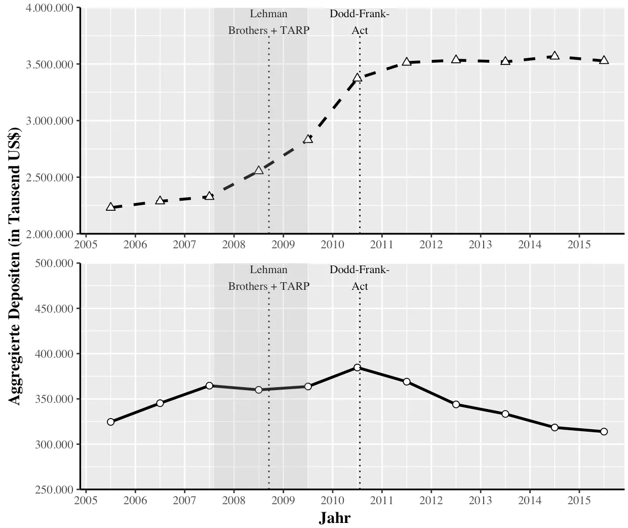
我试图创建一个多个图表,这些图表具有相同的x轴但不同的y轴,因为我有两组值具有不同的范围。由于我想控制轴的值(分别从2,000,000到4,000,000和从250,000到500,000到达y轴),所以我无法使用带有scales = "free"的facet_grid进行操作。
因此,我尝试创建两个图表(名为“plots.treat”和“plot.control”)并将它们与grid.arrange和arrangeGrob结合起来。我的问题是,我不知道如何控制两个图表的确切位置,使得两个y轴位于同一垂直线上。因此,在下面的示例中,第二个图表的y轴需要向右移动一点。
因此,我尝试创建两个图表(名为“plots.treat”和“plot.control”)并将它们与grid.arrange和arrangeGrob结合起来。我的问题是,我不知道如何控制两个图表的确切位置,使得两个y轴位于同一垂直线上。因此,在下面的示例中,第二个图表的y轴需要向右移动一点。
这里是代码:
# Load Packages
library(ggplot2)
library(grid)
library(gridExtra)

# Create Data
data.treat <- data.frame(seq(2005.5, 2015.5, 1), rep("SIFI", 11),
                    c(2230773, 2287162, 2326435, 2553602, 2829325, 3372657, 3512437,
                      3533884, 3519026, 3566553, 3527153))

colnames(data.treat) <- c("Jahr", "treatment",
                          "Aggregierte Depositen (in Tausend US$)")

data.control <- data.frame(seq(2005.5, 2015.5, 1), rep("Nicht-SIFI", 11),
                    c(324582, 345245, 364592, 360006, 363677, 384674, 369007,
                      343893, 333370, 318409, 313853))

colnames(data.control) <- c("Jahr", "treatment",
                            "Aggregierte Depositen (in Tausend US$)")

# Create Plot for data.treat
plot.treat <- ggplot() +
  geom_line(data = data.treat,
            aes(x = `Jahr`,
                y = `Aggregierte Depositen (in Tausend US$)`),
            size = 1,
            linetype = "dashed") +
  geom_point(data = data.treat,
             aes(x = `Jahr`,
                 y = `Aggregierte Depositen (in Tausend US$)`),
             fill = "white",
             size = 2,
             shape = 24) +
  scale_x_continuous(breaks = seq(2005, 2015.5, 1),
                     minor_breaks = seq(2005, 2015.5, 0.5),
                     limits = c(2005, 2015.8),
                     expand = c(0.01, 0.01)) +
  scale_y_continuous(breaks = seq(2000000, 4000000, 500000),
                     minor_breaks = seq(2000000, 4000000, 250000),
                     labels = c("2.000.000", "2.500.000", "3.000.000",
                                "3.500.000", "4.000.000"),
                     limits = c(2000000, 4000000),
                     expand = c(0, 0.01)) +
  theme(text = element_text(family = "Times"),
        axis.title.x = element_blank(),
        axis.title.y = element_blank(),
        axis.line.x = element_line(color="black", size = 0.6),
        axis.line.y = element_line(color="black", size = 0.6),
        legend.position = "none") +
  geom_segment(aes(x = c(2008.7068),
                   y = c(2000000),
                   xend = c(2008.7068),
                   yend = c(3750000)),
               linetype = "dotted") +
  annotate(geom = "text", x = 2008.7068, y = 3875000, label = "Lehman\nBrothers + TARP",
           colour = "black", size = 3, family = "Times") +
  geom_segment(aes(x = c(2010.5507),
                   y = c(2000000),
                   xend = c(2010.5507),
                   yend = c(3750000)),
               linetype = "dotted") +
  annotate(geom = "text", x = 2010.5507, y = 3875000, label = "Dodd-Frank-\nAct",
           colour = "black", size = 3, family = "Times") +
  geom_rect(aes(xmin = 2007.6027, xmax = 2009.5, ymin = -Inf, ymax = Inf),
            fill="dark grey", alpha = 0.2)

# Create Plot for data.control
plot.control <- ggplot() +
  geom_line(data = data.control,
            aes(x = `Jahr`,
                y = `Aggregierte Depositen (in Tausend US$)`),
            size = 1,
            linetype = "solid") +
  geom_point(data = data.control,
             aes(x = `Jahr`,
                 y = `Aggregierte Depositen (in Tausend US$)`),
             fill = "white",
             size = 2,
             shape = 21) +
  scale_x_continuous(breaks = seq(2005, 2015.5, 1), # x-Achse
                     minor_breaks = seq(2005, 2015.5, 0.5),
                     limits = c(2005, 2015.8),
                     expand = c(0.01, 0.01)) +
  scale_y_continuous(breaks = seq(250000, 500000, 50000),
                     minor_breaks = seq(250000, 500000, 25000),
                     labels = c("250.000", "300.000", "350.000", "400.000",
                                "450.000", "500.000"),
                     limits = c(250000, 500000),
                     expand = c(0, 0.01)) +
  theme(text = element_text(family = "Times"),
        axis.title.x = element_blank(), # Achse
        axis.title.y = element_blank(), # Achse
        axis.line.x = element_line(color="black", size = 0.6),
        axis.line.y = element_line(color="black", size = 0.6),
        legend.position = "none") +
  geom_segment(aes(x = c(2008.7068),
                   y = c(250000),
                   xend = c(2008.7068),
                   yend = c(468750)),
               linetype = "dotted") +
  annotate(geom = "text", x = 2008.7068, y = 484375, label = "Lehman\nBrothers + TARP",
           colour = "black", size = 3, family = "Times") +
  geom_segment(aes(x = c(2010.5507),
                   y = c(250000),
                   xend = c(2010.5507),
                   yend = c(468750)),
               linetype = "dotted") +
  annotate(geom = "text", x = 2010.5507, y = 484375, label = "Dodd-Frank-\nAct",
           colour = "black", size = 3, family = "Times") +
  geom_rect(aes(xmin = 2007.6027, xmax = 2009.5, ymin = -Inf, ymax = Inf),
            fill="dark grey", alpha = 0.2)

# Combine both Plots with grid.arrange
grid.arrange(arrangeGrob(plot.treat, plot.control,
                         ncol = 1,
                         left = textGrob("Aggregierte Depositen (in Tausend US$)",
                                         rot = 90,
                                         vjust = 1,
                                         gp = gpar(fontfamily = "Times",
                                                   size = 12,
                                                   colout = "black",
                                                   fontface = "bold")),
                         bottom = textGrob("Jahr",
                                           vjust = 0.1,
                                           hjust = 0.2,
                                           gp = gpar(fontfamily = "Times",
                                                     size = 12,
                                                     colout = "black",
                                                     fontface = "bold"))))