我试图在 ggplot2 图形上添加多个阴影/矩形。在这个可重现的例子中,我只添加了3个,但是使用完整数据可能需要添加多达一百个。
这是我的原始数据子集 - 存储在一个名为 temp 的数据框中 - dput 在问题底部:
     Season tier  group value
NA       NA   NA   <NA>    NA
99     1948    2   Wins    20
101    1948    2 Losses    17
NA.1     NA   NA   <NA>    NA
NA.2     NA   NA   <NA>    NA
104    1951    2   Wins    21
106    1951    2 Losses    18
107    1952    2   Wins    23
109    1952    2 Losses    18
110    1953    2   Wins    25
112    1953    2 Losses    18
113    1954    2   Wins    26
115    1954    2 Losses    19
116    1955    2   Wins    26
118    1955    2 Losses    19
119    1956    2   Wins    26
121    1956    2 Losses    20
NA.3     NA   NA   <NA>    NA
123    1958    1   Wins    27
125    1958    1 Losses    20
126    1959    1   Wins    27
128    1959    1 Losses    21
129    1960    1   Wins    28
131    1960    1 Losses    21
132    1961    1   Wins    30
134    1961    1 Losses    21
135    1962    1   Wins    30
137    1962    1 Losses    23
138    1963    1   Wins    31
140    1963    1 Losses    23
141    1964    1   Wins    32
143    1964    1 Losses    23
144    1965    1   Wins    34
146    1965    1 Losses    23
NA.4     NA   NA   <NA>    NA
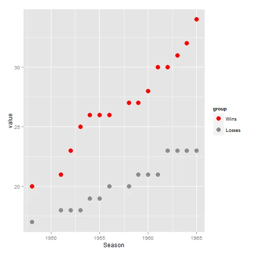
我可以制作一个像这样的ggplot:
p <- ggplot(temp, aes(Season,value, color=group)) + geom_point(size=4, shape=19) +
  scale_color_manual(values=c("red", "gray55"))
p
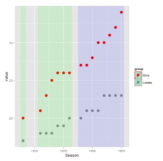
现在,我想添加阴影。每个阴影将以“季节”列中开始一系列日期的季节开头,并以“季节”列中最后一组日期的日期/季节结束。最后,每个阴影应该根据“层级”变量进行染色。当“tier==2”时为绿色,“tier==1”时为蓝色。
我使用了rle函数加上一些额外的脚本来提取在季节变量的NA运行结束后的第一个观测值,以及获取在NAs运行开始之前的第一个观测值。然后我只需分别加上和减去0.5,这就给了我另一个类似于这样的数据帧(tempindex):
#    xmin   xmax ymin ymax
#5 1947.5 1948.5 -Inf  Inf
#6 1950.5 1956.5 -Inf  Inf
#7 1957.5 1965.5 -Inf  Inf
我可以像这样手动添加阴影:
t2.rect1 <- data.frame (xmin=1947.5, xmax=1948.5, ymin=-Inf, ymax=Inf)
t2.rect2 <- data.frame (xmin=1950.5, xmax=1956.5, ymin=-Inf, ymax=Inf)
t1.rect1 <- data.frame (xmin=1957.5, xmax=1965.5, ymin=-Inf, ymax=Inf)

p +
  geom_rect(data=t2.rect1, aes(xmin=xmin, xmax=xmax, ymin=ymin, ymax=ymax), fill="green", alpha=0.1, inherit.aes = FALSE) +
  geom_rect(data=t2.rect2, aes(xmin=xmin, xmax=xmax, ymin=ymin, ymax=ymax), fill="green", alpha=0.1, inherit.aes = FALSE) +
  geom_rect(data=t1.rect1, aes(xmin=xmin, xmax=xmax, ymin=ymin, ymax=ymax), fill="blue", alpha=0.1, inherit.aes = FALSE)
这将会产生所需的输出结果:
然而,显然当我有许多阴影/矩形需要应用时,我不希望手动编写一百次。我正在寻找一种自动化的方法来实现这一点。我尝试了一个 for 循环(没有尝试通过层级来调整颜色),但非常失败...
grect <-vector("list", nrow(indextemp)) #vector for storing geom_rects

 for (i in 1:nrow(indextemp)){
 grect[[i]] <- geom_rect(data=temp[i], aes(xmin=xmin, xmax=xmax, ymin=ymin, ymax=ymax), alpha=0.1, inherit.aes = FALSE)
 }
dput:structure(list(Season = c(NA, 1948L, 1948L, NA, NA, 1951L, 1951L,
1952L, 1952L, 1953L, 1953L, 1954L, 1954L, 1955L, 1955L, 1956L,
1956L, NA, 1958L, 1958L, 1959L, 1959L, 1960L, 1960L, 1961L, 1961L,
1962L, 1962L, 1963L, 1963L, 1964L, 1964L, 1965L, 1965L, NA),
tier = c(NA, 2L, 2L, NA, NA, 2L, 2L, 2L, 2L, 2L, 2L, 2L,
2L, 2L, 2L, 2L, 2L, NA, 1L, 1L, 1L, 1L, 1L, 1L, 1L, 1L, 1L,
1L, 1L, 1L, 1L, 1L, 1L, 1L, NA), group = structure(c(NA,
1L, 3L, NA, NA, 1L, 3L, 1L, 3L, 1L, 3L, 1L, 3L, 1L, 3L, 1L,
3L, NA, 1L, 3L, 1L, 3L, 1L, 3L, 1L, 3L, 1L, 3L, 1L, 3L, 1L,
3L, 1L, 3L, NA), .Label = c("Wins", "Draws", "Losses"), class = "factor"),
value = c(NA, 20L, 17L, NA, NA, 21L, 18L, 23L, 18L, 25L,
18L, 26L, 19L, 26L, 19L, 26L, 20L, NA, 27L, 20L, 27L, 21L,
28L, 21L, 30L, 21L, 30L, 23L, 31L, 23L, 32L, 23L, 34L, 23L,
NA)), .Names = c("Season", "tier", "group", "value"), row.names = c("NA",
"99", "101", "NA.1", "NA.2", "104", "106", "107", "109", "110",
"112", "113", "115", "116", "118", "119", "121", "NA.3", "123",
"125", "126", "128", "129", "131", "132", "134", "135", "137",
"138", "140", "141", "143", "144", "146", "NA.4"), class = "data.frame")
dput 用于 tempindex 数据框:
structure(list(xmin = c(1947.5, 1950.5, 1957.5), xmax = c(1948.5,
1956.5, 1965.5), ymin = c(-Inf, -Inf, -Inf), ymax = c(Inf, Inf,
Inf)), .Names = c("xmin", "xmax", "ymin", "ymax"), row.names = 5:7, class = "data.frame")