我有一个值数组,想要创建一个直方图。我主要关注低端数字,并希望将300以上的每个数字收集到一个箱子中。该箱子应该与所有其他(等宽)箱子具有相同的宽度。我该如何做?
注意:这个问题与这个问题相关:在Matplotlib直方图中定义bin宽度/x轴刻度
这是我到目前为止尝试过的:
import matplotlib.pyplot as plt
import numpy as np

def plot_histogram_01():
    np.random.seed(1)
    values_A = np.random.choice(np.arange(600), size=200, replace=True).tolist()
    values_B = np.random.choice(np.arange(600), size=200, replace=True).tolist()

    bins = [0, 25, 50, 75, 100, 125, 150, 175, 200, 225, 250, 275, 300, 600]

    fig, ax = plt.subplots(figsize=(9, 5))
    _, bins, patches = plt.hist([values_A, values_B], normed=1,  # normed is deprecated and will be replaced by density
                                bins=bins,
                                color=['#3782CC', '#AFD5FA'],
                                label=['A', 'B'])

    xlabels = np.array(bins[1:], dtype='|S4')
    xlabels[-1] = '300+'

    N_labels = len(xlabels)
    plt.xlim([0, 600])
    plt.xticks(25 * np.arange(N_labels) + 12.5)
    ax.set_xticklabels(xlabels)

    plt.yticks([])
    plt.title('')
    plt.setp(patches, linewidth=0)
    plt.legend()

    fig.tight_layout()
    plt.savefig('my_plot_01.png')
    plt.close()
这是结果,看起来不太美观: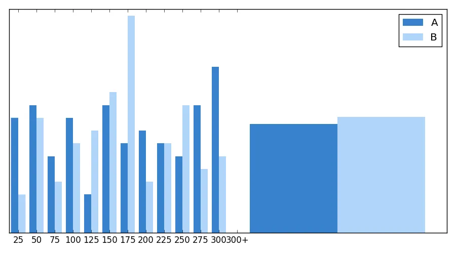
然后我改变了带有xlim的那一行:
plt.xlim([0, 325])
以下是结果:
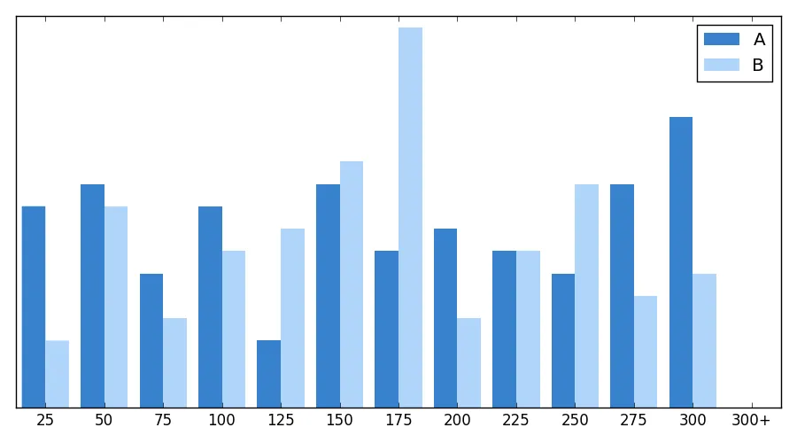
它看起来基本符合我的要求,但最后一组数据现在不可见。我需要使用什么技巧来使这个宽度为25的最后一个组数据可视化?
xlabels = bins.astype(str),然后xlabels[-1] += '+'。 - leonard vertighelxlabels = [str(b) for b in bins[1:]]。两个版本都是合理的,但我会坚持原来的版本,因为它更符合OP的要求。但是将第二行改为xlabels[-1] += '+'绝对是一个真正的改进。 - Mike