我正在尝试为Plotly散点图绘制趋势线,但是我无法弄清如何让趋势线出现在散点图上方。以下是我使用的代码:
import plotly.express as px
fig = px.scatter(df, x='Percentage_LIFT', y='Average_Daily_Contacts',
                 title='Percent on LIFT vs Average Daily Contacts',
                 trendline = "ols", trendline_color_override="red")
fig.show()
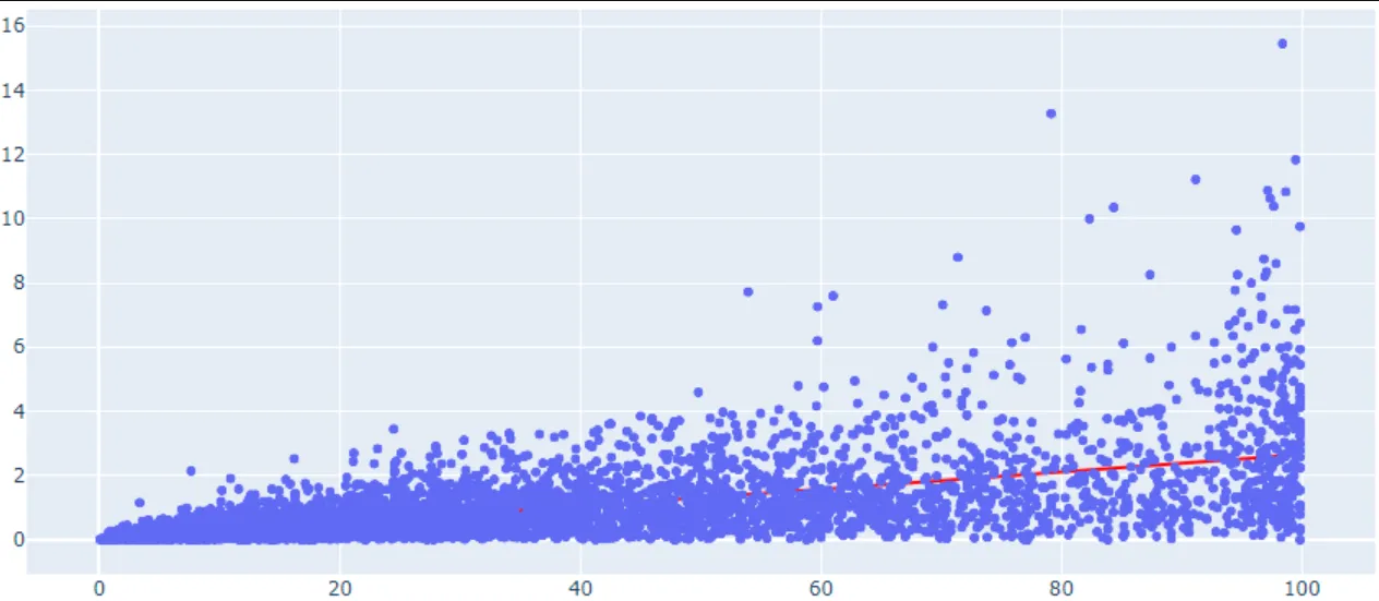
如何使趋势线显示在散点图上方?

