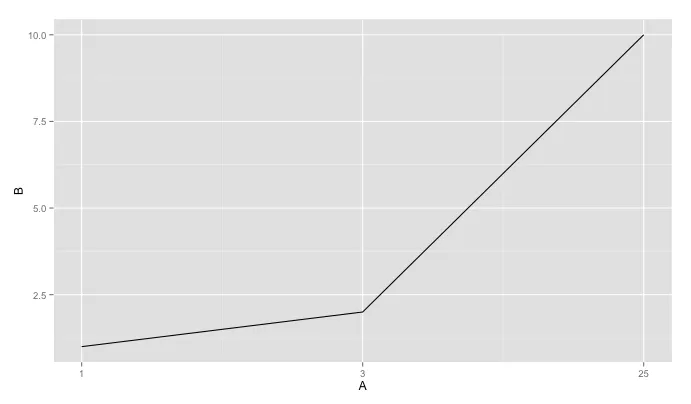
我有一些数据,想用ggplot2绘制图形,其中x轴是一个数字/整数值。当绘制图形时,我希望图表只显示数据集中存在的x值,而不添加x轴上的值(离散值)。下面是完全可重现的示例,演示了问题:即使提供的x轴值为1、3、25,所得到的图形在x轴上呈现出0、5、15、20、25。我尝试过对值进行转换,以及尝试使用离散刻度,但似乎都没有奏效。
编辑:虽然x轴上的值是数字/整数,但它们表示因素(即试验中的人数、发动机中的气缸数等),并不是连续值。
编辑:虽然x轴上的值是数字/整数,但它们表示因素(即试验中的人数、发动机中的气缸数等),并不是连续值。
#Example
library(ggplot2)
row1 <- c(1, 1)
row2 <- c(3, 2)
row3 <- c(25, 10)
data <- data.frame()
data <- rbind(data, row1)
data <- rbind(data, row2)
data <- rbind(data, row3)
names(data) <- c("A", "B")
qplot(A, B, data = data, geom="line")
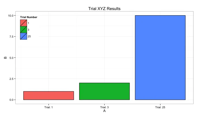
#Things Tried
qplot(factor(A), B, data = data, geom="line") #geom_path: Each group consist of only one observation. Do you need to adjust the group aesthetic?
qplot(as.factor(A), B, data = data, geom="line") #geom_path: Each group consist of only one observation. Do you need to adjust the group aesthetic?
qplot(character(A), B, data = data, geom="line") #Error in character(A) : invalid 'length' argument
qplot(as.character(A), B, data = data, geom="line") #geom_path: Each group consist of only one observation. Do you need to adjust the group aesthetic?
qplot(A, B, data = data, geom="line") + scale_x_discrete(breaks = data$A) #Works, but values are too far apart