在ggplot2中的柱状图中为分类变量添加交替区域阴影

4

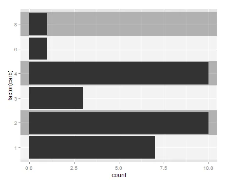
我正在尝试使用ggplot2绘制条形图,代码如下:

library(ggplot2)
ggplot(mtcars, aes(factor(carb))) +
  geom_bar() +
  coord_flip()

enter image description here

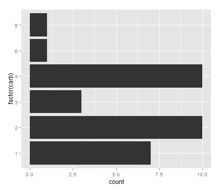
x轴是一个连续变量,而y轴是一个分类变量(factor)。

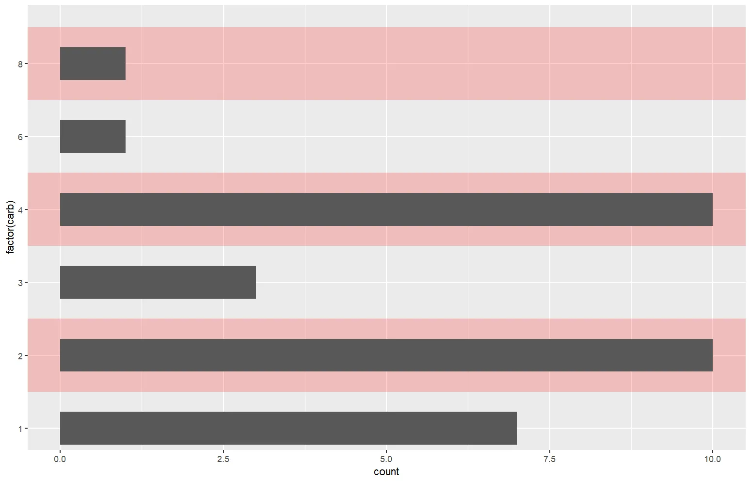
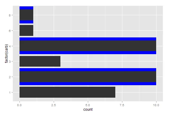
我想在每个条形图后面添加交替的阴影区域,以区分y轴上的因子。我知道可以使用geom_rect()来实现这一点。当y轴为factor时,如何计算区域的y轴限制?矩形的x轴限制将为-InfInf

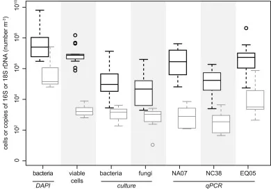
我正在寻找类似于这张图片的东西,但是针对的是条形图而不是箱线图。

enter image description here

3个回答

8

问题已解决

# Create data.frame with shading info
shading <- data.frame(min = seq(from = 0.5, to = max(as.numeric(as.factor(mtcars$carb))), by = 1),
           max = seq(from = 1.5, to = max(as.numeric(as.factor(mtcars$carb))) + 0.5, by = 1),
           col = c(0,1))

# Plot
ggplot() +
  geom_bar(data = mtcars, mapping = aes(factor(carb))) +
  geom_rect(data = shading,
            aes(xmin = min, xmax = max, ymin = -Inf, ymax = Inf,
                fill = factor(col), alpha = 0.1)) +
  scale_fill_manual(values = c("white", "gray53")) +
  geom_bar(data = mtcars, mapping = aes(factor(carb))) +
  coord_flip() +
  guides(fill = FALSE, alpha = FALSE)

enter image description here


1

使用rect选项也可以使用annotate来完成类似的任务:

ggplot(data = mtcars) +
  annotate('rect', xmin = c('1.5','3.5', '7'), xmax = c('2.5','4.5','8.5'), 
  ymin=-Inf, ymax=Inf, alpha=0.2, fill="red") +
  scale_fill_manual(values = c("white", "gray53")) +
  geom_bar(data = mtcars, mapping = aes(factor(carb))) +
  coord_flip() +
  scale_x_discrete(breaks=levels(factor(mtcars$carb))) + 
  guides(fill = "none", alpha = "none")

以下是生成的图表:

enter image description here

不幸的是,注释区域超出了柱形图。目前还没有找到解决方法。如果有人正在寻找类似的解决方案,希望这能帮到你。


1
也许可以这样做,将变色的宽阴影条与较暗的小条叠加在一起?
ggplot(mtcars, aes(factor(carb))) +
  geom_bar(width = 1.1, aes(x = factor(carb), fill = ifelse(mtcars$carb %in% c(1,3,6), "blue", "transparent"))) +
  guides(fill = FALSE) +
  geom_bar(width = 0.7) +
  scale_fill_manual(values = c("transparent", "blue")) +
  coord_flip()

enter image description here


网页内容由stack overflow 提供, 点击上面的
可以查看英文原文,
原文链接