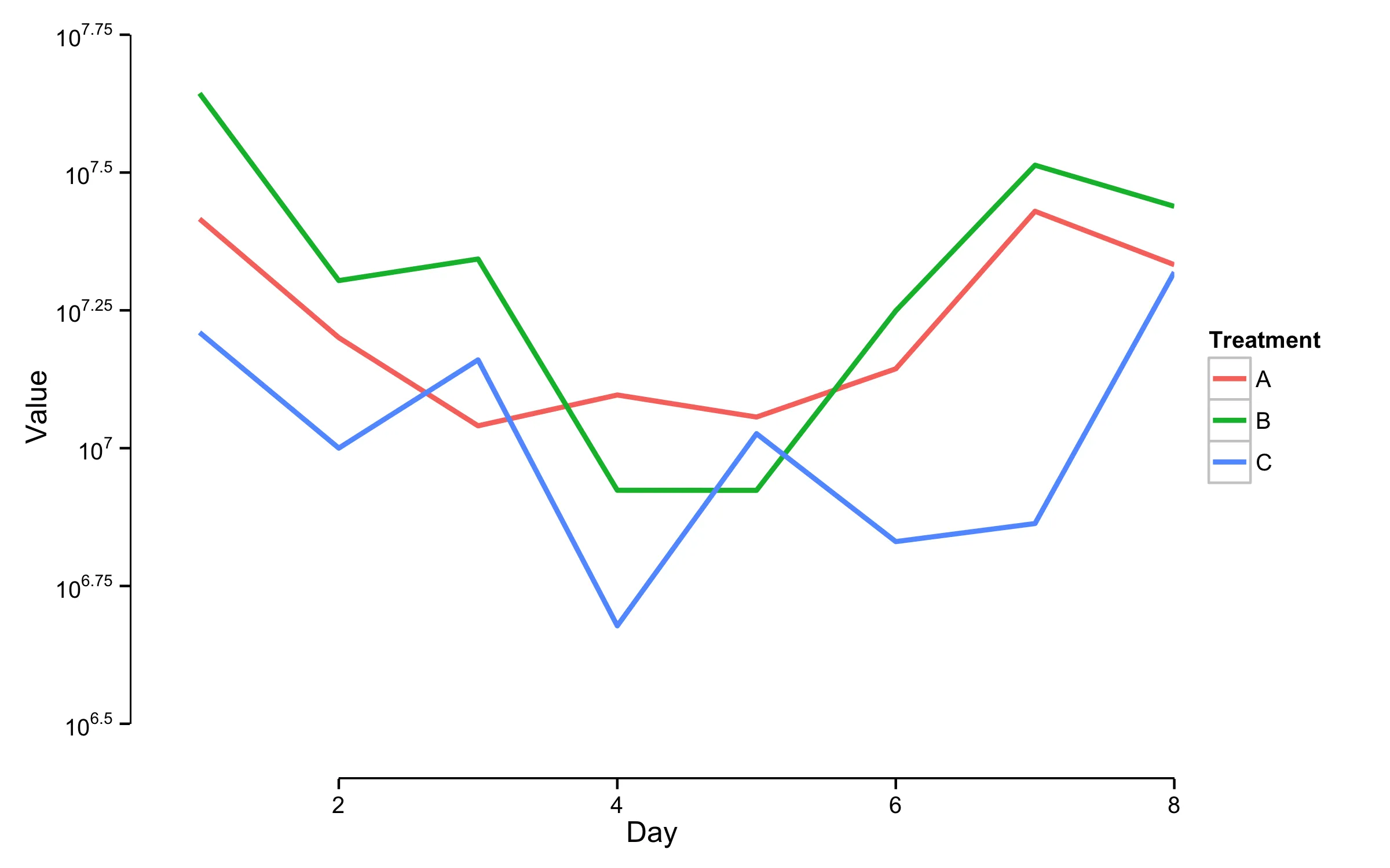
我正在使用ggplot2制作一些对数转换数据的折线图,这些数据都有很大的值(在10^6和10^8之间); 由于轴不从零开始,我希望它们不要在“原点”相交。以下是当前轴的外观:
 我更喜欢从基本图形中得到的效果(但我还使用geom_ribbon和其他我在ggplot2中非常喜欢的花哨的东西,所以我更喜欢找到一个ggplot2解决方案):
 以下是我目前正在做的事情:
我更喜欢从基本图形中得到的效果(但我还使用geom_ribbon和其他我在ggplot2中非常喜欢的花哨的东西,所以我更喜欢找到一个ggplot2解决方案):
以下是我目前正在做的事情:mydata <- data.frame(Day = rep(1:8, 3),
Treatment = rep(c("A", "B", "C"), each=8),
Value = c(7.415929, 7.200486, 7.040555, 7.096490, 7.056413, 7.143981, 7.429724, 7.332760, 7.643673, 7.303994, 7.343151, 6.923636, 6.923478, 7.249170, 7.513370, 7.438630, 7.209895, 7.000063, 7.160154, 6.677734, 7.026307, 6.830495, 6.863329, 7.319219))
ggplot(mydata, aes(x=Day, y=Value, group=Treatment))
+ theme_classic()
+ geom_line(aes(color = Treatment), size=1)
+ scale_y_continuous(labels = math_format(10^.x))
+ coord_cartesian(ylim = c(6.4, 7.75), xlim=c(0.5, 8))
plot(mydata$Day, mydata$Value, frame.plot = F) #non-intersecting axes

geom_point或qplot? - Harpal