我有动态生成的内容,形成了3个类似这样的Bootstrap列...
<div class="col-md-4">
  <div class="article">
  content goes here
  </div>
</div>
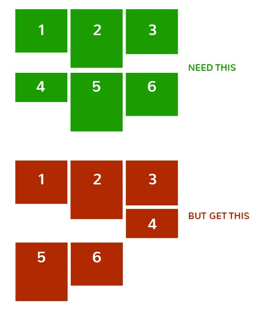
问题在于,当列具有不同的内容时,不同的高度会破坏布局。
我该如何强制在每3个项目后启动一个清晰的行以避免这种情况?
所以基本上...
我有动态生成的内容,形成了3个类似这样的Bootstrap列...
<div class="col-md-4">
<div class="article">
content goes here
</div>
</div>
问题在于,当列具有不同的内容时,不同的高度会破坏布局。
我该如何强制在每3个项目后启动一个清晰的行以避免这种情况?
所以基本上...
.your-class:nth-child(3n) {clear: left;}。display:flex;来为一行中的div添加统一的高度,如此示例中所示:http://www.bootply.com/126437
HTML: <div class="container">
<div class="row row-flex row-flex-wrap">
<div class="col-md-4">
<div class="article flex-col">
content goes here
</div>
</div>
<div class="col-md-4">
<div class="article flex-col">
content goes here
</div>
</div>
<div class="col-md-4">
<div class="article flex-col">
content goes here
</div>
</div>
</div>
</div>
.row-flex, .row-flex > div[class*='col-'] {
    display: -webkit-box;
    display: -moz-box;
    display: -ms-flexbox;
    display: -webkit-flex;
    display: flex;
    flex:1 1 auto;
}

.row-flex-wrap {
    -webkit-flex-flow: row wrap;
    align-content: flex-start;
    flex:0;
}

.row-flex > div[class*='col-'], .container-flex > div[class*='col-'] {
     margin:-.2px; /* hack adjust for wrapping */
}

.container-flex > div[class*='col-'] div,.row-flex > div[class*='col-'] div {
    width:100%;
}


.flex-col {
    display: flex;
    display: -webkit-flex;
    flex: 1 100%;
    flex-flow: column nowrap;
}
flex比使用floats和clearfix更加简洁和可取。正如在这里提到的:http://imstillreallybored.com/2013/08/building-a-responsive-grid-with-css3-flexbox-and-no-floats/"Flex允许复杂的布局和包含许多子元素的布局变得更加轻量级和易于编码(无需额外的清除浮动)"。 - AndrewL64只需在列的div中添加min-height以保持统一的布局,如下所示:
HTML:
<div class="row">
  <div class="col-md-4">
    <div class="article">
    content goes here
    </div>
  </div>
  <div class="col-md-4">
    <div class="article">
    content goes here
    </div>
  </div>
  <div class="col-md-4">
    <div class="article">
    content goes here
    </div>
  </div>
</div>
.col-md-4 {
    min-height: 200px; /* change to the height value of the longest column in the row */
}
<div class='row'>
    <div class='col-md-4'>
    </div>
    <div class='col-md-4'>
    <div class='col-md-4'>
        <div class='row'>
            <div class='col-md-12'>
            </div>
        </div>
        <div class='row'>
            <div class='col-md-12'>
            </div>
        </div>
    </div>
</div>
<div class='row'>
    <div class='col-md-4'>
    </div>
    <div class='col-md-4'>
    </div>
    <div class='col-md-4'>
    </div>
</div
可能有些晚了,但也许有人会对此感到高兴:
如果你的所有列都具有相同的宽度,你可以按照以下方式操作: (使用这个CSS,你必须为所有断点指定大小)
//Used to generate the html, not relevant to this question
for(var i=0;i<50;i++){
  jQuery(".row").append(
    '<div class="col-xs-12 col-sm-6 col-md-4 col-lg-3 col-xl-3">'+
    '<h1>Title '+i+'</h1>'+
    '<img src="http://lorempixel.com/'+getRandomInt(300, 700)+'/'+getRandomInt(200, 800)+'">'+
  '</div>');
}

function getRandomInt(min, max) {
  return Math.floor(Math.random() * (max - min + 1)) + min;
}
@media (min-width: 0) and (max-width: 544px) {
.row.same-width .col-xs-1:nth-child(12n + 13), html body > div.container ul.products .col-xs-1:nth-child(12n + 13),
html body > div.container-fluid ul.products .col-xs-1:nth-child(12n + 13) {
clear: left
}
.row.same-width .col-xs-2:nth-child(6n + 7), html body > div.container ul.products .col-xs-2:nth-child(6n + 7),
html body > div.container-fluid ul.products .col-xs-2:nth-child(6n + 7) {
clear: left
}
.row.same-width .col-xs-3:nth-child(4n + 5), html body > div.container ul.products .col-xs-3:nth-child(4n + 5),
html body > div.container-fluid ul.products .col-xs-3:nth-child(4n + 5) {
clear: left
}
.row.same-width .col-xs-4:nth-child(3n + 4), html body > div.container ul.products .col-xs-4:nth-child(3n + 4),
html body > div.container-fluid ul.products .col-xs-4:nth-child(3n + 4) {
clear: left
}
.row.same-width .col-xs-6:nth-child(2n + 3), html body > div.container ul.products .col-xs-6:nth-child(2n + 3),
html body > div.container-fluid ul.products .col-xs-6:nth-child(2n + 3) {
clear: left
}
.row.same-width .col-xs-12:nth-child(1n + 2), html body > div.container ul.products .col-xs-12:nth-child(1n + 2),
html body > div.container-fluid ul.products .col-xs-12:nth-child(1n + 2) {
clear: left
}
}
@media (min-width: 544px) and (max-width: 768px) {
.row.same-width .col-sm-1:nth-child(12n + 13), html body > div.container ul.products .col-sm-1:nth-child(12n + 13),
html body > div.container-fluid ul.products .col-sm-1:nth-child(12n + 13) {
clear: left
}
.row.same-width .col-sm-2:nth-child(6n + 7), html body > div.container ul.products .col-sm-2:nth-child(6n + 7),
html body > div.container-fluid ul.products .col-sm-2:nth-child(6n + 7) {
clear: left
}
.row.same-width .col-sm-3:nth-child(4n + 5), html body > div.container ul.products .col-sm-3:nth-child(4n + 5),
html body > div.container-fluid ul.products .col-sm-3:nth-child(4n + 5) {
clear: left
}
.row.same-width .col-sm-4:nth-child(3n + 4), html body > div.container ul.products .col-sm-4:nth-child(3n + 4),
html body > div.container-fluid ul.products .col-sm-4:nth-child(3n + 4) {
clear: left
}
.row.same-width .col-sm-6:nth-child(2n + 3), html body > div.container ul.products .col-sm-6:nth-child(2n + 3),
html body > div.container-fluid ul.products .col-sm-6:nth-child(2n + 3) {
clear: left
}
.row.same-width .col-sm-12:nth-child(1n + 2), html body > div.container ul.products .col-sm-12:nth-child(1n + 2),
html body > div.container-fluid ul.products .col-sm-12:nth-child(1n + 2) {
clear: left
}
}
@media (min-width: 768px) and (max-width: 992px) {
.row.same-width .col-md-1:nth-child(12n + 13), html body > div.container ul.products .col-md-1:nth-child(12n + 13),
html body > div.container-fluid ul.products .col-md-1:nth-child(12n + 13) {
clear: left
}
.row.same-width .col-md-2:nth-child(6n + 7), html body > div.container ul.products .col-md-2:nth-child(6n + 7),
html body > div.container-fluid ul.products .col-md-2:nth-child(6n + 7) {
clear: left
}
.row.same-width .col-md-3:nth-child(4n + 5), html body > div.container ul.products .col-md-3:nth-child(4n + 5),
html body > div.container-fluid ul.products .col-md-3:nth-child(4n + 5) {
clear: left
}
.row.same-width .col-md-4:nth-child(3n + 4), html body > div.container ul.products .col-md-4:nth-child(3n + 4),
html body > div.container-fluid ul.products .col-md-4:nth-child(3n + 4) {
clear: left
}
.row.same-width .col-md-6:nth-child(2n + 3), html body > div.container ul.products .col-md-6:nth-child(2n + 3),
html body > div.container-fluid ul.products .col-md-6:nth-child(2n + 3) {
clear: left
}
.row.same-width .col-md-12:nth-child(1n + 2), html body > div.container ul.products .col-md-12:nth-child(1n + 2),
html body > div.container-fluid ul.products .col-md-12:nth-child(1n + 2) {
clear: left
}
}
@media (min-width: 992px) and (max-width: 1200px) {
.row.same-width .col-lg-1:nth-child(12n + 13), html body > div.container ul.products .col-lg-1:nth-child(12n + 13),
html body > div.container-fluid ul.products .col-lg-1:nth-child(12n + 13) {
clear: left
}
.row.same-width .col-lg-2:nth-child(6n + 7), html body > div.container ul.products .col-lg-2:nth-child(6n + 7),
html body > div.container-fluid ul.products .col-lg-2:nth-child(6n + 7) {
clear: left
}
.row.same-width .col-lg-3:nth-child(4n + 5), html body > div.container ul.products .col-lg-3:nth-child(4n + 5),
html body > div.container-fluid ul.products .col-lg-3:nth-child(4n + 5) {
clear: left
}
.row.same-width .col-lg-4:nth-child(3n + 4), html body > div.container ul.products .col-lg-4:nth-child(3n + 4),
html body > div.container-fluid ul.products .col-lg-4:nth-child(3n + 4) {
clear: left
}
.row.same-width .col-lg-6:nth-child(2n + 3), html body > div.container ul.products .col-lg-6:nth-child(2n + 3),
html body > div.container-fluid ul.products .col-lg-6:nth-child(2n + 3) {
clear: left
}
.row.same-width .col-lg-12:nth-child(1n + 2), html body > div.container ul.products .col-lg-12:nth-child(1n + 2),
html body > div.container-fluid ul.products .col-lg-12:nth-child(1n + 2) {
clear: left
}
}
@media (min-width: 1200px) {
.row.same-width .col-xl-1:nth-child(12n + 13), html body > div.container ul.products .col-xl-1:nth-child(12n + 13),
html body > div.container-fluid ul.products .col-xl-1:nth-child(12n + 13) {
clear: left
}
.row.same-width .col-xl-2:nth-child(6n + 7), html body > div.container ul.products .col-xl-2:nth-child(6n + 7),
html body > div.container-fluid ul.products .col-xl-2:nth-child(6n + 7) {
clear: left
}
.row.same-width .col-xl-3:nth-child(4n + 5), html body > div.container ul.products .col-xl-3:nth-child(4n + 5),
html body > div.container-fluid ul.products .col-xl-3:nth-child(4n + 5) {
clear: left
}
.row.same-width .col-xl-4:nth-child(3n + 4), html body > div.container ul.products .col-xl-4:nth-child(3n + 4),
html body > div.container-fluid ul.products .col-xl-4:nth-child(3n + 4) {
clear: left
}
.row.same-width .col-xl-6:nth-child(2n + 3), html body > div.container ul.products .col-xl-6:nth-child(2n + 3),
html body > div.container-fluid ul.products .col-xl-6:nth-child(2n + 3) {
clear: left
}
.row.same-width .col-xl-12:nth-child(1n + 2), html body > div.container ul.products .col-xl-12:nth-child(1n + 2),
html body > div.container-fluid ul.products .col-xl-12:nth-child(1n + 2) {
clear: left
}
}
.row img{
width: 100%;
height: auto;
}<script src="https://ajax.googleapis.com/ajax/libs/jquery/2.1.1/jquery.min.js"></script>
<link href="https://maxcdn.bootstrapcdn.com/bootstrap/3.3.6/css/bootstrap.min.css" rel="stylesheet"/>
<div class="row same-width"></div>$grid-breakpoints: (
// Extra small screen / phone
xs: 0,
// Small screen / phone
sm: 544px,
// Medium screen / tablet
md: 768px,
// Large screen / desktop
lg: 992px,
// Extra large screen / wide desktop
xl: 1200px
) !default;
$grid-columns: 12 !default;
.row.same-width{
$break-values: map-keys($grid-breakpoints);
@each $breakpoint in $break-values{
@if(index($break-values, $breakpoint) < length($break-values)){
@media (min-width: #{map-get($grid-breakpoints, $breakpoint)}) and (max-width: #{map-get($grid-breakpoints, nth($break-values, index($break-values, $breakpoint)+1))}){
@for $i from 1 through $grid-columns {
@if($grid-columns % $i == 0){
.col-#{$breakpoint}-#{$i}:nth-child(#{($grid-columns/$i)}n + #{($grid-columns/$i)+1}){
clear: left;
}
}
}
}
}@else{
@media (min-width: #{map-get($grid-breakpoints, $breakpoint)}){
@for $i from 1 through $grid-columns {
@if($grid-columns % $i == 0){
.col-#{$breakpoint}-#{$i}:nth-child(#{($grid-columns/$i)}n + #{($grid-columns/$i)+1}){
clear: left;
}
}
}
}
}
}
}