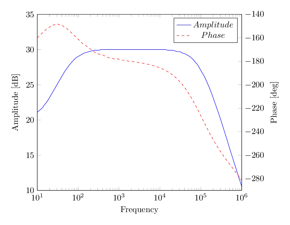
我正在尝试建立一个带有两个y轴的图表,即振幅和相位在同一图表上的波德图。我使用tikzpicture包中的\begin{axis}和\addplot来叠加两个图形。好吧,至少这是我的想法... 我遇到的问题是似乎我不能控制图形,无法为轴设置固定间隔,也无法控制图线的颜色/样式。请指出如果我在尝试制作波德图时有哪些奇怪的地方。特别是,如何设置线条的样式,一个虚线和一个实线?
    \begin{figure}[H]
\centering
\begin{minipage}{0.9 \textwidth}

\begin{tikzpicture}

%%% AMPLITUDE
\begin{axis}[
    width=340pt,
    height=180pt,
    xlabel=Frequency,
    xmode = log,
    ylabel=Amplitude [dB],
    axis x line=bottom,
    axis y line=left,
%   xmin=10, xmax=1000000,
%   ylabel near ticks,
    legend pos= south west,
    font=\scriptsize,
    legend style={font=\scriptsize,draw=none,fill=none}
    ]


\addplot table [color=black, mark=none,dotted,y=$amp$, x=freq, font=\scriptsize]{amp.dat};
\addlegendentry{$Amplitude$ }

\end{axis}

%%% PHASE
\begin{axis}[
    width=340pt,
    height=180pt,
%   xmin=10, xmax=1000000,
    hide x axis,
    axis y line=right,
    xmode = log,
    ylabel=Phase [deg],
%   ymin=-300, ymax=-120,
%   ylabel near ticks,
    legend pos= north east,
    font=\scriptsize,
    legend style={font=\scriptsize,draw=none,fill=none}
    ]


\addplot table [mark=none,dashed, y=$phase$, x=freq]{phase.dat};
\addlegendentry{$Phase$ }

\end{axis}

\end{tikzpicture}


\caption{A Bode-plot of the common source gain stage.}
\label{fig:cg_sweep}
\end{minipage}
\end{figure}
如果需要,这里有一些用于绘图的测试数据:https://dl.dropboxusercontent.com/u/43498716/cg_sweep.dat
谢谢!