我想在我的一个图表中添加一个图例,但是我有不同的美学和我从未创建过图例,所以我觉得很难确定如何构建它。
我的一个美学是填充代码,我手动添加了一个向量。另一个美学是我用geom_vline添加的垂直线。
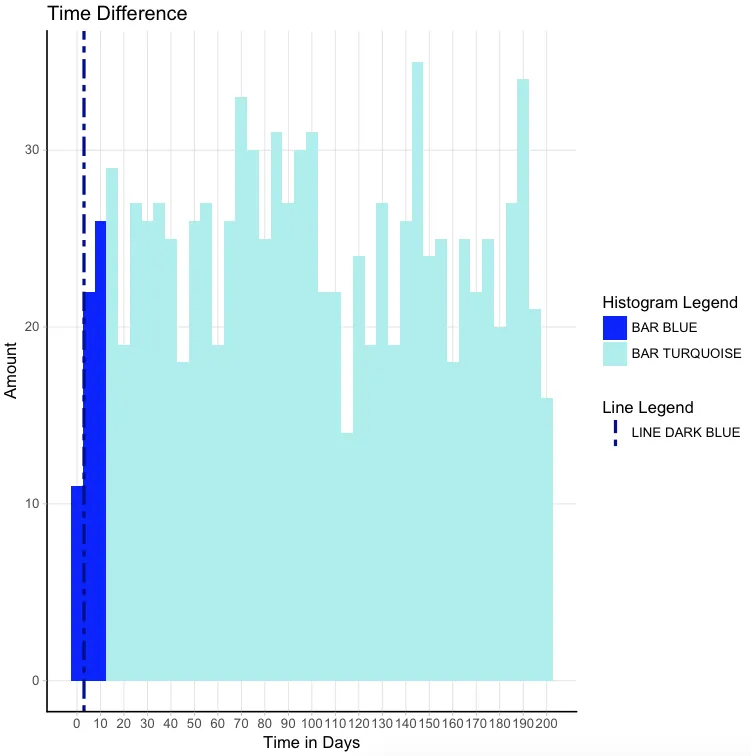
从下面的图表中,有三个特征我想要添加到图例中:1)深蓝色的条形,2)浅蓝色的条形和3)垂直线。
有没有人对如何高效编写代码有建议?
我的一个美学是填充代码,我手动添加了一个向量。另一个美学是我用geom_vline添加的垂直线。
从下面的图表中,有三个特征我想要添加到图例中:1)深蓝色的条形,2)浅蓝色的条形和3)垂直线。
有没有人对如何高效编写代码有建议?
#df
df <- data.frame(Time_Diff <- runif(1000, 0, 200))


# Show median, IQR range and outliers
colors <- c(rep("blue",3), rep("paleturquoise2",38))
bp_overall <- ggplot(data = df, aes(Time_Diff))
bp_overall +
  geom_histogram(binwidth = 5, fill = colors) + #create histogram
  ggtitle("Time Difference")  +
  xlab("Time in Days") +
  ylab("Amount") +
  geom_vline(xintercept = 3, linetype = "twodash", size = 1,      colour= "darkblue") + #show median
  scale_x_continuous(breaks = seq(0, 202, 10)) +
  theme_light() +
  theme(panel.grid.minor = element_blank(),
    panel.border = element_blank(), #remove all border lines
    axis.line.x = element_line(size = 0.5, linetype = "solid", colour = "black"), #add x-axis border line
    axis.line.y = element_line(size = 0.5, linetype = "solid", colour = "black")) + #add y-axis border line
  theme(plot.title = element_text(family = windowsFont("Verdana"),     color="black", size=14, hjust = 0.5)) +
  theme(axis.title = element_text(family = windowsFont("Verdana"), color="black", size=12))
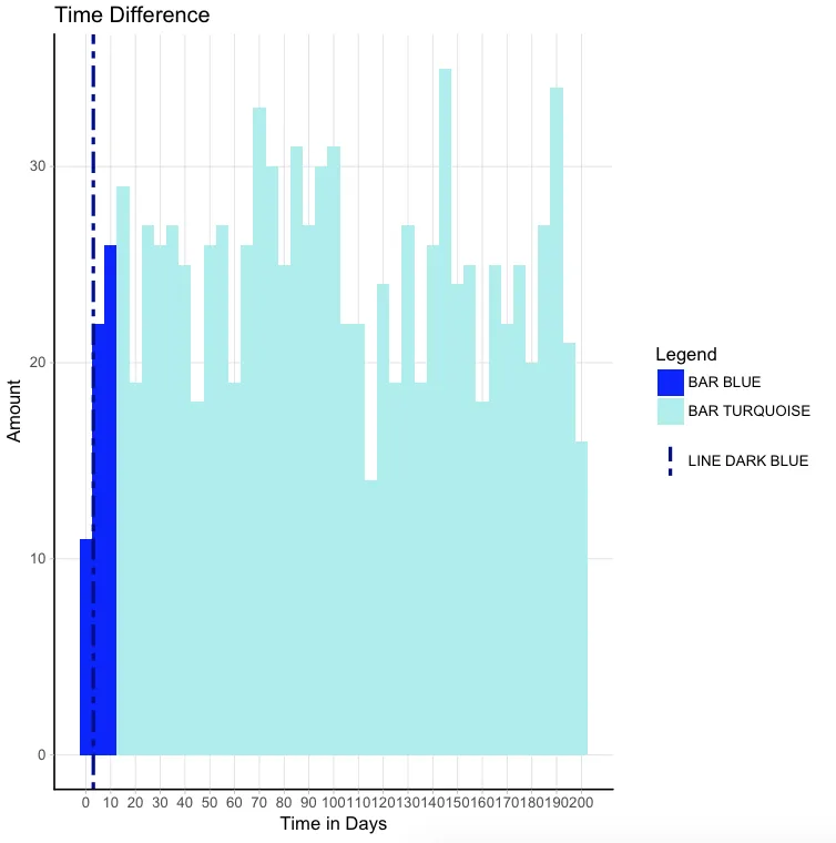
在Djork的建议下,我编写了下面的脚本,它可以正常工作,我很满意。现在唯一想要实现的是让图例成为一个整体(直方图图例和折线图图例合并成一个连贯整体)。是否有任何建议?
# reformat data
set.seed(1)
df <- data.frame(runif(1000, 0, 200))
colnames(df) <- "Time_Diff"

bp_overall +
  geom_histogram(data = subset(df, Time_Diff <= 12.5), aes(x = Time_Diff, fill="BAR BLUE"), binwidth = 5) + # subset for blue data, where aes fill is fill group 1 label
  geom_histogram(data = subset(df, Time_Diff > 12.5), aes(x = Time_Diff, fill="BAR TURQUOISE"), binwidth = 5) + # subset for turquoise data, where aes fill is fill group 2 label
  scale_fill_manual("Histogram Legend", values=c("blue", "paleturquoise2")) + # manually assign histogram fill colors
  geom_vline(aes(xintercept = 3, colour="LINE DARK BLUE"), linetype="twodash", size = 1) + # where aes colour is vline label
  scale_colour_manual("Line Legend", values="darkblue") + #removed legend title
  scale_x_continuous(breaks = seq(0, 202, 10)) +
  ggtitle("Time Difference")  +
  xlab("Time in Days") +
  ylab("Amount") +
  theme_light() +
  theme(panel.grid.minor = element_blank(),
        panel.border = element_blank(),
        axis.line.x = element_line(size = 0.5, linetype = "solid", colour = "black"),
        axis.line.y = element_line(size = 0.5, linetype = "solid", colour = "black"),
        legend.position = c(0.95, 0.95),
        legend.justification = c("right", "top"),
        legend.box.just = ("right"))
aes()内指定特征。因此,您需要转换包括统计数据和颜色列的数据框架。请参见 这里 或 这里。 - Roman