如何使用ggplot相比spplot来改进空间栅格地图?

8
如何改进ggplot的空间栅格地图图例,与spplot()图例相比?
我想使用ggplot()绘制空间地图,但是与spplot()相比,我有几个需要改进的地方:
  1. 创建一个从小到大值的ggplot图例(从底部到顶部)
  2. 使ggplot图例中的分段类似于spplot()图例的分段,以便我知道每种颜色的边界。
## load packages
require(raster)
require(ggplot2)
require(rgdal)
require(RColorBrewer)
set.seed(1)

r <- raster(xmn=-110, xmx=-90, ymn=40, ymx=60, ncols=40, nrows=40,
          crs="+proj=lcc +lat_1=48 +lat_2=33 +lon_0=-100
+ellps=WGS84")
r <- setValues(r,matrix(rnorm(1600, mean=0.4,sd=0.2))) 

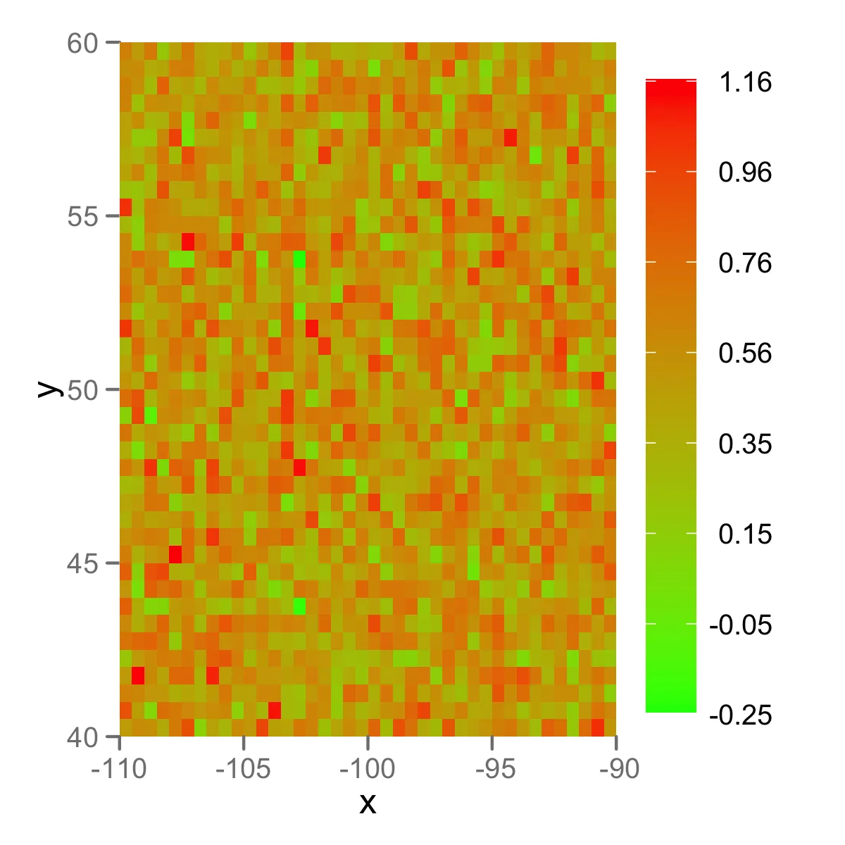
## 1. spatial map with spplot
cuts <-seq(minValue(r),maxValue(r),length.out=8)
cuts = round(cuts,digits=2)
col.regions = brewer.pal(length(cuts)+3-1, "RdYlGn")
print( 
spplot(as(r, 'SpatialGridDataFrame'),at=cuts,
col.regions=col.regions,
colorkey=list(labels=list(at=cuts),at=cuts), pretty=TRUE,
scales=list(draw=T)
) 
)

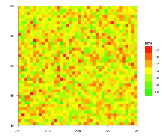
## 2. spatial map with ggplot
p = rasterToPoints(r); df = data.frame(p)
colnames(df) = c("x", "y", "NDVI")

p  <- ggplot(data=df) + geom_tile(aes(x, y, fill=NDVI)) +
coord_equal() + labs(x=NULL, y=NULL) + 
scale_fill_gradient2(low="red", mid="yellow",high="green",
limits=c(minValue(r),maxValue(r)), midpoint = 0.4) + theme_bw() +
scale_x_continuous(expand=c(0,0)) + scale_y_continuous(expand=c(0,0))
print(p)

ssplot()的结果 ssplot

ggplot()的结果 ggplot


10
请不要使用红绿色对比度。5-10%的男性有红绿色弱,他们会发现这种对比度很难阅读。 - hadley
Koske网站上的链接 - 大致说明了我想要做的事情。我将进一步探索ggplot()的功能,调整颜色,改善图例,并在下面发布更新。欢迎提供所有提示/示例。谢谢 - Janvb
3个回答

5

感谢 @joran 给出的指引。

这里是一个使用开发版本的示例代码和输出:

br <- seq(min(df$NDVI), max(df$NDVI), len=8)

ggplot(data=df) + 
  geom_tile(aes(x, y, fill=NDVI)) + 
  scale_fill_gradient(low="red", high="green", 
    breaks=br, labels=sprintf("%.02f", br), 
    guide=guide_colorbar(title=NULL, nbin=100, barheight=unit(0.75, "npc"), label.hjust=1)) + 
  scale_x_continuous(expand=c(0,0)) + 
  scale_y_continuous(expand=c(0,0))

图片描述

您可以尝试通过以下步骤:

# from Hadley's instruction
install.packages("devtools")
library(devtools)
dev_mode() # to avoid interfering with your existing install
install_github("ggplot2", username="kohske", branch = "feature/new-guides-with-gtable")
library(ggplot2)

更新:

以下是从头开始安装的说明:

install.packages(
  c('devtools', 'digest', 'memoise', 'plyr', 'reshape2', 'RColorBrewer', 'stringr', 'dichromat', 'munsell', 'plyr', 'colorspace'), 
  dep=TRUE)

library(devtools)
dev_mode()

install_github("scales")
install_github("ggplot2", username="kohske", branch = "feature/new-guides-with-gtable")

我刚试了一下,但出现了以下错误:在构建‘ggplot2_0.9.0.tar.gz’时 错误: 依赖项‘scales’对于包‘ggplot2’不可用,它说scales在2.13.0上不可用,我该去哪里找到它?这样可以制作像上面那样的图例,太棒了。 - Janvb
我在 GitHub 上找到了 scales https://github.com/hadley/scales,那么在 R 中安装它的最佳方式是什么? - Janvb
答案已更新。请尝试使用 install_github("scales") 命令进行安装。如果出现缺少包的错误,如 RColorBrewer, stringr, dichromat, munsell, plyr, colorspace,请尝试使用 install.packages(c('RColorBrewer', 'stringr', 'dichromat', 'munsell', 'plyr', 'colorspace'), dep=TRUE) 命令进行安装。 - kohske
谢谢!太棒了,这个很有效。我现在会尝试改进颜色,以便不同的级别有清晰的颜色(关于Hadley的评论)。 - Janvb

4
我不确定如何立即解决(1)。但是以下是(2)和(3)的一些可能解决方案。
我认为ggplot2目前无法以那种方式标记图例。但是,Koske一直在编写代码,这些代码可能在未来被整合到ggplot2中,从而创建具有这种样式的图例。这里是一个链接,尽管需要安装其他软件包,并且仅为测试版。
要获取您想要的特定间隔,请尝试以下操作:
br <- c(-0.25,-0.05,0.15,0.35,0.56,0.76,0.96,1.16)
p  <- ggplot(data=df) + geom_tile(aes(x, y, fill=NDVI)) +
coord_equal() + labs(x=NULL, y=NULL) + 
scale_fill_gradient(low="red", mid="yellow",high="green",
breaks = br) + theme_bw() +
scale_x_continuous(expand=c(0,0)) + scale_y_continuous(expand=c(0,0))
print(p)

这是在我的电脑上生成的图表:

在此输入图片描述

我尚未测试使用上述实验性代码会产生什么样的效果。


我所能想到的在不篡改ggplot代码内部的情况下获得高到低图例的唯一方法是将比例尺转换为因子,使用“cut”手动分配颜色,并反转级别的顺序... - Ben Bolker
谢谢提供 Koske 网站的链接,这正是我想要在 ggplot 空间地图的图例中实现的。我会进行一些测试,并很快在下面发布最终结果。 - Janvb
请注意,这些代码已经过时。请在以下 ggplot2 列表中查找此帖子:http://groups.google.com/group/ggplot2/browse_thread/thread/1026e8bf330deca2 - kohske

0

回复:(2) 首先使用cut()函数对数据进行切割,得到一个分组的数据集。在cut()函数中使用breakslabels选项来获取正确的标签,例如:

dat$col <- cut(
  df$NDVI, 
  breaks=c(-Inf, -0.25, 0.05, ...whatever..., Inf), 
  labels=c(-0.25, 0.05, ...whatever..., "")
)

然后您可以使用ggplot进行绘图,并将标签移动到颜色边界上,方法如下:

 scale_fill_manual (your options...) + guides(fill=guide_legend(label.vjust = 1.2)) #1.2= what fits your legend best. Use label.hjust if using an horizontal color bar

参见: 使用ggplot2生成带有偏移标签的颜色图例 或者,您可以使用外部脚本(例如,GrADS使用正确的脚本制作漂亮的颜色图例)创建颜色图例,并在scale_fill_manual中手动指定相同的颜色。

网页内容由stack overflow 提供, 点击上面的
可以查看英文原文,
原文链接