使用科学坐标轴绘图,更改有效数字位数

12
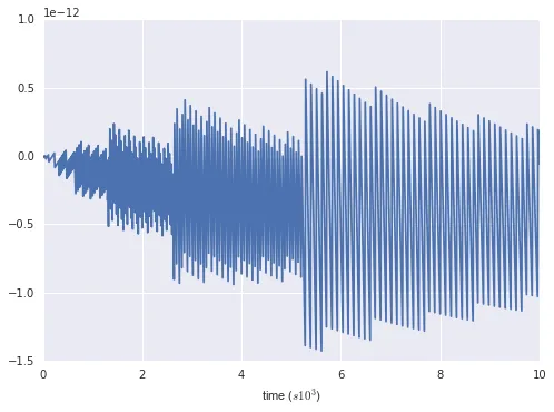
我正在使用matplotlib制作下面的图表,其中包含plt.ticklabel_format(axis='y',style='sci',scilimits=(0,3))等内容。这将产生如下所示的y轴:

enter image description here

现在的问题是,我想让y轴上的刻度为[0, -2, -4, -6, -8, -12]。 我已经尝试了scilimits参数但无济于事。

如何强制使刻度只有一位有效数字,并且没有尾随零,在需要时为浮点数?

下面是MWE:

import matplotlib.pyplot as plt
import numpy as np

t = np.arange(0.0, 10000.0, 10.)
s = np.sin(np.pi*t)*np.exp(-t*0.0001)

fig, ax = plt.subplots()

ax.tick_params(axis='both', which='major')
plt.ticklabel_format(style='sci', axis='x', scilimits=(0,3))
plt.plot(t,s)

plt.show()

你能添加可剪切和可粘贴的代码吗? - Lee
1
http://stackoverflow.com/help/mcve - Lee
2个回答

1
当我遇到这个问题时,我能想到的最好方法是使用自定义的FuncFormatter来处理刻度。然而,我发现没有办法让它显示比例尺(例如1e5)和轴一起显示。简单的解决方案是手动将其包含在刻度标签中。
如果这不能完全回答问题,那么它可能足以作为相对简单的解决方案 :)
在MWE中,我的解决方案看起来有些像这样:
import matplotlib.pyplot as plt
from matplotlib.ticker import FuncFormatter
import numpy as np


def tickformat(x):
    if int(x) == float(x):
        return str(int(x))
    else:
        return str(x)        


t = np.arange(0.0, 10000.0, 10.)
s = np.sin(np.pi*t)*np.exp(-t*0.0001)

fig, ax = plt.subplots()

ax.tick_params(axis='both', which='major')
plt.plot(t,s)

fmt = FuncFormatter(lambda x, pos: tickformat(x / 1e3))
ax.xaxis.set_major_formatter(fmt)

plt.xlabel('time ($s 10^3$)')

plt.show()

请注意,此示例操作了x轴!

enter image description here

当然,这也可以通过重新缩放数据来实现。不过,我假设您不想触碰数据,只想操作轴。

谢谢您提供这个小技巧,非常好用。很奇怪似乎没有一个好的方法来解决这个问题。 - Astrid
1
我同意,但也许真正的matplotlib大师会稍后提供一个简单实用的解决方案;) - MB-F
确切地说,人们只能抱有希望 :) - Astrid

0

我没有看到通过ScalarFormatter上存在的旋钮来完成这个任务的明显方法。类似于这样:

import matplotlib.pyplot as plt
import numpy as np
import matplotlib.ticker as mticker

t = np.arange(0.0, 10000.0, 10.)
s = np.sin(np.pi*t)*np.exp(-t*0.0001)

class EpiCycleScalarFormatter(mticker.ScalarFormatter):
    def _set_orderOfMagnitude(self, rng):
        # can just be super() in py3, args only needed in LPy
        super(EpiCycleScalarFormatter, self)._set_orderOfMagnitude(rng)
        if self.orderOfMagnitude != 0:
            self.orderOfMagnitude -= 1


fig, ax = plt.subplots()

ax.tick_params(axis='both', which='major')
ax.yaxis.set_major_formatter(EpiCycleScalarFormatter())
ax.xaxis.set_major_formatter(EpiCycleScalarFormatter())
plt.ticklabel_format(style='sci', axis='x', scilimits=(0,3))
plt.
plt.show()plot(t,s)

enter image description here

将解决您的问题。请注意子类的名称,因为这只是向现有代码添加了复杂性(它们看起来像是有效的,但只会增加更多的复杂性)。这也会触及库的私有部分,我们随时可能会破坏它们。


网页内容由stack overflow 提供, 点击上面的
可以查看英文原文,
原文链接