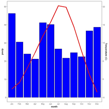
当我绘制第二个y轴时,数据集中的负值将低于其他绘制的数据。 我想让这两个数据集从同一基线开始,但具有不同的轴刻度。
我尝试过对数据进行缩放,但无法实现我的目标。 我对ggplot2包不是很熟悉。 根据所示代码,我认为我正在使用与降水相同的比例绘制温度数据。
结果是温度曲线图的负值低于降水柱状图的数值。我希望主轴从0到50,次轴从-5到25,但在同一位置起始。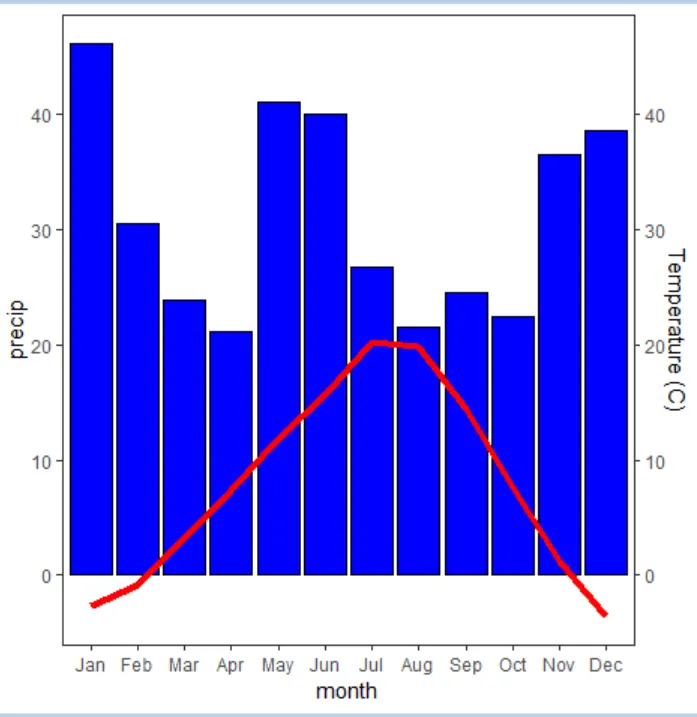
我尝试过对数据进行缩放,但无法实现我的目标。 我对ggplot2包不是很熟悉。 根据所示代码,我认为我正在使用与降水相同的比例绘制温度数据。
# Enter climate data to be graphed
month <- month.abb[c(1,2,3,4,5,6,7,8,9,10,11,12)]
month <- ordered(month, month.abb)
aveT <- c(-2.7, -0.9, 3.1, 7.3, 11.9, 15.7, 20.2, 19.8, 14.4, 7.6, 1.2, -3.6)
precip <- c(46.2, 30.5, 23.9, 21.1, 41.1, 40.1, 26.7, 21.6, 24.6, 22.4, 36.6, 38.6)

#Set the dataframe
df <- data.frame(month, aveT, precip)

#Graph precipitation data as bar graph
g <- ggplot(df)
g <- g + geom_bar(aes(x=month, y=precip), stat="identity", fill="blue", color="black") + theme_bw() + theme(panel.grid = element_blank())
g <- g + ylim(0, 50)

#Add Temperature data
g <- g + geom_line(aes(x=month, y=aveT, group=1), color="red", size=1.5)
g <- g + scale_y_continuous(sec.axis = sec_axis(~.*1, name = "Temperature (C)"))
结果是温度曲线图的负值低于降水柱状图的数值。我希望主轴从0到50,次轴从-5到25,但在同一位置起始。