我是新手程序员,很难理解插值。我所找到的每一个试图解释它的来源都非常晦涩(特别是basemap/matplotlib的特定站点)。我正在使用matplotlib的basemap进行地图绘制,但我的数据的性质是以5度×5度的块(纬度和经度块)形式提供的。我想通过插值来平滑地图。
那么首先是我的代码。
现在,我该如何轻松地插值我的数据以平滑它?我尝试调用Basemap.interp,但是我收到了一个错误,说basemap没有interp属性。
我对用于插值数据的工具并不偏爱,我只需要有人能像我是个白痴一样向我解释这个问题。
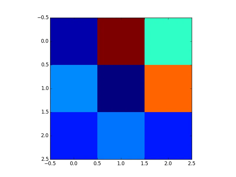
还要注意的是,我正在学习绘制地图,所以标签等细节我暂时不太担心。下面是上述代码输出的示例地图。
那么首先是我的代码。
from netCDF4 import Dataset
import numpy as np
import matplotlib.pyplot as plt
from mpl_toolkits.basemap import Basemap, addcyclic

#load the netcdf file into a variable
mar120="C:/Users/WillEvo/Desktop/sec_giptie_cpl_mar_120.nc"

#grab the data into a new variable
fh=Dataset(mar120,mode="r")

#assign model variable contents to python variables
lons=fh.variables['lon'][:]
lats=fh.variables['lat'][:]
test=fh.variables['NE'][:]

#specifying which time and elevation to map
ionst=test[12,0]

#close the netCDF file
fh.close()

# get rid of white stripe on map
ionst, lons=addcyclic(ionst, lons)

#map settings
m=Basemap(llcrnrlon=-180, llcrnrlat=-87.5, urcrnrlon=180, urcrnrlat=87.5,rsphere=6467997, resolution='i', projection='cyl',area_thresh=10000, lat_0=0, lon_0=0)

#Creating 2d array of latitude and longitude
lon, lat=np.meshgrid(lons, lats)
xi, yi=m(lon, lat)

#setting plot type and which variable to plot
cs=m.pcolormesh(xi,yi,np.squeeze(ionst))

#drawing grid lines
m.drawparallels(np.arange(-90.,90.,30.),labels=[1,0,0,0],fontsize=10)
m.drawmeridians(np.arange(-180.,181.,30.), labels=[0,0,0,1],fontsize=10)

#drawing coast lines
m.drawcoastlines()

#color bar
cbar=m.colorbar(cs, location='bottom', pad="10%")
cbar.set_label("Elecron Density cm-3")

#showing the plot
plt.show()
现在,我该如何轻松地插值我的数据以平滑它?我尝试调用Basemap.interp,但是我收到了一个错误,说basemap没有interp属性。
我对用于插值数据的工具并不偏爱,我只需要有人能像我是个白痴一样向我解释这个问题。
还要注意的是,我正在学习绘制地图,所以标签等细节我暂时不太担心。下面是上述代码输出的示例地图。
 以及。
以及。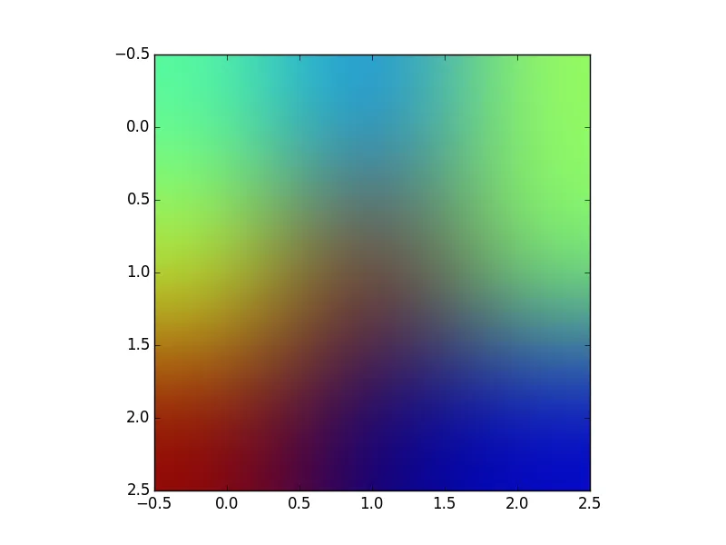
sec_giptie_cpl_mar_120.nc谢谢。 - tommy.carstensen