多项式回归方程。

4

我正在尝试将两个沉积物核心进行相关性分析,因为在核心中不同深度处具有不同的样本。我使用了ggplot2函数绘制了一个5次多项式回归图,显示了方程和r2值。

我的问题是方程本身,r2值是正确的,但方程不正确。我认为这与lm_eq引用线性回归有关,但我不太确定。

非常感谢任何帮助或指导。我对图形本身感到满意,但是对于如何清理我的代码的任何建议也将不胜感激。

我已经尝试了搜索其他函数以显示方程,但没有找到解决方案。

long_data <- gather(Correlations, key = "Core", value = "Depth",
#Reshapes my data frame
                    LC1U, LC3U) 
df <- data.frame("x"=long_data$Sample, "y"=long_data$Depth)

lm_eqn = function(df){   m=lm(y ~ poly(x, 5), df)#3rd degree polynomial   eq <- substitute(italic(y) == a + b %.% italic(x)*","~~italic(r)^2~"="~r2,
                   list(a = format(coef(m)[1], digits = 2),
                        b = format(coef(m)[2], digits = 2),
                        r2 = format(summary(m)$r.squared, digits = 4)))   as.character(as.expression(eq)) }

p1 <- ggplot(long_data, aes(x=Sample,y=Depth)) + geom_point(aes(color=Core)) +  
    labs(x ='Sample N.', y ='Depth (mm)', title = 'Core Correlation of Lake Nganoke') +  
    ylim(1,800) 

p1 + stat_smooth(method = "lm", formula = y~poly(x,5, raw = TRUE), size = 1) +    
    annotate("text", x = 0, y = 800, label = lm_eqn(df), hjust=0, family="Times", parse = TRUE) + #Add polynomial regression
    scale_y_continuous(trans = "reverse", breaks = c(0,100,200,300,400,500,600,700,800))

My graph


1
不确定为什么你作为第一个发帖者被踩了。看起来你已经做了一些功课,但对 SO 的发帖文化还不太熟悉。不幸的是,虽然我自己也是 GGPLOT 的新手,但无法为你提供解决方案。希望有人能够帮到你。如果你找到了解决方案,请务必发布答案。 - Cam_Aust
尝试将
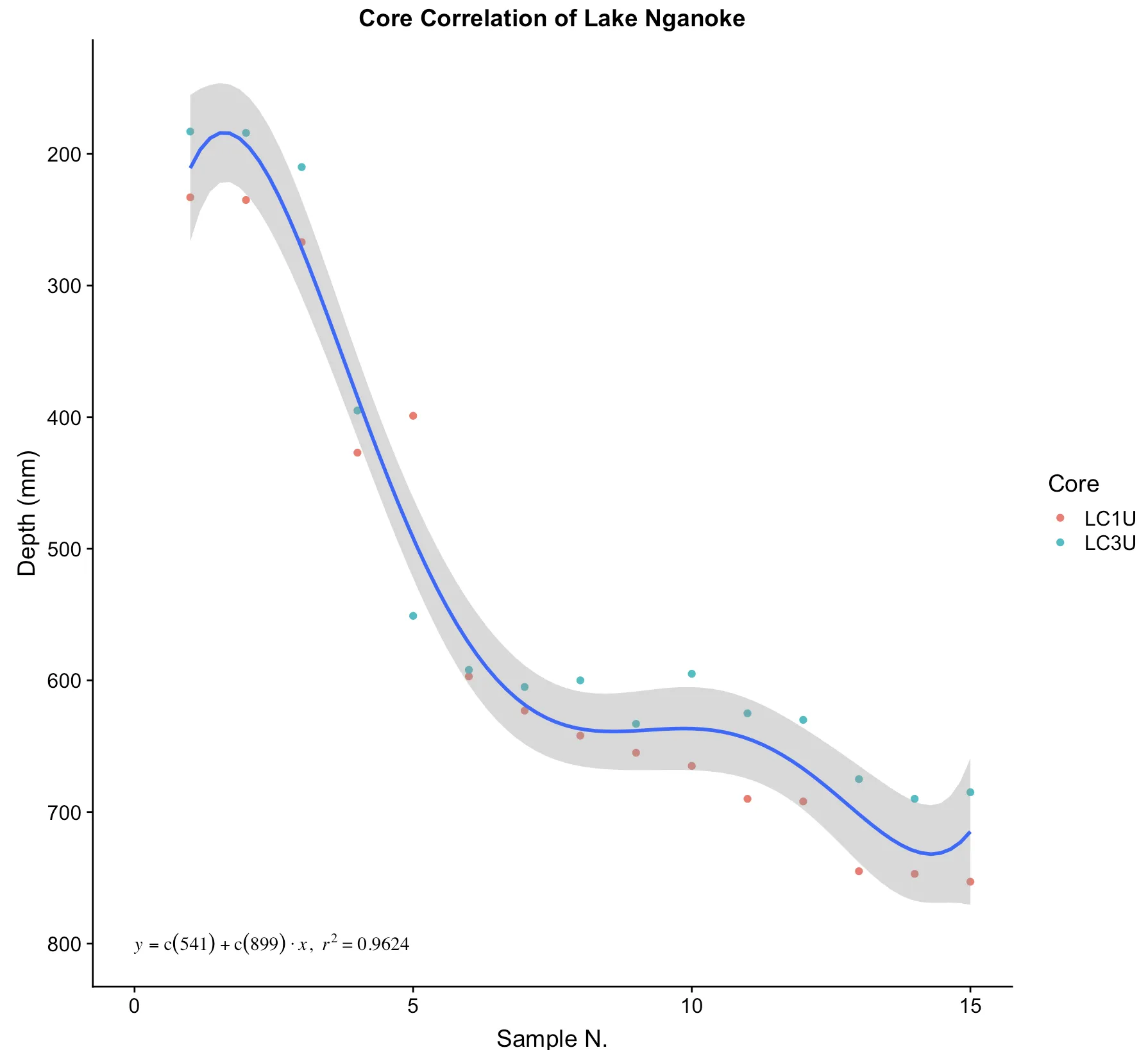
raw设置为TRUE。lm(y ~ poly(x, 5, raw = TRUE), data = df) - Tony Ladson
3个回答

2
这里是另一种答案。我观察到你绘制的多项式的端点呈现出曲率,这种曲率似乎不符合数据的形状(朗格现象),所以我从散点图中提取了数据并进行了方程搜索。我能找到的最佳候选方程是“y = C /(1.0 + exp((x-A)/ B))+ D * exp((x-B)/ E)”,如下所示,Y轴以正常方式绘制。对于参数:
A =  4.1190742945259711E+00
B = -6.4849391432073888E-01
C =  3.5527347656282654E+02
D =  1.7759549500121045E+02
E =  2.1295437650578787E+01

我得到了R平方=0.9604和RMSE=36.37,并注意到方程的极端值没有展现出多项式所显示的曲率。如果这可能有用,您需要使用实际研究数据重新拟合,以这些参数值作为非线性求解器的初始参数估计。

plot


1
你说得对,这些数据是我粗略创建的模拟数据集。我本不指望它们一开始就遵循多项式趋势。 - Jake Parrish
没问题。每次我能使用“朗格现象”这个词组都是值得的。 - James Phillips

2

您的问题在于lm_eqn是为显示线性回归方程而设计的,即一次多项式的方程。我已经修改它以显示N次多项式的方程。由于您还没有发布数据(这是您未能得到好评的原因),我使用了datasets中的cars数据集。

library(datasets)
library(ggplot2)

lm_eqn <- function(df, degree, raw=TRUE){
  m <- lm(y ~ poly(x, degree, raw=raw), df)  # get the fit
  cf <- round(coef(m), 2)  # round the coefficients
  r2 <- round(summary(m)$r.squared, 4)  # round the r.squared
  powers <- paste0("^", seq(length(cf)-1))  # create the powers for the equation
  powers[1] <- ""  # remove the first one as it's redundant (x^1 = x)
  # first check the sign of the coefficient and assign +/- and paste it with
  # the appropriate *italic(x)^power. collapse the list into a string
  pcf <- paste0(ifelse(sign(cf[-1])==1, " + ", " - "), abs(cf[-1]),
                paste0("*italic(x)", powers), collapse = "")
  # paste the rest of the equation together
  eq <- paste0("italic(y) == ", cf[1], pcf, "*','", "~italic(r)^2==", r2)
  eq
}

df <- data.frame("x" = cars$speed, "y" = cars$dist)
ggplot(cars, aes(x = speed, y = dist)) +
  geom_point() +
  stat_smooth(method = "lm", formula = y ~ poly(x, 5, raw = TRUE), size = 1) +    
  annotate("text", x = 0, y = 100, label = lm_eqn(df, 5, raw = TRUE),
           hjust = 0, family = "Times", parse = TRUE)

example


0

感谢Arienhood的帮助!结果发现我的数据在这个序列中并没有遵循多项式趋势,但是进一步使用这段代码将会有所改善。(未来一定会发布我的数据集)

library(ggplot2)

lm_eqn <- function(df, degree, raw=TRUE){
  m <- lm(y ~ poly(x, degree, raw=raw), df)  
  cf <- round(coef(m), 2)  
  r2 <- round(summary(m)$r.squared, 4)  
  powers <- paste0("^", seq(length(cf)-1))  
  powers[1] <- ""  

  pcf <- paste0(ifelse(sign(cf[-1])==1, " + ", " - "), abs(cf[-1]),
                paste0("*italic(x)", powers), collapse = "")

  eq <- paste0("italic(y) == ", cf[1], pcf, "*','", "~italic(r)^2==", r2)
  eq
}

df <- data.frame("x"=Correlations$LC3U, "y"=Correlations$LC1U)

p2 <- ggplot(df, aes(x = x, y = y)) +
  geom_point() +
  labs(x ='LC3U', y ='LC1U', title = 'Core Correlation of Lake Nganoke') +
  stat_smooth(method = "lm", formula = y ~ poly(x, 1, raw = TRUE), size = 1) +
  annotate("text", x = 10, y = 10, label = lm_eqn(df, 1, raw = TRUE),
           hjust = 0, family = "Times", parse = TRUE) +
  scale_y_continuous(breaks = c(0,10,20,30,40,50,60,70,80)) +
  scale_x_continuous(breaks = c(0,10,20,30,40,50,60,70,80))

p2

Plot


网页内容由stack overflow 提供, 点击上面的
可以查看英文原文,
原文链接