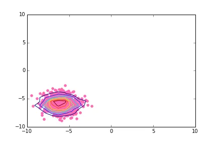
我正在尝试制作一个极坐标系下的散点图,并将等高线叠加在点云上。我知道如何使用numpy.histogram2d在直角坐标系中完成这个操作:
# Simple case: scatter plot with density contours in cartesian coordinates

import matplotlib.pyplot as pl
import numpy as np

np.random.seed(2015)
N = 1000
shift_value = -6.

x1 = np.random.randn(N) + shift_value
y1 = np.random.randn(N) + shift_value

fig, ax = pl.subplots(nrows=1,ncols=1)

ax.scatter(x1,y1,color='hotpink')

H, xedges, yedges = np.histogram2d(x1,y1)
extent = [xedges[0],xedges[-1],yedges[0],yedges[-1]]
cset1 = ax.contour(H,extent=extent)

# Modify xlim and ylim to be a bit more consistent with what's next
ax.set_xlim(xmin=-10.,xmax=+10.)
ax.set_ylim(ymin=-10.,ymax=+10.)
输出在这里:
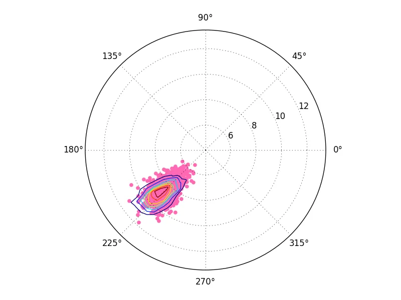
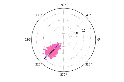
然而,当我尝试将我的代码转换为极坐标时,轮廓线变得扭曲了。下面是我的代码和生成的(错误)输出:
# Case with polar coordinates; the contour lines are distorted

np.random.seed(2015)
N = 1000
shift_value = -6.

def CartesianToPolar(x,y):
    r = np.sqrt(x**2 + y**2)
    theta = np.arctan2(y,x)

    return theta, r

x2 = np.random.randn(N) + shift_value
y2 = np.random.randn(N) + shift_value

theta2, r2 = CartesianToPolar(x2,y2)

fig2 = pl.figure()
ax2 = pl.subplot(projection="polar")
ax2.scatter(theta2, r2, color='hotpink')

H, xedges, yedges = np.histogram2d(x2,y2)


theta_edges, r_edges = CartesianToPolar(xedges[:-1],yedges[:-1])
ax2.contour(theta_edges, r_edges,H)
这里是错误输出:
有没有办法让等高线在正确的比例尺下显示?
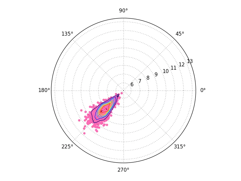
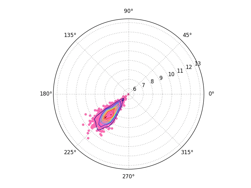
编辑以回应评论中提出的建议。
编辑2:有人建议这个问题可能是这个问题的重复。虽然我认识到这些问题很相似,但我的问题特别涉及将点的密度等高线绘制在散点图上。另一个问题是关于如何绘制与点坐标一起指定的任何量的等高线级别的。