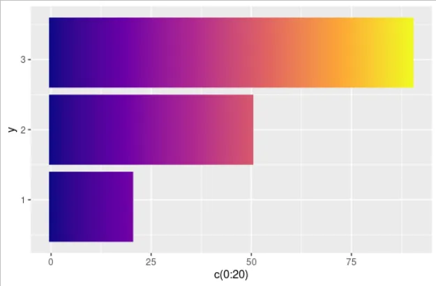
使用这个数据:
df <- data.frame(value =c(20, 50, 90),
                 group = c(1, 2,3))
我可以得到一个条形图:
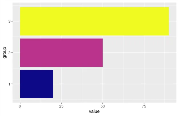
df %>% ggplot(aes(x = group, y = value, fill = value)) +
  geom_col() +
  coord_flip()+
  scale_fill_viridis_c(option = "C") +
  theme(legend.position = "none")
但我希望这些条形图的颜色能根据它们对应的value值变化。
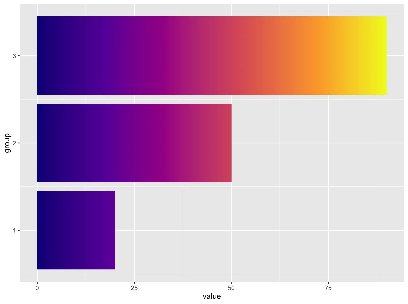
我已经使用geom_raster成功地改变了它们的颜色:
ggplot() +
  geom_raster(aes(x = c(0:20), y = .9, fill = c(0:20)),
              interpolate = TRUE) +
  geom_raster(aes(x = c(0:50), y = 2, fill = c(0:50)),
              interpolate = TRUE) +
  geom_raster(aes(x = c(0:90), y = 3.1, fill = c(0:90)),
              interpolate = TRUE) +
  scale_fill_viridis_c(option = "C") +
  theme(legend.position = "none")
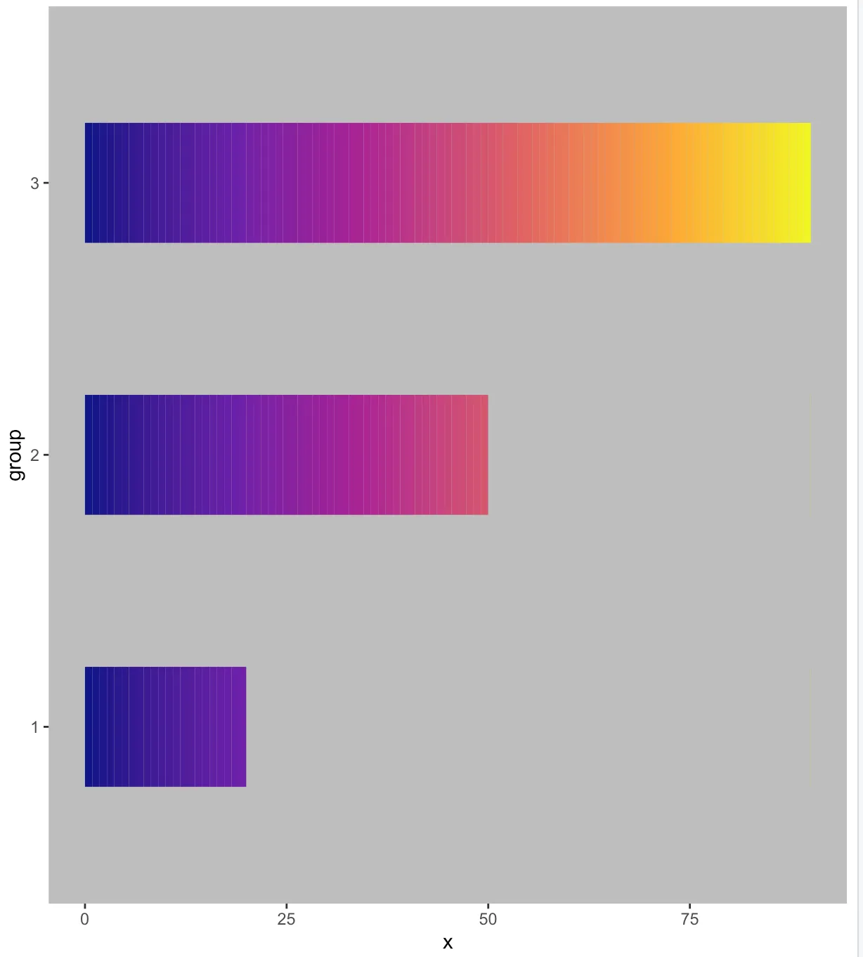
我找到了以前类似问题的被接受答案, 但是"这些数字需要根据x值和y范围进行调整"。我正在寻找一种不需要根据数据调整数字的方法。David Gibson的答案符合我的目的。