改变geom_ribbon的填充颜色

3

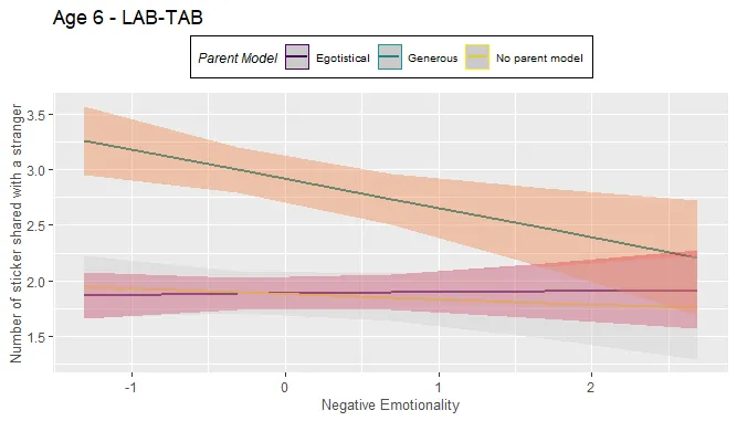
我有一个混合效应线性模型,并且想使用sjPlot包来绘制它。我已经添加了一个geom-ribbon层来显示每个回归线的置信区间,但是我不知道如何更改它的填充颜色。理想情况下,我希望每个ribbon的颜色与其对应的回归线相同。

以下是我的模型代码:

model <- lme(no_stickers_gave_stranger ~ s_negativeAff*parent_model,
             data = table4, random = ~1|ifam)

这里是绘图的代码:

plot_model(model = model, line.size = 0.71, type = "int",
           colors = sjplot_pal(palette = "metro"),
           axis.title = c("Negative Emotionality",
                          "Number of sticker shared with a stranger"),
           title = "Age 6 - LAB-TAB",
           legend.title = "Parent Model") +
  scale_fill_sjplot(palette = "metro", discrete = T) +
  geom_ribbon(aes(ymin = conf.low, ymax = conf.high), colour = NA, alpha = 0.25)

我能做的最好翻译如下:

我所能做的最好就是这样:

在此输入图片描述

1个回答

1
由于某种原因,在plot_model()中设置colors=并没有正常工作。解决方法是使用scale_color_sjplot()scale_color_manual(values=sjplot_pal())来设置颜色值,就像设置填充值一样。

奇怪的是,这两种方法都可以(匹配颜色和填充美学),但会给出不同的实际颜色。我不知道为什么,但这是如何匹配颜色和填充的方法。我正在使用sjplot网站上的vignettes示例数据集。
library(sjPlot)
library(ggplot2)
data(efc)

fit <- lm(barthtot ~ c12hour + neg_c_7 + c161sex + c172code, data = efc)
cols <- sjplot_pal(palette = "metro")

p <- plot_model(fit, type = "pred", terms = c("c161sex", "c12hour"))
p

enter image description here

只需添加 scale_fill_sjplot() 函数即可改变填充颜色:

p + scale_fill_sjplot()

enter image description here

添加 scale_color_sjplot() 可以解决这个问题:
p + scale_fill_sjplot() + scale_color_sjplot()

enter image description here

奇怪的是,如果我们使用scale_*_manual()函数并将sjplot_pal()作为values=的参考,我们会得到不同的颜色,但至少它们是匹配的:

p + scale_fill_manual(values=cols) + scale_color_manual(values=cols)

enter image description here

不了解 sjPlot 包和 plot_model() 的更多信息,我猜测颜色差异可能与该包将级别和颜色分配方式略有不同于 ggplot2 的默认方式(即按字母顺序或基于 levels() 如果您有一个因子)。


网页内容由stack overflow 提供, 点击上面的
可以查看英文原文,
原文链接