我希望有一个div区域,尽可能填满其父元素并保持比例。
渲染结果如下: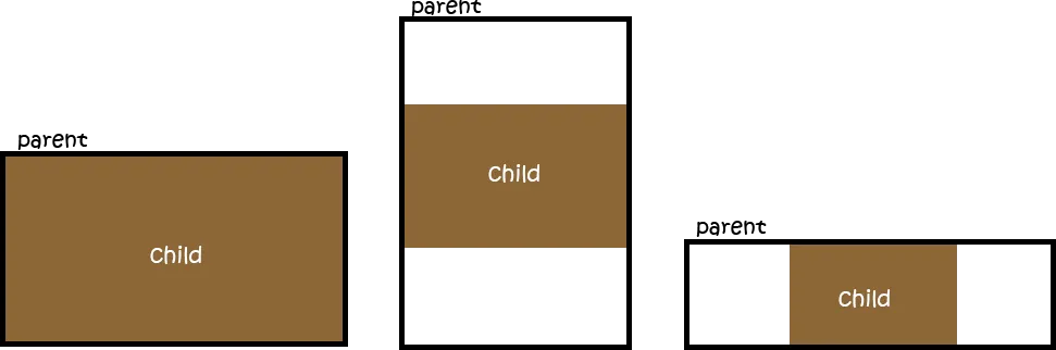 目前我的做法是:
渲染结果如下:
目前我的做法是:
html,
body {
  height: 100%;
}

.parent {
  /* Parent's height and width are unknown,
     it could be dynamic, e.g. parent is part of a flex layout. */
  height: 80%;
  width: 90%;
  border-style: solid;
  border-width: 2px;
  border-color: black;
}

.child {
  width: 90vw;
  /* 90% of viewport vidth */
  height: 50.625vw;
  /* ratio = 9/16 * 90 = 50.625 */
  max-height: 90vh;
  max-width: 160vh;
  /* 16/9 * 90 = 160 */
  margin: auto;
  position: absolute;
  top: 0;
  bottom: 0;
  left: 0;
  right: 0;
  background: #A0522D;
}<div class="parent">
<div class="child">
content that is not images...
</div>
</div>这个 CSS 的效果与我的期望一致,但是它使用了视口而非父元素 div,在实际情况中可能会出现问题。
我正在寻找一种基于父元素 div 来填充的方法。
position: relative;并删除顶部,底部,左侧和右侧定位。对于边距,您可能也要将其删除,除非您需要水平居中,然后使用margin 0 auto;。我现在有一些测试代码,父div为40%,子div为80%,它可以工作,并且我已经尝试了几个不同的百分比。除了这些更改之外,没有其他区别。 - Krik