我有一个保持长宽比的
元素:它根据其宽度计算其高度(使用填充技巧)。我想做的是将此
放入另一个
中,以适应可用的最大空间,垂直和水平,不剪裁。我认为最接近我想要的东西是
object-fit: contain - 仅适用于img。
我希望
覆盖可能的最大高度和宽度,同时保持长宽比。没有垂直或水平裁剪。
只使用CSS是否可能? 如果可以,如何实现?
更新: 一篇很好的文章,介绍了目前的情况。
代码(可以是任何其他解决方案,不必基于此片段构建):
html,
body {
  display: flex;
  justify-content: center;
  align-items: center;
  width: 100%;
  height: 100%;
}

.container {
  position: relative;
  width: 100%;
}

.container:before {
  content: "";
  display: block;
  width: 50%;
  padding-top: 50%;
}

.embed {
  position: absolute;
  top: 0;
  left: 0;
  width: 100%;
  height: 100%;
  background-color: red;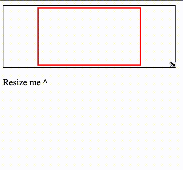
}<div class="container">
<div class="embed">
this should accommodate all the available space and maintain aspect ratio, no crop when width is too wide
</div>
</div>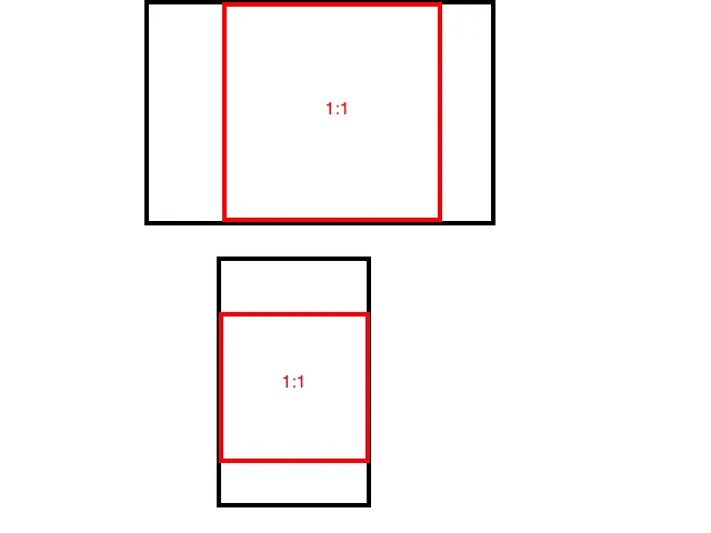
width:100%;吗? - Candy Crunch100%吗? - Adam