无论父元素的宽高比如何,保持div的宽高比并使其居中

6
我找到了这段CSS代码,可以让我保持div的宽高比。
.container {
  width: 100%;
  height: 100%;
  background-color: red;
  position: absolute;
 }


.wrapper {
  width: 100%;
  /* whatever width you want */
  display: inline-block;
  position: relative;
  top: 50%;
  transform: translate(0%, -50%);
}
.wrapper:after {
  padding-top: 56.25%;
  /* 16:9 ratio */
  display: block;
  content: '';
}
.main {
  position: absolute;
  top: 0;
  bottom: 0;
  right: 0;
  left: 0;
 /* fill parent */
  background-color: deepskyblue;
  /* let's see it! */
  color: white;
}

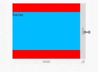
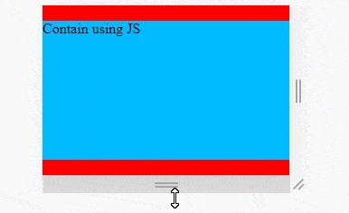
请参考此JSFiddle示例:https://jsfiddle.net/1uyo07tg/3/ 我希望使用纯CSS的方法(不使用VW或VH)来保持这个宽高比,即使父元素比这个宽高比(在这种情况下是16:9)更宽。
换句话说,我希望蓝色的div即使父元素(.container)被拉伸到比16:9更宽时也能保持16:9的比例。
澄清一下 - 我希望有一些纯CSS的解决方案,使子div始终保持固定的比例,垂直和水平居中,不管父div的大小或宽高比如何,而且不能使用vw,vh。我很确定这需要JS代码(我已经有了),但只是想看看是否有人有一个纯CSS的巧妙技巧。
底线 - 寻找仅使用CSS实现功能,不使用vh或vw。
希望这样讲清楚了。 有什么想法吗?
提前感谢, Sa'ar

为什么不在蓝色容器的上方和下方使用2个div并使它们永久存在?因为您所要求的与纵横比的概念相冲突。 - Aslam
更新了问题并进行了澄清。 - Saariko
你能和我们分享一下你的JS解决方案吗?这会让事情更加清晰。 - Aslam
1
请查看此链接:https://jsfiddle.net/vmx6281f/ - Saariko
1
我有完全相同的问题,我认为这个问题没有纯CSS的解决方案。 - TeeJaay
2个回答

11

使用CSS "contain" 为元素保留宽高比

CSS contain with aspect ratio for elements

  • 在父元素上使用居中内容的 CSS flex
  • 使用aspect-ratio CSS 属性。
  • 使用 :after 元素来强制保持盒子的初始宽高比状态

/* QuickReset */ * { margin: 0; box-sizing: border-box; }

#parent {
  /* This can be just any element with responsive W/H */
  min-height: 100vh;
  background-color: red;
  position: relative;
}

#aspectRatio {
  background-color: #0bf;
  position: absolute;
  margin: auto;
  left: 0;
  right: 0;
  top: 0;
  bottom: 0;
  max-width: 100%;
  max-height: 100%;
  aspect-ratio: 16 / 9;
}
<div id="parent">
  <div id="aspectRatio">Lorem</div>
</div>

这里是另一个例子固定页头和页脚,保持宽高比的主体

JavaScript解决方案:

这里提供了JavaScript实现,如果您对细节和计算感兴趣:

JS包含带有元素宽高比

const contain = (EL, rx, ry) => {
  // We need to rely on JS since Firefox is still experimental with aspect-ratio
  // https://dev59.com/w5zha4cB1Zd3GeqPIq7R#66721382

  const scale = 1.0; // 1 = max parent size. 0.8 = scale down
  const margin = 0;  // PX gutter around the box

  rx *= scale;
  ry *= scale;
  const parent = EL.parentElement;
  const pw = parent.offsetWidth * scale - margin;
  const ph = parent.offsetHeight * scale - margin;
  // If H should apply instead of W and vice versa
  const isSwap = pw / ph > rx / ry;
  const w = isSwap ? (ph / ry) * rx : pw;
  const h = isSwap ? ph : (pw / rx) * ry;
  EL.style.cssText = `width: ${w}px; height: ${h}px;`;
};


const ELS_aspectRatio = document.querySelectorAll(".ar-box");
const applyContain = () => ELS_aspectRatio.forEach(EL => contain(EL, 16, 9));

window.addEventListener("resize", applyContain);
applyContain();
* { margin: 0; box-sizing: border-box; }

/* DEMO ONLY: This can be any responsive parent with any responsive unit! */
#parent { 
  width: 100vw;
  height: 100vh;
  background-color: red;
  display: flex;
  justify-content: center;
  align-items: center;
}

.ar-box {
  background-color: #0bf;
}
<div id="parent">
  <div class="ar-box">Contain using JS</div>
</div>


这对我非常有效。谢谢你。我想知道是否能详细说明如何使用粘性页脚完成CSS解决方案? https://dev59.com/HnANtIcB2Jgan1znw4A0 - goodson

-1
body,html {
  margin: 0;
  height: 100%;
  width: 100%;
}
.container {
  width: 100%;
  height: 100%;
  background-color: red;
  overflow: hidden;
}     
.wrapper {
  width: 100%;
  max-width: calc(100vh / 0.5625);
  padding-top: 56.25%;
  top: 50%;
  left: 50%;
  transform: translate(-50%, -50%);
  background-color: deepskyblue;
}

.main 甚至不必要


非常感谢。我在问题中忘记提到:没有VH或VW。如果没有它,还有可能吗? - Saariko
抱歉,我做不到。没有 VH,我无法将窗口高度与其宽度进行比较,这意味着很难确认 BODY 是否始终可以包含包装盒。 - Chibiao.Wang
一个带有背景图像(16:9比例)的背景,使用background-size:contain和background-position:50%怎么样? - Chibiao.Wang
谢谢,但我需要子div成为一个容器,而不仅仅是一个图片。我已经更新了问题并进行了澄清。 - Saariko

网页内容由stack overflow 提供, 点击上面的
可以查看英文原文,
原文链接