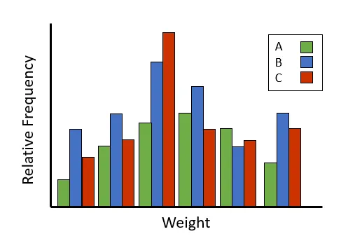
我想获取人们体重的相对频率,基于一个类别标签,然后将其作为条形图进行绘制,看起来类似于这样:
数据框的样式如下:
Weight   Category
83.8     A
87.3     A
75.1     B
70.9     A
69.8     C
75.5     B
...      ...
我考虑将每个类别的权重提取到自己的数据框中,并成功地获得了一个类别的相对频率,但我不确定如何将它们全部绘制在一起。
# This holds the total number of people in each category, with categories in alphabetical order
counts = df.groupby("Category")["Weight"].count()

catA = df.loc[df["Category"] == "A"]["Weight"].reset_index().drop(columns="index")
catA["bucket"] = pd.cut(catA["Weight"], 10)

newA = catA[["bucket", "Weight"]].groupby("bucket").count()
newE["relative"] = newE["Weight"] / counts[0]

ax = newA["relative"].plot(kind="bar", title="Relative Frequency of Weight for Category A")
ax.set(xlabel="Weight Bucket", ylabel="Relative Frequency (%)")
ax.tick_params(axis="x", labelrotation=45)
plt.show()