这是我目前针对上述图片的代码:
我希望将每个x轴刻度标签中的“G”和“S”变为下标(它们表示两个不同组的样本量,G和S)。
写作
ggplot(AllData, aes(Year, AGResiduals, fill=Type)) +
geom_boxplot(outlier.size=0) +
scale_fill_manual(values=c("skyblue4", "skyblue"),
name="Male Type",
labels=c("Guarders","Sneakers")) +
labs(x=NULL, y = "Residual of Accessory Gland Mass x Total Mass") +
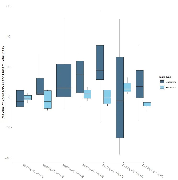
scale_x_discrete(limits=c("2007","2008","2010","2011","2013","2014","2015"),
labels=str_wrap(c("2007 (nG=37, nS=8)","2008 (nG=4, nS=6)","2010 (nG=31, nS=6)","2011 (nG=55, nS=5)","2013 (nG=202, nS=24)","2014 (nG=63)","2015 (nG=59, nS=3)"),
width=6)) +
theme(plot.title = element_text(size = rel(1.4)),
axis.title = element_text(size = rel(1.2)),
axis.text.x = element_text(size = rel(1.5)),
axis.text.y = element_text(size = rel(1.5)),
panel.grid.major = element_blank(),
panel.grid.minor = element_blank(),
panel.background = element_blank(),
axis.line = element_line(colour = "black"))
我希望将每个x轴刻度标签中的“G”和“S”变为下标(它们表示两个不同组的样本量,G和S)。
写作
expression(2007 (n[G]=37, n[S]=8)
如果我删除前面的内容,这个功能可以工作。
str_wrap
因为某种原因需要编写代码。
我需要限制每个x轴刻度标签的文本宽度,因此需要保留str_wrap或在表达式函数中使用换行符。
我还不能用因为我必须设置要显示的年份范围,所以不能用我的标签列表替换成因子。
请有人帮忙解决如何制作一个允许下标的3行x轴刻度标签?
fmts <- rep("atop(%s,(n[G]==%d) ~ (n[S]==%d))",nrow(sdf)),您可以得到两行,但我无法得到第三行。如果将波浪号替换为逗号,则第三行会消失。此外,我必须调用 ggplot 两次才能绘制图形,否则会出现错误,但第二次就可以正常工作。非常挑剔。@baptiste 可能知道。 - rawr