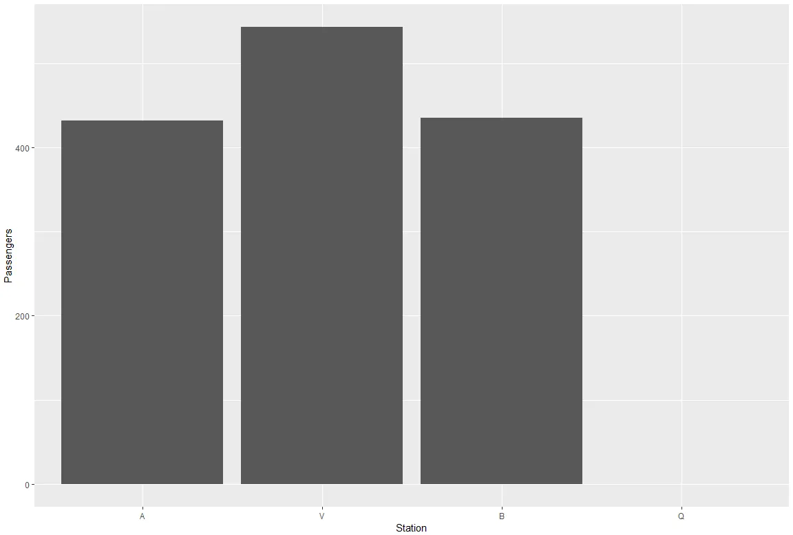
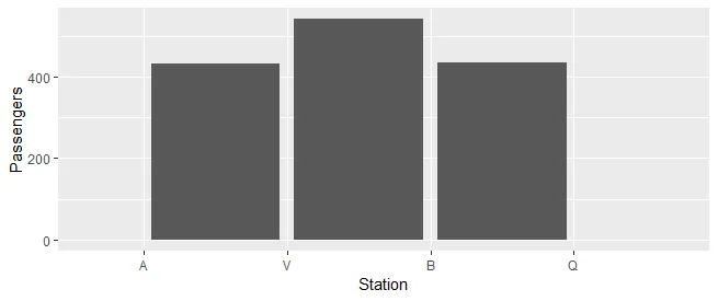
我需要可视化的数据包含了4个车站之间的乘客负载。数据是按顺序提供的,例如,在A站和V站之间有432名乘客在火车上,在V站和B站之间有543名乘客等等。在编程示例中,我使用ggplot2绘制了这些数据。
library(tidyverse)

df <- tribble(~Station, ~Passengers,
              "A", 432,
              "V", 543,
              "B", 435,
              "Q", 0)

df$Station <- factor(df$Station, levels=unique(df$Station))

ggplot(data = df, aes(x = Station, y = Passengers)) +
  geom_bar(stat = "identity")