我希望你能帮助我,因为我已经迷失了方向。
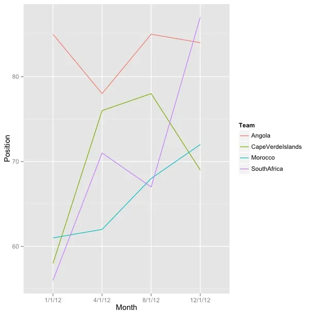
我正在尝试创建一条折线图,显示几个团队一年的表现。我将这一年分成四个季度:2012年1月1日、2012年4月1日、2012年8月1日和2012年12月1日,并将csv数据框加载到R中。
     Month               Team Position
1   1/1/12       South Africa       56
2   1/1/12             Angola       85
3   1/1/12            Morocco       61
4   1/1/12 Cape Verde Islands       58
5   4/1/12       South Africa       71
6   4/1/12             Angola       78
7   4/1/12            Morocco       62
8   4/1/12 Cape Verde Islands       76
9   8/1/12       South Africa       67
10  8/1/12             Angola       85
11  8/1/12            Morocco       68
12  8/1/12 Cape Verde Islands       78
13 12/1/12       South Africa       87
14 12/1/12             Angola       84
15 12/1/12            Morocco       72
16 12/1/12 Cape Verde Islands       69
当我尝试使用ggplot2生成图表时,第四季度12/1/12不可解地移动到了第二个位置。
ggplot(groupA, aes(x=Month, y=Position, colour=Team, group=Team)) + geom_line()
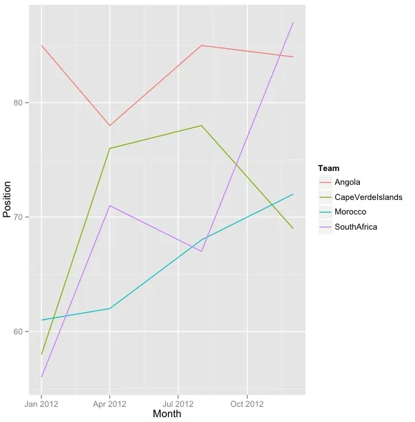
我将这个绘图放入一个名为GA的变量中,以尝试使用scale_x格式化日期:
GA + scale_x_date(labels = date_format("%m/%d"))
但是我一直收到这个错误提示:
Error in structure(list(call = match.call(), aesthetics = aesthetics, :
无法找到函数"date_format"
如果运行以下代码:
GA + scale_x_date()
I get this error:
Error: Invalid input: date_trans works with objects of class Date only
我正在使用运行R 2.15.2的Mac OS X操作系统。请帮忙。