我有一些时间序列数据,想要预测明天的现货价格。我的数据长这样: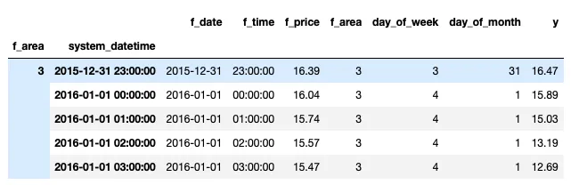
我对f_area进行了分组,得到了多级索引。现在我正在尝试使用RandomForestRegressor进行预测。
from sklearn.model_selection import train_test_split
from sklearn.ensemble import RandomForestRegressor
from sklearn.metrics import mean_squared_error

y = area3['y'].values
X = area3[['f_price', 'day_of_week', 'day_of_month']]
X_train, X_test, y_train, y_test = train_test_split(X, y, test_size=0.20, random_state=42)

model = RandomForestRegressor()
model = model.fit(X_train, y_train)
y_pred = model.predict(X_test)
现在,当我尝试绘制y_test(实际值)和y_pred(预测值)时。
fig, ax = plt.subplots()
ax.plot(y_test)
ax.plot(y_pred)
我得到了这张图表。
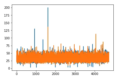 我想要的是在X轴上显示日期,但由于有多重索引,我无法实现。该怎么办才能添加日期或者移除多重索引呢?我尝试使用reset_index来移除多重索引,但在我的情况下无法生效。谢谢。