我正在使用基础图形叠加两个条形图(因为它们具有不同的比例尺,到目前为止在ggplot上做这件事情一直是一场噩梦)来展示以下数据:
这是我绘制图形的代码:
当我运行这段代码时,x轴比数据短。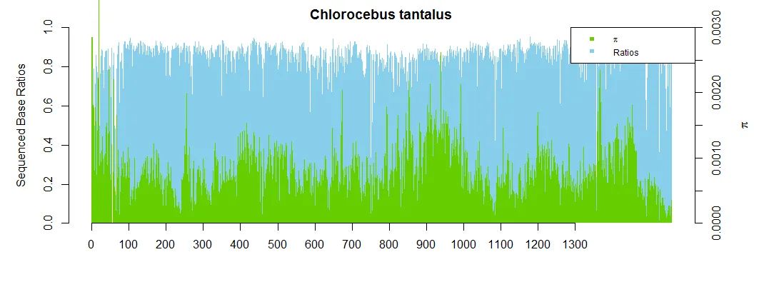 如果我在第一个图中指定
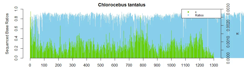 有人知道为什么会发生这种情况以及如何解决吗?我猜可能与par值有关,但我需要这些值才能为右侧绘制的轴留出空间。提前感谢!
> str(pidf)
'data.frame':   1300 obs. of  7 variables:
$ spec1  : num  0.00192 0.00213 0.00151 0.00234 0.00133 ...
$ spec2  : num  0.00241 0.00278 0.00189 0.00264 0.00155 ...
$ spec3  : num  0.00231 0.00262 0.00187 0.00274 0.00165 ...
$ spec4  : num  0.00209 0.0026 0.00166 0.00225 0.00165 ...
$ spec5  : num  0.0025 0.00285 0.00188 0.00285 0.00181 ...
$ numbers: int  1 2 3 4 5 6 7 8 9 10 ...
$ ratios : num  0.59 0.642 0.544 0.625 0.567 ...
这是我绘制图形的代码:
par(mar = c(5,5,2,5))
barplot(pidf$ratios, col = "skyblue", ylim = c(0, 1),
ylab = "Sequenced Base Ratios", border = NA, main = "Chlorocebus tantalus")
axis(1, at = round(seq(0, 1300, 100)))
par(new = T)
barplot(pidf$spec5, col = "chartreuse3", border = NA, ylim = c(0, 0.003),
    axes = F, xlab = NA, ylab = NA)
axis(side = 4)
mtext(side = 4, line = 3, expression(pi))
legend("topright", legend=c(expression(pi), "Ratios"), cex = 0.75,
    pch=c(15, 15), col=c("chartreuse3", "skyblue"))
当我运行这段代码时,x轴比数据短。
如果我在第一个图中指定xlim = c(1,1300),那么我得到的结果是这样的:
有人知道为什么会发生这种情况以及如何解决吗?我猜可能与par值有关,但我需要这些值才能为右侧绘制的轴留出空间。提前感谢!