我想在时间轴上叠加一个图表。以下是我的数据:
 Flight_No Dest      Date  Time STD.60 STD.45      Date2          start       end
1    ab0729  KP 14-Oct-13 00:05      1      0 2013-10-14 2013-10-14 00:05:00 2013-10-14 00:20:00
2    ab8063  KI 14-Oct-13 00:20      0      3 2013-10-14 2013-10-14 00:20:00 2013-10-14 00:35:00
3    ab0337  ST 14-Oct-13 00:30      1      0 2013-10-14 2013-10-14 00:30:00 2013-10-14 00:45:00
以下是绘制图形的代码示例:
data$Total<-data$STD.60+data$STD.45
ggplot(data,aes(x=start,y=Total,xmin=start,xmax=end,ymin=0,ymax=Total,alpha=0,fill=factor(Dest)))+geom_rect()
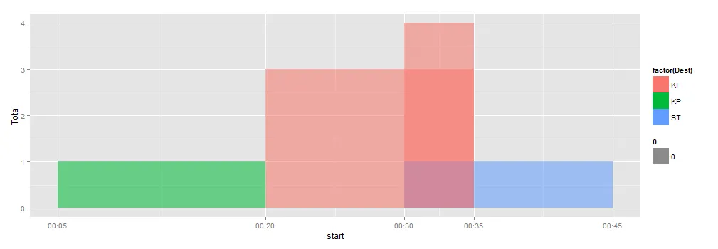
上面的代码生成了这个图表:
 但是,我想在有重叠的情况下将这些矩形堆叠起来。 例如,在00:30到00:35之间,y轴的值应该显示为4而不是3。
请帮忙解决。