我应该选择哪种最佳选项来使用高级编程语言(如Ruby或Python)创建财务开高低收(OHLC)图表?尽管似乎有许多绘图选项,但我没有看到任何可以生成这种类型图表的宝石(Ruby)或Egg(Python)。
http://en.wikipedia.org/wiki/Open-high-low-close_chart (但我不需要移动平均线或布林带)
JFreeChart可以在Java中完成此操作,但我想让我的代码库尽可能小和简单。
谢谢!
bottom。然后,你可以使用线图plot来表示开盘价和收盘价:#!/usr/bin/env python
import numpy as np
import matplotlib.pyplot as plt
from matplotlib import lines
import random
deltas = [4, 6, 13, 18, 15, 14, 10, 13, 9, 6, 15, 9, 6, 1, 1, 2, 4, 4, 4, 4, 10, 11, 16, 17, 12, 10, 12, 15, 17, 16, 11, 10, 9, 9, 7, 10, 7, 16, 8, 12, 10, 14, 10, 15, 15, 16, 12, 8, 15, 16]
bases = [46, 49, 45, 45, 44, 49, 51, 52, 56, 58, 53, 57, 62, 63, 68, 66, 65, 66, 63, 63, 62, 61, 61, 57, 61, 64, 63, 58, 56, 56, 56, 60, 59, 54, 57, 54, 54, 50, 53, 51, 48, 43, 42, 38, 37, 39, 44, 49, 47, 43]
def rand_pt(bases, deltas):
return [random.randint(base, base + delta) for base, delta in zip(bases, deltas)]
# randomly assign opening and closing prices
openings = rand_pt(bases, deltas)
closings = rand_pt(bases, deltas)
# First we draw the bars which show the high and low prices
# bottom holds the low price while deltas holds the difference
# between high and low.
width = 0
ax = plt.axes()
rects1 = ax.bar(np.arange(50), deltas, width, color='r', bottom=bases)
# Now draw the ticks indicating the opening and closing price
for opening, closing, bar in zip(openings, closings, rects1):
x, w = bar.get_x(), 0.2
args = {
}
ax.plot((x - w, x), (opening, opening), **args)
ax.plot((x, x + w), (closing, closing), **args)
plt.show()
生成如下图所示的绘图:
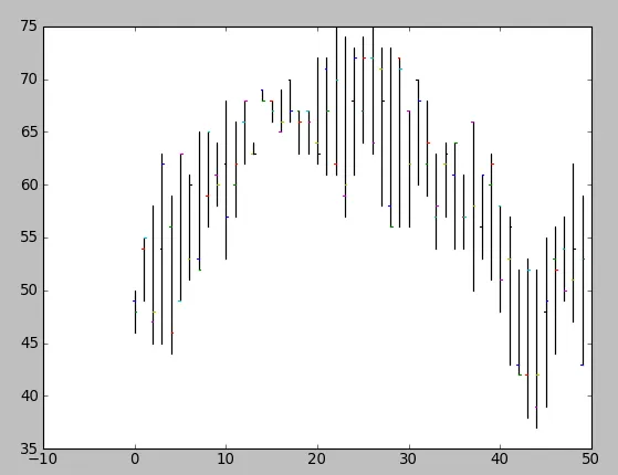
显然,你需要将这个过程封装成一个函数,使用 (open, close, min, max) 元组绘制图形(并且你可能不希望随机分配开盘和收盘价格)。
matplotlib.finance)进行操作。以下是一些示例:http://matplotlib.sourceforge.net/examples/pylab_examples/plotfile_demo.html。对于这个问题,Beginning Python Visualization中有一些很好的材料。
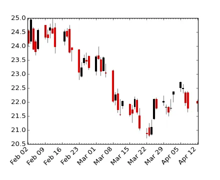
更新:我认为您可以使用matplotlib.finance.candlestick来实现日本蜡烛图效果。
在这里可以找到一些使用matplotlib绘制财务图表(OHLC)的示例:
#!/usr/bin/env python
from pylab import *
from matplotlib.dates import  DateFormatter, WeekdayLocator, HourLocator, \
     DayLocator, MONDAY
from matplotlib.finance import quotes_historical_yahoo, candlestick,\
     plot_day_summary, candlestick2

# (Year, month, day) tuples suffice as args for quotes_historical_yahoo
date1 = ( 2004, 2, 1)
date2 = ( 2004, 4, 12 )


mondays = WeekdayLocator(MONDAY)        # major ticks on the mondays
alldays    = DayLocator()              # minor ticks on the days
weekFormatter = DateFormatter('%b %d')  # Eg, Jan 12
dayFormatter = DateFormatter('%d')      # Eg, 12

quotes = quotes_historical_yahoo('INTC', date1, date2)
if len(quotes) == 0:
    raise SystemExit

fig = figure()
fig.subplots_adjust(bottom=0.2)
ax = fig.add_subplot(111)
ax.xaxis.set_major_locator(mondays)
ax.xaxis.set_minor_locator(alldays)
ax.xaxis.set_major_formatter(weekFormatter)
#ax.xaxis.set_minor_formatter(dayFormatter)

#plot_day_summary(ax, quotes, ticksize=3)
candlestick(ax, quotes, width=0.6)

ax.xaxis_date()
ax.autoscale_view()
setp( gca().get_xticklabels(), rotation=45, horizontalalignment='right')

show()
你可以自由地使用JRuby来代替Ruby吗?这样可以让你使用JFreeChart,同时你的代码仍然是用Ruby编写的。
如果你喜欢示例的外观,那么Open Flash Chart是一个不错的选择。但我已经转向像Flot这样的JavaScript/Canvas库来制作HTML嵌入式图表,因为它更加可定制,而且我可以在不进行太多修改的情况下获得所需的效果(http://itprolife.worona.eu/2009/08/scatter-chart-library-moving-to-flot.html)。