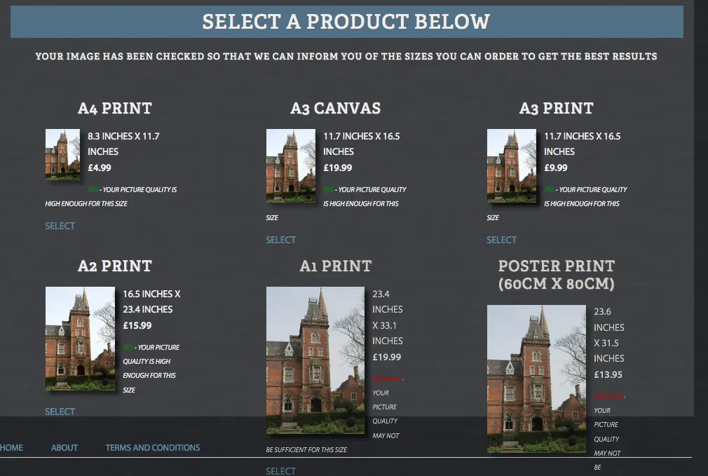
目前遇到一些DIV重叠其包含的DIV的问题。请参见下面的图像(底部的3个产品):
页面的所有正文内容都位于#content DIV中:
div#content {
    width: 960px;
    float: left;
    background-image: url("../img/contentBg.png");
    background-repeat: repeat;
    margin-top: 10px;
    line-height: 1.8em;
    border-top: 8px solid #5E88A2;
    padding: 10px 15px 10px 15px;
}
以下是位于#content div内的产品框的CSS:
.upper {
    text-transform: uppercase;
}
.center {
    text-align: center;
}
div#products {
    float: left;
    width: 100%;
    margin-bottom: 25px;
}
div.productContainer {
    float: left;
    width: 265px;
    font-size: 1em;
    margin-left: 50px;
    height: 200px;
    padding-top: 25px;
    text-align: right;
}

div.product {
    float: left;
    width: 200px;
}
div.product p {
}
div.product a {
    display: block;
}
div.product img {
    float: left;
}
div.product img:hover {
    opacity: 0.8;
    filter: alpha(opacity = 80);
}
div.transparent {
    opacity: 0.8;
    filter: alpha(opacity = 80);
}
这里是盒子的HTML代码:
<div class="productContainer">
<div class="product">
<h2 class="upper center">A2 Print</h2>
<a href='../edit/?productId=5&align=v' class='upper'> <img src="../../wflow/tmp/133703b808c91b8ec7e7c7cdf19320b7A2-Print.png" alt="Representation of image printed at A2 Print through Website." /></a>
<p class="upper">16.5 inches x 23.4 inches<br /><strong>£15.99</strong></p>
<p class="upper smaller"><em><span><span class="yes">Yes</span> - your picture quality is high enough for this size</span> </em></p>
<p><a href='../edit/?productId=5&align=v' class='upper'><span>Select</span></a></p>
</div>
</div>
<div class="productContainer">
<div class="product transparent">
<h2 class="upper center">A1 Print</h2>
<a href='../edit/?productId=11&align=v' class='upper'> <img src="../../wflow/tmp/133703b808c91b8ec7e7c7cdf19320b7A1-Print.png" alt="Representation of image printed at A1 Print through Website." /></a>
<p class="upper">23.4 inches x 33.1 inches<br /><strong>£19.99</strong></p>
<p class="upper smaller"><em><span><span class="no">Warning</span> - your picture quality may not be sufficient for this size</span> </em></p>
<p><a href='../edit/?productId=11&align=v' class='upper'><span>Select</span></a></p>
</div>
</div>
<div class="productContainer">
<div class="product transparent">
<h2 class="upper center">Poster Print (60cm x 80cm)</h2>
<a href='../edit/?productId=12&align=v' class='upper'> <img src="../../wflow/tmp/133703b808c91b8ec7e7c7cdf19320b7Poster-Print-(60cm-x-80cm).png" alt="Representation of image printed at Poster Print (60cm x 80cm) through Website." /></a>
<p class="upper">23.6 inches x 31.5 inches<br /><strong>£13.95</strong></p>
<p class="upper smaller"><em><span><span class="no">Warning</span> - your picture quality may not be sufficient for this size</span> </em></p>
<p><a href='../edit/?productId=12&align=v' class='upper'><span>Select</span></a></p>
</div>
</div>
这些DIV重叠的原因是什么?我希望所有的盒子都能如预期地适合#container div中。这让我发疯了!
谢谢