我想要做的是创建一个界面,根据背景颜色改变颜色,使文本始终可读。到目前为止一切都运作良好。我已经录制了我的浏览器以展示一个工作示例:
最初我想提供演示,但是
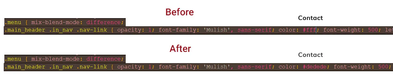
无论如何,这里有一张图片(来自浏览器截图的部分):
我知道这很愚蠢,但是当我尝试在Photoshop中重新创建相同的效果时,一切都很好,这意味着使用
我的问题是:一个人能否获得相同的结果而不会使字体变粗(?)或者可能是它的工作方式就是这样,我无能为力?
我不想改变字体样式以强制获得不同的外观。
编辑:好的,这里是一个快速的例子 - 我不知道为什么,但这次它奏效了。上次
无论如何,左侧和右侧的文本都没有使用

mix-blend-mode: difference;。唯一的问题是出现了某些未知原因导致文本加粗的情况。最初我想提供演示,但是
mix-blend-mode在代码片段中无法工作。我不太确定为什么,我看到其他人在演示中使用它,但对我来说,它被突出显示为红色。无论如何,这里有一张图片(来自浏览器截图的部分):
mix-blend-mode: difference;后,文本明显变粗。也许这不是什么大问题,但是当我将其应用于较小的文本时,它看起来真的很糟糕。我知道这很愚蠢,但是当我尝试在Photoshop中重新创建相同的效果时,一切都很好,这意味着使用
difference混合模式颠倒颜色是正确的。我的问题是:一个人能否获得相同的结果而不会使字体变粗(?)或者可能是它的工作方式就是这样,我无能为力?
我不想改变字体样式以强制获得不同的外观。
编辑:好的,这里是一个快速的例子 - 我不知道为什么,但这次它奏效了。上次
mix-blend-mode: difference;在演示中根本不起作用,这就是为什么我使用图像来描述我的问题的原因。无论如何,左侧和右侧的文本都没有使用
mix-blend-mode: difference;,以便能够看到差异。奇怪的是,没有使用mix-blend-mode: difference;的白色版本似乎看起来还不错 - 我通过在黑色背景上添加版本来发现这一点。
* {
  margin: 0;
  padding: 0;
}
.white {
  background-color: #fff;
  width: 50%;
  position: absolute;
  left: 0;
  height: 100%;
}
.black {
  background-color: #000;
  width: 50%;
  position: absolute;
  right: 0;
  height: 100%;
}
.normalb {
  position: absolute;
  top: 50%;
  left: 5%;
  color: #000;
  font-family: 'Roboto', sans-serif;
  font-weight: normal;
  font-size: 42px;
  transform: translateY(-50%);
  z-index: 10;
}
.normalw {
  position: absolute;
  top: 50%;
  right: 5%;
  color: #fff;
  font-family: 'Roboto', sans-serif;
  font-weight: normal;
  font-size: 42px;
  transform: translateY(-50%);
  z-index: 10;
}
.difference {
  position: absolute;
  top: 50%;
  left: 50%;
  transform: translate(-50%,-50%);
  color: #fff;
  font-family: 'Roboto', sans-serif;
  font-weight: normal;
  font-size: 42px;
  mix-blend-mode: difference;
  z-index: 10;
}<div class="white"></div>
<div class="black"></div>
<div class="normalb">example</div>
<div class="normalw">example</div>
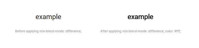
<div class="difference">example</div>这里是一张截图的快速比较,以便更近距离地查看:

嗯...看起来在白色文本上应用mix-blend-mode: difference;后,它被呈现为白底黑字的形式,但在白色背景下,这很奇怪,因为字体保持不变,所以通过颜色反转,它应该看起来像正常的黑底白字版本,但它并没有。我很困惑。