使用ggplot2创建计数频率的直方图

3
假设我有以下数据框:
d = data.frame(letter = c(
    'a', 'a', 'a', 
    'b', 'b', 'b', 
    'c',
    'd', 'd', 'd', 'd',
    'e', 'e', 
    'f', 'f', 'f', 'f', 'f', 'f', 'f',
    'g'))

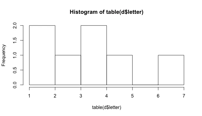
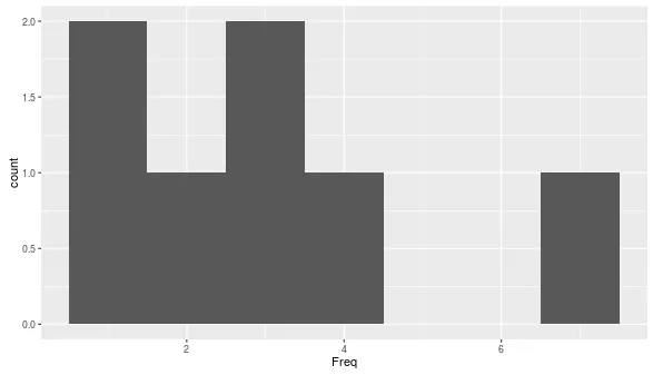
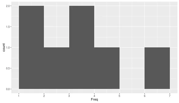
我该如何使用ggplot2制作直方图,而不是计算给定字母出现的次数,而是计算给定字母频率出现的次数? 在这个例子中:

table(d$letter)

a b c d e f g 
3 3 1 4 2 7 1 

两个字母(c和g)各出现一次,一个字母(e)出现两次,两个字母出现三次等。这样,您可以制作与基础图相当的图形:

hist(table(d$letter), right = F, breaks = 6)

base histogram

1个回答

4
你可以将table的结果转换为数据框,然后使用ggplot
df <- as.data.frame(table(d$letter))
ggplot(df, aes(x = Freq)) +
    geom_histogram(binwidth = 1)

enter image description here

这能够起作用是因为包含频率的列默认被称为 Freq
head(df)
##   Var1 Freq
## 1    a    3
## 2    b    3
## 3    c    1
## 4    d    4
## 5    e    2
## 6    f    7

如果您希望将条形图放置在整数数字之间,可以使用center = 0.5将柱形居中于半个整数。我还使用了closed = "left",它等价于在hist()中设置right = FALSE
ggplot(df, aes(x = Freq)) +
  geom_histogram(binwidth = 1, center = 0.5, closed = "left") +
  scale_x_continuous(breaks = 1:7)

enter image description here


网页内容由stack overflow 提供, 点击上面的
可以查看英文原文,
原文链接