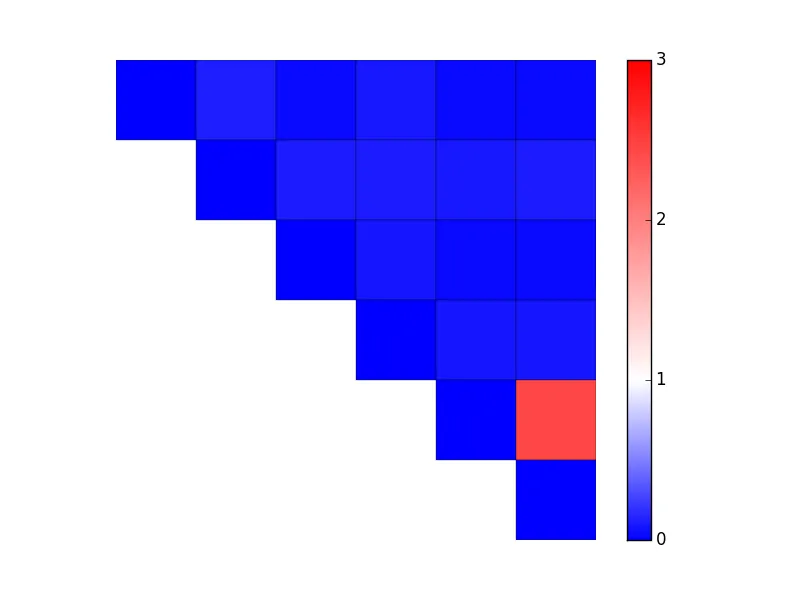
我有一张用matplotlib显示的图片。
这张图片是通过以下代码生成的:
我想应用自定义色图,使值:
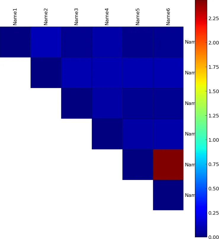
这张图片是通过以下代码生成的:
import numpy as np
import matplotlib.pyplot as plt
from matplotlib import cm


labels = ['Name1', 'Name2', 'Name3', 'Name4', 'Name5', 'Name6']

data = np.array(
 [[ 0.000, 0.120, 0.043, 0.094, 0.037, 0.045],
  [ 0.120, 0.000, 0.108, 0.107, 0.105, 0.108],
  [ 0.043, 0.108, 0.000, 0.083, 0.043, 0.042],
  [ 0.094, 0.107, 0.083, 0.000, 0.083, 0.089],
  [ 0.037, 0.105, 0.043, 0.083, 0.000, 2.440],
  [ 0.045, 0.108, 0.042, 0.089, 2.440, 0.000]])


mask =  np.tri(data.shape[0], k=-1)
data = np.ma.array(data, mask=mask) # Mask out the lower triangle of data.

fig, ax = plt.subplots(sharex=True)
im = ax.pcolor(data, edgecolors='black', linewidths=0.3)

# Format
fig = plt.gcf()
fig.set_size_inches(10, 10)

ax.set_yticks(np.arange(data.shape[0]) + 0.5, minor=False)
ax.set_xticks(np.arange(data.shape[1]) + 0.5, minor=False)

# Turn off the frame.
ax.set_frame_on(False)
ax.set_aspect('equal')  # Ensure heatmap cells are square.

# Want a more natural, table-like display.
ax.invert_yaxis()
ax.yaxis.tick_right()
ax.xaxis.tick_top()

ax.set_xticklabels(labels, minor=False)
ax.set_yticklabels(labels, minor=False)

# Rotate the upper labels.
plt.xticks(rotation=90)
ax.grid(False)
ax = plt.gca()

for t in ax.xaxis.get_major_ticks():
    t.tick1On = False
    t.tick2On = False
for t in ax.yaxis.get_major_ticks():
    t.tick1On = False
    t.tick2On = False

fig.colorbar(im)

fig.savefig('out.png', transparent=False, bbox_inches='tight', pad_inches=0)
我想应用自定义色图,使值:
- 在0-1之间的呈蓝白线性渐变
- 在1-3之间的呈白红线性渐变。