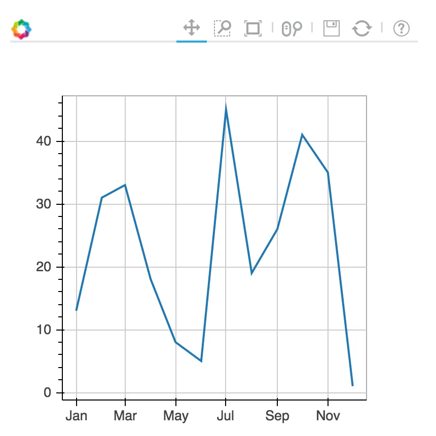
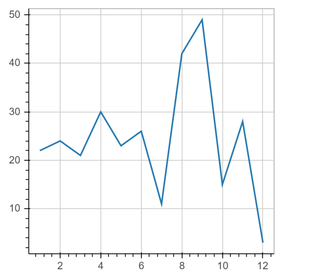
在Bokeh中使用月份作为X轴

4
假设我有以下数据:
import random
import pandas as pd
numbers = random.sample(range(1,50), 12)
d = {'month': range(1,13),'values':numbers}
df = pd.DataFrame(d)

我正在使用bokeh来可视化结果:

 p = figure(plot_width=400, plot_height=400)
 p.line(df['month'], df['values'], line_width=2)
 output_file('test.html')
 show(p)

enter image description here

结果还可以。我想让x轴表示一个月(1:一月,2:二月...)。我正在执行以下操作将数字转换为月份:
import datetime
df['month'] = [datetime.date(1900, x, 1).strftime('%B') for x in df['month']]
p = figure(plot_width=400, plot_height=400)
p.line(df['month'], df['values'], line_width=2)
show(p)

结果是一个空图。以下也不起作用:
p.xaxis.formatter = DatetimeTickFormatter(format="%B")

有什么办法能够越过它吗?

1个回答

7

您有两个选项:

您可以使用日期时间轴:

p = figure(plot_width=400, plot_height=400, x_axis_type='datetime')

请传递datetime对象或Unix(自纪元以来的秒数)时间戳值作为x值。

例如:df ['month'] = [datetime.date(1900,x,1)for x in df ['month']]

DatetimeTickFormatter将修改标签的格式(完整月份名称、数字月份等)。这些文档在此处:

http://docs.bokeh.org/en/latest/docs/reference/models/formatters.html#bokeh.models.formatters.DatetimeTickFormatter

第二点:

您可以使用类别型x轴,例如

p = figure(x_range=['Jan', 'Feb', 'Mar', ...)

与您的x_range相对应的绘图x值,例如:

x = ['Jan', 'Feb', 'Mar', ...]
y = [100, 200, 150, ...]
p.line(x, y)

用户指南涵盖了这里的分类轴:

http://docs.bokeh.org/en/latest/docs/user_guide/plotting.html#categorical-axes

这是一个例子:

Categorical Axis example


网页内容由stack overflow 提供, 点击上面的
可以查看英文原文,
原文链接