如何在图表中表示非常大和非常小的值

4

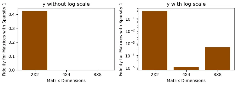
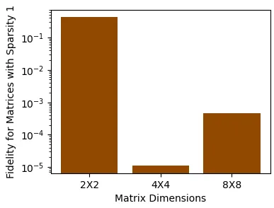
我需要在直方图中绘制3个值。其中一个值与其他值相比非常大。当我试图绘制它们时,由于该值过大,另外两个值在图表中无法显示。除了Python中的直方图之外,有没有其他方法在图表中说明它们?是否有缩放技巧来解决此问题?

下面给出的代码是我尝试过的。我使用了Python库numpy和matplotlib来绘制图表。

import numpy as np
import matplotlib.pyplot as plt

height = [0.422602, 0.000011, 0.000453]
bars = ('2X2', '4X4', '8X8')
y_pos = np.arange(len(bars))

plt.bar(y_pos, height, color = (0.572549,0.2862,0.0,1))
plt.xlabel('Matrix Dimensions')
plt.ylabel('Fidelity for Matrices with Sparsity 1')
plt.xticks(y_pos, bars)

plt.show()

在这里输入图片描述

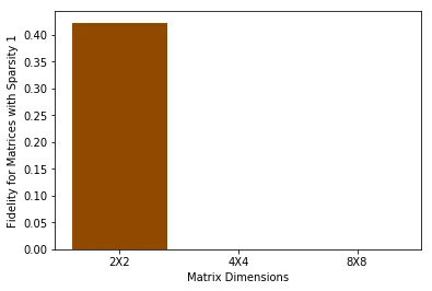
上面的图片是输出结果,但它没有显示另外两列的值。我该如何解决这个问题呢?

注:Original Answer 翻译成“最初的回答”

2个回答

8

导入和数据

import matplotlib.pyplot as plt
import numpy as np

height = [0.422602, 0.000011, 0.000453]
bars = ('2X2', '4X4', '8X8')
y_pos = np.arange(len(bars))

示例 1

fig, (ax1, ax2) = plt.subplots(1, 2, figsize=(8, 3))

ax1.bar(y_pos, height, color = (0.572549,0.2862,0.0,1))
ax1.set(xlabel='Matrix Dimensions', ylabel='Fidelity for Matrices with Sparsity 1', title='y without log scale')
ax1.set_xticks(y_pos)
ax1.set_xticklabels(bars)

ax2.bar(y_pos, height, color = (0.572549,0.2862,0.0,1))

# set yscale; can also use plt.yscale('log') or plt.yscale('symlog')
ax2.set(yscale='log', xlabel='Matrix Dimensions', ylabel='Fidelity for Matrices with Sparsity 1', title='y with log scale')
ax2.set_xticks(y_pos)
ax2.set_xticklabels(bars)

fig.tight_layout()
plt.show()

在此输入图片描述

例子2

plt.bar(y_pos, height, color = (0.572549,0.2862,0.0,1))
plt.yscale('log')
plt.xlabel('Matrix Dimensions')
plt.ylabel('Fidelity for Matrices with Sparsity 1')
plt.xticks(y_pos, bars)

plt.show()

enter image description here


1
这不是条形图本身的问题,因为数字之间的差异太大而无法显示。
通常情况下,会使用对数坐标轴。这意味着你不是有一个线性坐标轴,而是一个对数坐标轴。在此处查看文档: https://matplotlib.org/3.1.0/gallery/scales/log_bar.html

网页内容由stack overflow 提供, 点击上面的
可以查看英文原文,
原文链接