ggplot中图例键之间的间距

10

我有一个图表的顶部有一个图例。我希望将图例左对齐,并能够设置(1)美学符号(彩色方块)和文本之间的间距以及(2)文本和下一个美学符号之间的间距。
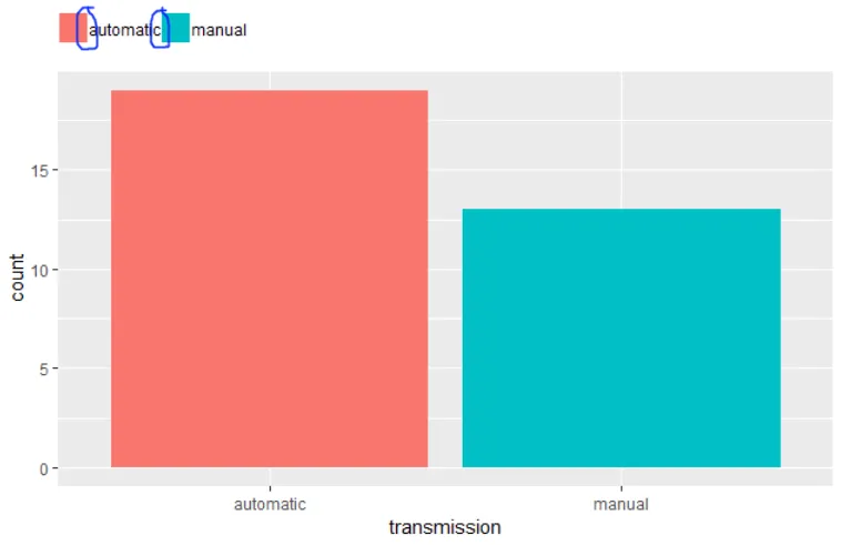
library(tidyverse)

mtcars %>% 
  mutate(transmission = ifelse(am, "manual", "automatic")) %>% 
ggplot() +
  aes(x = transmission, fill = transmission) +
  geom_bar() +
  labs(fill = NULL) +
  theme(
    #legend.spacing.x = unit(.5, "char"), # adds spacing to the left too
    legend.position = "top", 
    legend.justification = c(0,0),
    legend.title=element_blank(),
    legend.margin=margin(c(5,5,5,0)))

enter image description here


1
可能是 ggplot2 增加图例键之间的间隔 的重复。 - erc
请参见此处的代码:https://dev59.com/Wmgu5IYBdhLWcg3wYWFX#26971729 - erc
1个回答

11

element_text 增加一个边距以进行 调整

mtcars %>%
  mutate(transmission = ifelse(am, "manual", "automatic")) %>%
  ggplot() +
  aes(x = transmission, fill = transmission) +
  geom_bar() +
  labs(fill = NULL) +
  theme(
    #legend.spacing.x = unit(.5, "char"), # adds spacing to the left too
    legend.position = "top",
    legend.justification = c(0, 0),
    legend.title = element_blank(),
    legend.margin = margin(c(5, 5, 5, 0)),
    legend.text = element_text(margin = margin(r = 10, unit = "pt")))

输入图像描述


对于我的情况来说是适得其反的(垂直图例):给文本添加边距会使文本相对于键发生偏移... - JelenaČuklina
1
使用l代替r来垂直显示图例文本:legend.text = element_text(margin = margin(l = -5, unit = "pt") - undefined

网页内容由stack overflow 提供, 点击上面的
可以查看英文原文,
原文链接