- 本回答将讨论如何独立设置x或y刻度标签大小。
sns.set(font_scale=2)来自p-robot将设置所有图形字体。- Kabir Ahuja的答案之所以有效,是因为y标签位置被用作文本。
- 有多种方法可以获取刻度和标签:
plt.xticks()ax.get_xticklabels()ax.get_xticks()
- 在
python 3.10、matplotlib 3.5.2和seaborn 0.12.0中进行了测试
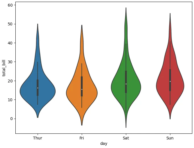
给定以下图表
import matplotlib.pyplot as plt
import seaborn as sns
tips = sns.load_dataset("tips")
plt.figure(figsize=(8, 6))
p = sns.violinplot(x="day", y="total_bill", data=tips)
_, ylabels = plt.yticks()
_, xlabels = plt.xticks()
plt.show()
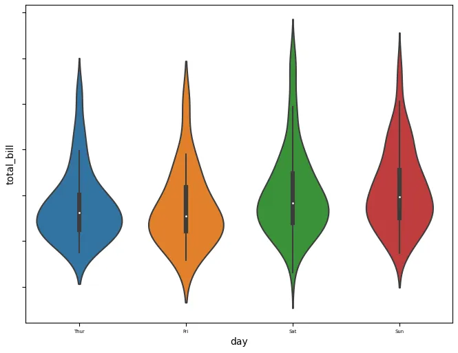
设置y轴无效
fig, ax = plt.subplots(figsize=(8, 6))
sns.violinplot(x="day", y="total_bill", data=tips, ax=ax)
print(ax.get_xticks())
print(ax.get_yticks())
print('\n')
print(ax.get_xticklabels())
print(ax.get_yticklabels())
print('\n')
print(plt.xticks())
print(plt.yticks())
print('\n')
yticks, ylabels = plt.yticks()
xticks, xlabels = plt.xticks()
print(ylabels)
print(yticks)
print(ylabels[0].get_text())
print(xlabels)
print(ax.get_yticks())
ax.set_xticklabels(xlabels, size=5)
ax.set_yticklabels(ylabels, size=15)
plt.show()
print 输出
[0 1 2 3]
[-10.   0.  10.  20.  30.  40.  50.  60.  70.]

[Text(0, 0, 'Thur'), Text(1, 0, 'Fri'), Text(2, 0, 'Sat'), Text(3, 0, 'Sun')]
[Text(0, 0, ''), Text(0, 0, ''), Text(0, 0, ''), Text(0, 0, ''), Text(0, 0, ''), Text(0, 0, ''), Text(0, 0, ''), Text(0, 0, ''), Text(0, 0, '')]

(array([0, 1, 2, 3]), [Text(0, 0, 'Thur'), Text(1, 0, 'Fri'), Text(2, 0, 'Sat'), Text(3, 0, 'Sun')])
(array([-10.,   0.,  10.,  20.,  30.,  40.,  50.,  60.,  70.]), [Text(0, 0, ''), Text(0, 0, ''), Text(0, 0, ''), Text(0, 0, ''), Text(0, 0, ''), Text(0, 0, ''), Text(0, 0, ''), Text(0, 0, ''), Text(0, 0, '')])

[Text(0, 0, ''), Text(0, 0, ''), Text(0, 0, ''), Text(0, 0, ''), Text(0, 0, ''), Text(0, 0, ''), Text(0, 0, ''), Text(0, 0, ''), Text(0, 0, '')]
[-10.   0.  10.  20.  30.  40.  50.  60.  70.]
← empty string from ylabels[0].get_text()
[Text(0, 0, 'Thur'), Text(1, 0, 'Fri'), Text(2, 0, 'Sat'), Text(3, 0, 'Sun')]
[-10.   0.  10.  20.  30.  40.  50.  60.  70.]
绘图
- 没有y轴刻度标签,因为
y_text = [y.get_text() for y in ylabels] = ['', '', '', '', '', '', '', '', '']
设置y轴刻度标签大小
p.set_yticklabels(p.get_yticks(), size=15)
_, ylabels = plt.yticks()
p.set_yticklabels(ylabels, size=15)
设置xticklabel的大小
p.set_xticklabels(p.get_xticks(), size=15)
_, xlabels = plt.xticks()
p.set_xticklabels(xlabels, size=15)
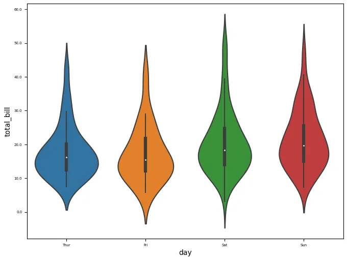
这很有效
fig , ax = plt.subplots(figsize=(8, 6))
sns.violinplot(x="day", y="total_bill", data=tips, ax=ax)
_, xlabels = plt.xticks()
ax.set_xticklabels(xlabels, size=5)
ax.set_yticks(ax.get_yticks()[1:])
_ = ax.set_yticklabels(ax.get_yticks(), size=5)
font_scale改变了所有字体,据我所知,包括标题大小。有没有一种方法仅更改刻度标签? - Mayou36sns.set(); fig, ax = plt.subplots(); sns.violinplot(data = df, ax = ax); ax.yaxis.set_tick_params(labelsize = 30); plt.show()- p-robot