假设我有一个 pandas.DataFrame 中的 datetime 时间戳列。以秒为单位,为了举例说明,我想将事件分入 10 分钟 [1] 的 bucket / bin 中。我了解可以将 datetime 表示为整数时间戳,然后使用直方图。是否有更简单的方法?pandas 中是否有内置的方法?
[1] 10 分钟仅为示例。最终,我希望使用不同的分辨率。
[1] 10 分钟仅为示例。最终,我希望使用不同的分辨率。
如果您想使用自定义频率,如“10Min”,则需要使用操作index的TimeGrouper(正如 @johnchase 所建议的)。
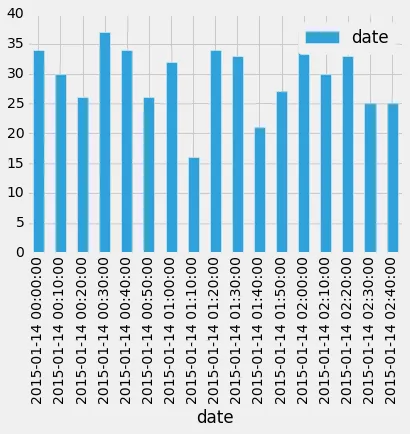
# Generating a sample of 10000 timestamps and selecting 500 to randomize them
df = pd.DataFrame(np.random.choice(pd.date_range(start=pd.to_datetime('2015-01-14'),periods = 10000, freq='S'), 500),  columns=['date'])
# Setting the date as the index since the TimeGrouper works on Index, the date column is not dropped to be able to count
df.set_index('date', drop=False, inplace=True)
# Getting the histogram
df.groupby(pd.TimeGrouper(freq='10Min')).count().plot(kind='bar')
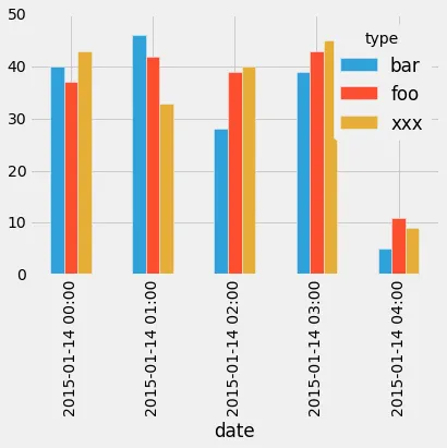
to_period还可以使用to_period方法,但据我所知,它不适用于自定义时间段,例如"10Min"。此示例使用附加列模拟项目的类别。
# The number of sample
nb_sample = 500
# Generating a sample and selecting a subset to randomize them
df = pd.DataFrame({'date': np.random.choice(pd.date_range(start=pd.to_datetime('2015-01-14'),periods = nb_sample*30, freq='S'), nb_sample),
                  'type': np.random.choice(['foo','bar','xxx'],nb_sample)})

# Grouping per hour and type
df = df.groupby([df['date'].dt.to_period('H'), 'type']).count().unstack()
# Droping unnecessary column level
df.columns = df.columns.droplevel()
df.plot(kind='bar')
.plot(kind='bar')而不是像@johnchase建议的.hist(),对吗? - Dror
df.groupby(pd.TimeGrouper(freq='10Min')).mean().plot(kind="bar")你可以将"bar"替换为"hist",但我不确定这是否有很多意义。我猜测y轴应该是频率,但x轴应该是什么呢?你有原始数据的示例和图表应该是什么样子的示例吗(即使只是口头描述)? - johnchase