我有两种数据,看起来像这样:
类型1 (http://dpaste.com/1697615/plain/)
Cluster-6   abTcells    1456.74119
Cluster-6   Macrophages 5656.38478
Cluster-6   Monocytes   4415.69078
Cluster-6   StemCells   1752.11026
Cluster-6   Bcells  1869.37056
Cluster-6   gdTCells    1511.35291
Cluster-6   NKCells 1412.61504
Cluster-6   DendriticCells  3326.87741
Cluster-6   StromalCells    2008.20603
Cluster-6   Neutrophils 12867.50224
Cluster-3   abTcells    471.67118
Cluster-3   Macrophages 1000.98164
Cluster-3   Monocytes   712.92273
Cluster-3   StemCells   557.88648
Cluster-3   Bcells  599.94109
Cluster-3   gdTCells    492.61994
Cluster-3   NKCells 524.42522
Cluster-3   DendriticCells  647.28811
Cluster-3   StromalCells    876.27875
Cluster-3   Neutrophils 1025.24105
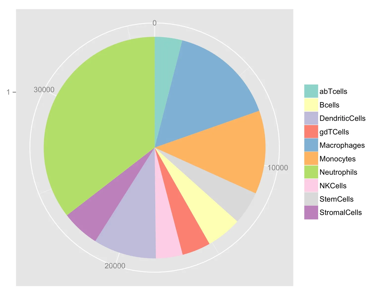
第二种类型,(http://dpaste.com/1697602/plain/)。 这些值与上面类型1中的Cluster-6完全相同:
abTcells    1456.74119
Macrophages 5656.38478
Monocytes   4415.69078
StemCells   1752.11026
Bcells  1869.37056
gdTCells    1511.35291
NKCells 1412.61504
DendriticCells  3326.87741
StromalCells    2008.20603
Neutrophils 12867.50224
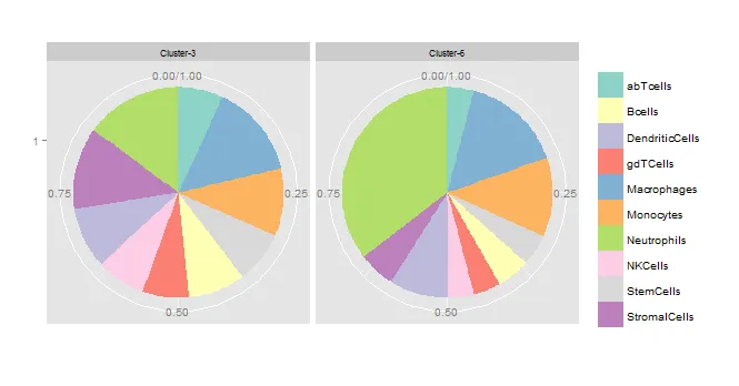
但是为什么使用这段代码处理类型1数据时:
library(ggplot2);
library(RColorBrewer);
filcol <- brewer.pal(10, "Set3")
dat <- read.table("http://dpaste.com/1697615/plain/")
ggplot(dat,aes(x=factor(1),y=dat$V3,fill=dat$V2))+
   facet_wrap(~V1)+
   xlab("") +
   ylab("") +
   geom_bar(width=1,stat="identity",position = "fill") +
   scale_fill_manual(values = filcol,guide = guide_legend(title = "")) +
   coord_polar(theta="y")+
   theme(strip.text.x = element_text(size = 8, colour = "black", angle = 0))
准备好的数据:
> dput(dat)
structure(list(V1 = structure(c(2L, 2L, 2L, 2L, 2L, 2L, 2L, 2L,
2L, 2L, 1L, 1L, 1L, 1L, 1L, 1L, 1L, 1L, 1L, 1L), .Label = c("Cluster-3",
"Cluster-6"), class = "factor"), V2 = structure(c(1L, 5L, 6L,
9L, 2L, 4L, 8L, 3L, 10L, 7L, 1L, 5L, 6L, 9L, 2L, 4L, 8L, 3L,
10L, 7L), .Label = c("abTcells", "Bcells", "DendriticCells",
"gdTCells", "Macrophages", "Monocytes", "Neutrophils", "NKCells",
"StemCells", "StromalCells"), class = "factor"), V3 = c(1456.74119,
5656.38478, 4415.69078, 1752.11026, 1869.37056, 1511.35291, 1412.61504,
3326.87741, 2008.20603, 12867.50224, 471.67118, 1000.98164, 712.92273,
557.88648, 599.94109, 492.61994, 524.42522, 647.28811, 876.27875,
1025.24105)), .Names = c("V1", "V2", "V3"), class = "data.frame", row.names = c(NA,
-20L))
生成了以下图形:
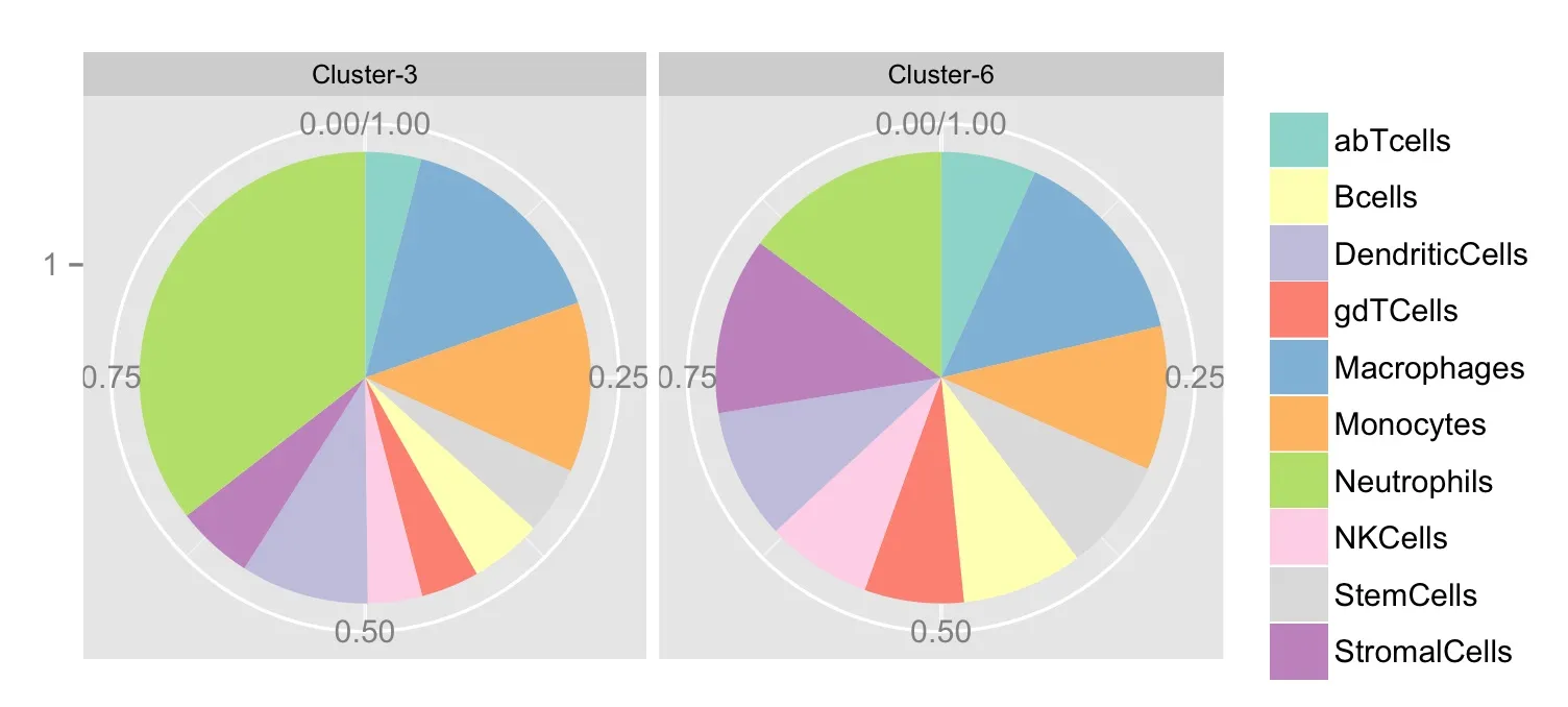 请注意Facet标签的位置错误,Cluster-3应为Cluster-6,其中中性粒细胞所占比例较大。
如何解决这个问题?
处理类型2数据时完全没有问题。
library(ggplot2)
df <- read.table("http://dpaste.com/1697602/plain/");
library(RColorBrewer);
filcol <- brewer.pal(10, "Set3")

ggplot(df,aes(x=factor(1),y=V2,fill=V1))+
   geom_bar(width=1,stat="identity")+coord_polar(theta="y")+
    theme(axis.title = element_blank())+
     scale_fill_manual(values = filcol,guide = guide_legend(title = "")) +
      theme(strip.text.x = element_text(size = 8, colour = "black", angle = 0))
准备好的数据:
> dput(df)
structure(list(V1 = structure(c(1L, 5L, 6L, 9L, 2L, 4L, 8L, 3L,
10L, 7L), .Label = c("abTcells", "Bcells", "DendriticCells",
"gdTCells", "Macrophages", "Monocytes", "Neutrophils", "NKCells",
"StemCells", "StromalCells"), class = "factor"), V2 = c(1456.74119,
5656.38478, 4415.69078, 1752.11026, 1869.37056, 1511.35291, 1412.61504,
3326.87741, 2008.20603, 12867.50224)), .Names = c("V1", "V2"), class = "data.frame", row.names = c(NA,
-10L))