我想知道是否有一种使用图像遮罩来实现类似于所示图像的方法?
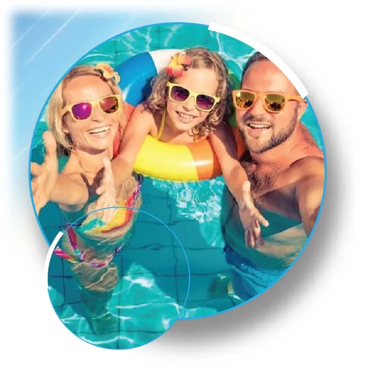
不需要左上角蓝色效果。 我想要得到圆形遮罩。
任何帮助将不胜感激。
.box {
  width:200px;
  height:200px;
  border-radius:50%;
  background-image:url(https://picsum.photos/id/1057/800/800);
  background-size:auto 220px;
  background-position:top left;
  position:relative;
}
.box:before {
  content:"";
  position:absolute;
  bottom:-20px;
  left:0;
  width:100px;
  height:100px;
  background-image:inherit;
  background-size:inherit;
  background-position:bottom left;
  border-radius:inherit;
}<div class="box">
</div>.box {
--b:-20px; /* Bottom of the pseudo element*/
--l:10px; /* Left of the pseudo element*/
--s:2; /*size of the pseudo element (as a scale factor)*/
width:200px;
height:200px;
border-radius:50%;
background-image:url(https://picsum.photos/id/1057/800/800);
background-size:auto calc(100% - var(--b));
background-position:top left;
position:relative;
display:inline-block;
}
.box:before {
content:"";
position:absolute;
bottom:var(--b);
left:var(--l);
width:calc(100%/var(--s));
height:calc(100%/var(--s));
background-image:inherit;
background-size:auto calc(100%*var(--s) - var(--b));
background-position:bottom 0 left calc(-1 * var(--l));
border-radius:inherit;
}<div class="box"></div>
<div class="box" style="--s:3;l:50px;"></div>
<div class="box" style="--s:1.5;l:50px;--b:-10px"></div>您可以轻松地添加边框:
.box {
  --b:-20px; /* Bottom of the pseudo element*/
  --l:10px;  /* Left of the pseudo element*/
  --s:2; /*size of the pseudo element (as a scale factor)*/
  width:200px;
  height:200px;
  border-radius:50%;
  background-image:url(https://picsum.photos/id/1057/800/800);
  background-size:auto calc(100% - var(--b));
  background-position:top left;
  position:relative;
  display:inline-block;
  border:2px solid blue;
  box-sizing:border-box;
}
.box:before {
  content:"";
  position:absolute;
  bottom:var(--b);
  left:var(--l);
  width:calc(100%/var(--s));
  height:calc(100%/var(--s));
  background-image:inherit;
  background-size:auto calc(100%*var(--s) - var(--b));
  background-position:bottom 0 left calc(-1 * var(--l));
  border-radius:inherit;
  border:inherit;
  box-sizing:inherit;
}<div class="box">
</div>
<div class="box" style="--s:3;l:50px;">
</div>
<div class="box" style="--s:1.5;l:50px;--b:-10px">
</div>