我有一个CSS文件,可以完美地制作圆形边框填充动画。它的宽度和高度都是100像素。但是我只需要一个宽度和高度为50像素的圆形,具有相同的动画效果。我尝试了很多次来缩小大小,但是圆形没有与动画正确地对齐。请帮助我缩小这个圆形。
我的需求:
宽度-50像素
高度-50像素
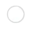
边框大小与附加的图像文件相同-circle border fill sample image。
我的代码
#loading
{
  width: 100px;
  height: 100px;
  margin: 30px auto;
  position: relative;
}

.outer-shadow, .inner-shadow
{
  z-index: 4;
  position: absolute;
  width: 100%;
  height: 100%;
  border-radius: 100%;
  box-shadow: 1px 1px 1px 1px rgba(0, 0, 0, 0.5);
}

.inner-shadow
{
  top: 50%;
  left: 50%;
  width: 80px;
  height: 80px;
  margin-left: -40px;
  margin-top: -40px;
  border-radius: 100%;
  background-color: #ffffff;
  box-shadow: 1px 1px 1px 1px rgba(0, 0, 0, 0.5);
}

.hold
{
  position: absolute;
  width: 100%;
  height: 100%;
  clip: rect(0px, 100px, 100px, 50px);
  border-radius: 100%;
  background-color: #fff;
}

.fill, .dot span
{
  background-color: #f50;
}

.fill
{
  position: absolute;
  width: 100%;
  height: 100%;
  border-radius: 100%;
  clip: rect(0px, 50px, 100px, 0px);
}

.left .fill
{
  z-index: 1;
  -webkit-animation: left 1s linear ;
  -moz-animation: left 1s linear ;
  animation: left 1s linear both;
}

@keyframes left
{
  0%{-webkit-transform:rotate(0deg);}
  100%{transform:rotate(180deg);}
}

@-webkit-keyframes left
{
  0%{-webkit-transform:rotate(0deg);}
  100%{-webkit-transform:rotate(180deg);}
}

.right
{
  z-index: 3;
  -webkit-transform: rotate(180deg);
  -moz-transform: rotate(180deg);
  transform: rotate(180deg);
}

.right .fill
{
  z-index: 3;
  -webkit-animation: right 1s linear ;
  -moz-animation: right 1s linear ;
  animation: right 1s linear both ;
  -webkit-animation-delay: 1s;
  -moz-animation-delay: 1s;
  animation-delay: 1s;
}

@keyframes right
{
  0%{-webkit-transform:rotate(0deg);}
  100%{transform:rotate(180deg);}
}

@-webkit-keyframes right
{
  0% {transform: rotate(0deg);}
  100% {transform: rotate(180deg);}
}
这是我在jsfiddle上的代码...!
transform: scale(0.5),就像这样。这将使圆的大小减半,而无需进行任何其他更改。 - Harry