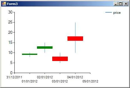
我正在尝试使用MSChart在Windows表单中制作蜡烛图。我已经成功地制作了一个没有问题的3D条形图。但是在长时间的互联网搜索、Microsoft的源代码(WinSamples)和大量的头皮屑后,我找不到创建蜡烛图的正确方法。
有什么可以帮助我的是添加一个系列到具有多个Y值的图表的清晰示例,或者纠正我的代码(当我运行调试时除了图例标签外什么都不显示)。
如果例子基于OleDB(我的值在Access数据库中),那就更好了。
所以我的问题是:如果您有在C#的Windows表单中创建蜡烛图的经验,您能给我一些提示吗?或者(更好)能够向我提供一些C#代码吗?
以下是我的当前(不起作用的)代码:
using System.Windows.Forms.DataVisualization.Charting;
public partial class CandleStick : Form
{
    public CandleStick()
    {
        InitializeComponent();
    }

    private void CandleStick_Load(object sender, EventArgs e)
    {
        GrafiekLaden();
    }

    public void GrafiekLaden()
    {

        Koers k = new Koers();
        // This method fills up a list, the data comes from my database
        // it contains Date, High, Low, Open, Close
        k.meerdereOphalen();

        Series price = new Series();
        chart1.Series.Add(price);

        // Set series chart type
        chart1.Series["price"].ChartType = SeriesChartType.Candlestick;

        // Set the style of the open-close marks
        chart1.Series["price"]["OpenCloseStyle"] = "Triangle";

        // Show both open and close marks
        chart1.Series["price"]["ShowOpenClose"] = "Both";

        // Set point width
        chart1.Series["price"]["PointWidth"] = "1.0";

        // Set colors bars
        chart1.Series[0]["PriceUpColor"] = "Green";
        chart1.Series[0]["PriceDownColor"] = "Red";

        for (int i = 0; i < k.Lijst.Count; i++)
        {
            // adding date and high
            chart1.Series["price"].Points.AddXY(DateTime.Parse(k.Lijst[i].Datum), k.Lijst[i].Hoog);
            // adding low
            chart1.Series["price"].Points[i].YValues[1] = k.Lijst[i].Laag;
            //adding open
            chart1.Series["price"].Points[i].YValues[2] = k.Lijst[i].PrijsOpen;
            // adding close
            chart1.Series["price"].Points[i].YValues[3] = k.Lijst[i].PrijsGesloten;
        }
    }