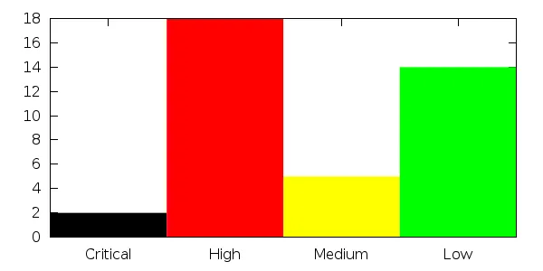
我有一个非常简单的数据集:
Critical 2
High 18
Medium 5
Low 14
创建一个gnuplot柱状图很容易,但所有的条形都是相同的颜色。我希望Critical是黑色的,high是红色的等等,但好像几乎没有关于如何做到这一点的在线教程。请问有人能指点我一下吗?
我有一个非常简单的数据集:
Critical 2
High 18
Medium 5
Low 14
set xrange [-.5:3.5]
set yrange [0:]
set style fill solid
plot "<sed 'G;G' test.dat" i 0 u (column(-2)):2:xtic(1) w boxes ti "Critical" lc rgb "black",\
     "<sed 'G;G' test.dat" i 1 u (column(-2)):2:xtic(1) w boxes ti "High" lc rgb "red" ,\
     "<sed 'G;G' test.dat" i 2 u (column(-2)):2:xtic(1) w boxes ti "Medium" lc rgb "green",\
     "<sed 'G;G' test.dat" i 3 u (column(-2)):2:xtic(1) w boxes ti "Low" lc rgb "blue"
sed 命令并在文件中加入三个空格,以便 gnuplot 将每行视为不同的数据集(或“索引”)。您可以使用 index <number> 或简写的 i <number> 分别绘制每个索引。此外,索引号也可用作 column(-2),这是我们正确间隔箱子的方法。set xrange [-.5:3.5]
set yrange [0:]
set style fill solid
CRITROW(x,y)=(x eq "Critical") ? y:1/0
HIGHROW(x,y)=(x eq "High") ? y:1/0
MIDROW(x,y) =(x eq "Medium") ? y:1/0
LOWROW(x,y) =(x eq "Low") ? y:1/0
plot 'test.dat' u ($0):(CRITROW(stringcolumn(1),$2)):xtic(1) w boxes lc rgb "black" ti "Critical" ,\
'' u ($0):(HIGHROW(stringcolumn(1),$2)):xtic(1) w boxes lc rgb "red" ti "High" ,\
'' u ($0):(MIDROW(stringcolumn(1),$2)):xtic(1) w boxes lc rgb "green" ti "Medium" ,\
'' u ($0):(LOWROW(stringcolumn(1),$2)):xtic(1) w boxes lc rgb "blue" ti "Low"
这个解决方案不依赖于数据文件中的任何特定排序(这就是为什么我稍微更喜欢它的原因)。我们使用column(0)(或$0)来实现间距,它是数据集中的记录号码(在本例中就是行号)。
linecolor 变量 选项实现此操作的方法。$0)作为线型索引:set style fill solid noborder
set linetype 1 lc rgb 'black'
set linetype 2 lc rgb 'red'
set linetype 3 lc rgb 'yellow'
set linetype 4 lc rgb 'green'
set yrange [0:*]
unset key
plot 'alerts.txt' using 0:2:($0+1):xtic(1) with boxes linecolor variable
alerts = 'Critical High Medium Low'
index(s) = words(substr(alerts, 0, strstrt(alerts, s)-1)) + 1

set style fill solid noborder
set linetype 1 lc rgb 'black'
set linetype 2 lc rgb 'red'
set linetype 3 lc rgb 'yellow'
set linetype 4 lc rgb 'green'

set yrange [0:*]
unset key
plot 'alerts.txt' using 0:2:(index(strcol(1))):xtic(1) with boxes linecolor variable