我想要基于
我想要复制以下操作结果中的图片:
这是我的翻译尝试...
PerformanceAnalytics软件包中可用的charts.PerformanceSummary 的基本功能创建一个“ggplot版本”,因为我认为ggplot通常更漂亮,并且从理论上讲在编辑图像方面更强大。虽然我已经相当接近目标,但还有一些问题需要解决,希望得到一些帮助,具体来说:
- 减少图例所占空间的数量,在超过10行时,它变得十分丑陋...(仅需要线条颜色和名称)。
- 增加Daily_Returns分面的大小,使其与
PerformanceAnalytics中的charts.PerformanceSummary相匹配。 - 有一个选项可以指定在Daily_Returns分面中显示哪个资产的日回报系列,而不总是使用第一列.
如果有更好的方法,可能可以使用gridExtra而不是facets...我不反对人们向我展示这将会更好...
这里的问题在于美学和潜在的易于操作性,因为PerformanceAnalytics已经有了一个良好的工作示例,我只是想让它看起来更漂亮/更专业...
此外,为了额外加分,我想能够在每个资产的图表下面或旁边显示与其相关的一些性能统计信息...不确定何处最好显示或显示此信息。
此外,如果有人对我的代码有建议,以清理它们的部分来改进,请不要犹豫提出建议。
下面是我的可重现示例...
首先生成回报数据:
require(xts)
X.stock.rtns <- xts(rnorm(1000,0.00001,0.0003), Sys.Date()-(1000:1))
Y.stock.rtns <- xts(rnorm(1000,0.00003,0.0004), Sys.Date()-(1000:1))
Z.stock.rtns <- xts(rnorm(1000,0.00005,0.0005), Sys.Date()-(1000:1))
rtn.obj <- merge(X.stock.rtns , Y.stock.rtns, Z.stock.rtns)
colnames(rtn.obj) <- c("x.stock.rtns","y.stock.rtns","z.stock.rtns")
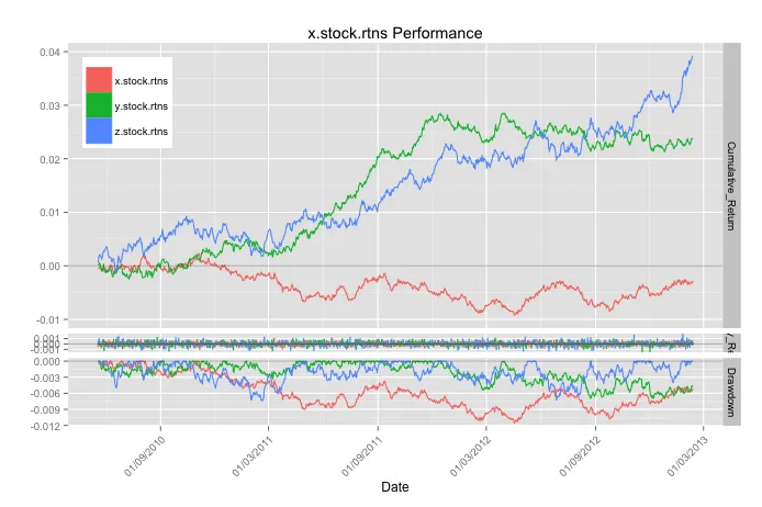
我想要复制以下操作结果中的图片:
require(PerformanceAnalytics)
charts.PerformanceSummary(rtn.obj, geometric=TRUE)
这是我的翻译尝试...
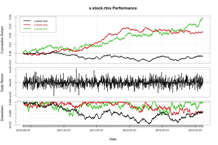
这是我迄今为止的尝试...
gg.charts.PerformanceSummary <- function(rtn.obj, geometric=TRUE, main="",plot=TRUE){

    # load libraries
suppressPackageStartupMessages(require(ggplot2))
suppressPackageStartupMessages(require(scales))
suppressPackageStartupMessages(require(reshape))
suppressPackageStartupMessages(require(PerformanceAnalytics))
    # create function to clean returns if having NAs in data
    clean.rtn.xts <- function(univ.rtn.xts.obj,na.replace=0){
    univ.rtn.xts.obj[is.na(univ.rtn.xts.obj)]<- na.replace
    univ.rtn.xts.obj
}
    # Create cumulative return function
cum.rtn <- function(clean.xts.obj, g=TRUE){
    x <- clean.xts.obj
    if(g==TRUE){y <- cumprod(x+1)-1} else {y <- cumsum(x)}
    y
}
    # Create function to calculate drawdowns
dd.xts <- function(clean.xts.obj, g=TRUE){
    x <- clean.xts.obj
    if(g==TRUE){y <- Drawdowns(x)} else {y <- Drawdowns(x,geometric=FALSE)}
    y
}
    # create a function to create a dataframe to be usable in ggplot to replicate charts.PerformanceSummary
cps.df <- function(xts.obj,geometric){
    x <- clean.rtn.xts(xts.obj)
    series.name <- colnames(xts.obj)[1]
    tmp <- cum.rtn(x,geometric)
    tmp$rtn <- x
    tmp$dd <- dd.xts(x,geometric)
    colnames(tmp) <- c("Cumulative_Return","Daily_Return","Drawdown")
    tmp.df <- as.data.frame(coredata(tmp))
    tmp.df$Date <- as.POSIXct(index(tmp))
    tmp.df.long <- melt(tmp.df,id.var="Date")
    tmp.df.long$asset <- rep(series.name,nrow(tmp.df.long))
    tmp.df.long
}
# A conditional statement altering the plot according to the number of assets
if(ncol(rtn.obj)==1){
            # using the cps.df function
    df <- cps.df(rtn.obj,geometric)
            # adding in a title string if need be
    if(main==""){
        title.string <- paste0(df$asset[1]," Performance")
    } else {
        title.string <- main
    }
            # generating the ggplot output with all the added extras....
    gg.xts <- ggplot(df, aes_string(x="Date",y="value",group="variable"))+
                facet_grid(variable ~ ., scales="free", space="free")+
                geom_line(data=subset(df,variable=="Cumulative_Return"))+
                geom_bar(data=subset(df,variable=="Daily_Return"),stat="identity")+
                geom_line(data=subset(df,variable=="Drawdown"))+
                ylab("")+
                geom_abline(intercept=0,slope=0,alpha=0.3)+
                ggtitle(title.string)+
                theme(axis.text.x = element_text(angle = 45, hjust = 1))+
                scale_x_datetime(breaks = date_breaks("6 months"), labels = date_format("%d/%m/%Y"))

} else {
            # a few extra bits to deal with the added rtn columns
    no.of.assets <- ncol(rtn.obj)
    asset.names <- colnames(rtn.obj)
    df <- do.call(rbind,lapply(1:no.of.assets, function(x){cps.df(rtn.obj[,x],geometric)}))
    df$asset <- ordered(df$asset, levels=asset.names)
    if(main==""){
        title.string <- paste0(df$asset[1]," Performance")
    } else {
        title.string <- main
    }
    if(no.of.assets>5){legend.rows <- 5} else {legend.rows <- no.of.assets}
    gg.xts <- ggplot(df, aes_string(x="Date", y="value",group="asset"))+
      facet_grid(variable~.,scales="free",space="free")+
      geom_line(data=subset(df,variable=="Cumulative_Return"),aes(colour=factor(asset)))+
      geom_bar(data=subset(df,variable=="Daily_Return"),stat="identity",aes(fill=factor(asset),colour=factor(asset)),position="dodge")+
      geom_line(data=subset(df,variable=="Drawdown"),aes(colour=factor(asset)))+
      ylab("")+
      geom_abline(intercept=0,slope=0,alpha=0.3)+
      ggtitle(title.string)+
      theme(legend.title=element_blank(), legend.position=c(0,1), legend.justification=c(0,1),
            axis.text.x = element_text(angle = 45, hjust = 1))+
      guides(col=guide_legend(nrow=legend.rows))+
      scale_x_datetime(breaks = date_breaks("6 months"), labels = date_format("%d/%m/%Y"))

}

assign("gg.xts", gg.xts,envir=.GlobalEnv)
if(plot==TRUE){
    plot(gg.xts)
} else {}

}
# seeing the ggplot equivalent....
gg.charts.PerformanceSummary(rtn.obj, geometric=TRUE)